01 · The website
The finished site, running live
Scroll inside the frame. Hover the origin cards and the product grid, walk the roast process track, reach the subscription block. Everything here is production markup, not a screenshot.
Live embed ↓ scroll inside the frame
02 · Desktop
How the system holds across the page
Four sections at 1440 wide, each anchored to its real position in the page rather than a guessed scroll depth. One serif, one sans, and a single espresso band breaking the cream so the page has a middle.
Hero
Copy staggers in while the image wipes open from the bottom
Origins
Three cooperatives, named, with altitude and varietal
Shop
Product cards with tasting notes, not adjectives
Subscribe
One field, one action, on the dark end of the palette
03 · Mobile
Every state, including the one nobody screenshots
At 390 wide the header carries the wordmark and menu only, then the primary action appears once the visitor scrolls, so nothing wraps at 360. Each screen is anchored to a real section. The navigation panel is captured opening over scrolled content, not over an empty hero.
Hero
The two-column hero stacks, copy above image. The floating roast tag moves inside the frame so it cannot overlap the headline at narrow widths.
Navigation, mid-scroll
The panel drops over the product grid beneath it. Items sit at 44px minimum touch height, with the cart action last.
Origins
Cards go full width and keep their 230px image height, so the photograph still reads as a place rather than a thumbnail.
Subscribe
The inline form stacks to a full-width field and button, both above 44px, with the drifting glow behind it left intact.
04 · Detail and interaction
The parts a screenshot cannot show
Every element below is the real thing, built to the same spec as the site. Hover them.
Origin card
.4s card · .8s image
Hovering anywhere on the card, including the body copy, lifts it eight pixels over .4s and scales the photograph to 1.06 over .8s. The image is deliberately twice as slow as the card, so the lift feels like picking something up rather than the whole tile jumping.
Actions and focus
.3s · plus a shine sweep
The solid button warms from espresso to caramel, lifts two pixels and casts a caramel shadow, all on .3s. A shine sweep crosses it on entry, looping here so you can see it. The outline button borrows the darker caramel so its label still clears AA at 13.8px.
The bean, and the nav rule
.3s underline sweep
The bean sits inside the wordmark as the O, a rotated ellipse with a radial highlight and a cream crease cut through it. The nav bar is translucent cream with a blur, and each link grows a caramel rule from the left over .3s. The bar never changes state, because this page has no dark hero to sit over.
Scroll reveal, staggered
.85s · 30px rise
Looping here so the timing is visible. On the site each element rises 30 pixels and fades in over .85 seconds. There are exactly two delay classes, .d1 at .1s and .d2 at .2s, so a row of three cards resolves left to right and nothing else in the system is allowed to stagger.
The page in motion
Looping · desktop and mobile together
Both frames scroll on a loop and reverse, so the hero wipe, the drifting glow behind the subscription block and the card lifts all play without you touching anything. Record either one straight off the page.
Motion specification
.3s
Buttons, nav rules, the burger. Anything under the cursor.
.85s
Content arriving on scroll, with .d1 and .d2 offsets only.
1.2s
The hero wipe, and the bestseller image scaling on hover.
18s
The hero drift, scaling 1 to 1.07 after the wipe completes.
Two curves, each with a job. cubic-bezier(.22,.61,.36,1) carries everything that eases in, and cubic-bezier(.77,0,.18,1) is used once, on the 1.2s clip-path wipe that opens the hero image, because that one needs to start slowly and finish with authority. Under reduced motion every duration collapses to zero, the wipe is removed and all content renders in its final state.
Part two
The identity system underneath it
Everything above draws on one small set of rules: a wordmark with a bean inside it, a palette named after the roast, and two type families across eight roles.
05 · The mark
Three lockups, and when each one is correct
The name sets in Newsreader at 600, uppercase, tracked out to .2em, with a roasted bean standing in for the O. The bean is an ellipse rotated 16 degrees with a cream crease cut through it and a radial highlight at the top left, so it reads as a bean and not as a dot.
Primary wordmark
Site header, bag labels, invoices, the cafe window. The default everywhere the name has room on one line.
Bean alone
Anywhere the wordmark would fall under 14px: favicon, app icon, cup lid sticker, the seal on a subscription box. The crease is what keeps it legible at 16px.
Coffee Roasters
Stacked lockup
First contact with someone who has not heard of Volta: wholesale sheets, market stalls, packaging ends. The descriptor is set in the sans so it reads as information, not as part of the name.
Construction and clear space
The bean is .52em wide by .68em tall, which renders .80em tall once the 16 degree rotation is applied, against a .667em cap height. The overshoot is deliberate and larger than it would be for a circle: a rotated ellipse tapers at its tips, so matching the cap height exactly makes it read shorter than the letters beside it. Margins are asymmetric on purpose: the .2em tracking of the wordmark already lands to the right of the V, and the rotation makes the bean overhang its own box by about 1.75px on each side, so it takes no left margin and .24em on the right to make both gaps optically equal. Because the wordmark is an inline-flex row, the bean is centered with align-self and then raised .1em, since flex centring would otherwise sit it on the line box including descender space rather than on the cap band.
Clear space equals the width of one bean on all four sides. Minimums: bean 16px on screen and 8mm in print, primary wordmark 120px wide on screen and 30mm in print.
Inverted and single ink
On photography
A photograph has no fixed luminance, so the lockup cannot be placed on one directly and checked once. The rule is a scrim: 72% of espresso under the mark, which bounds the ground regardless of what is beneath it.
Direct, no scrim
Not permitted. Contrast here is whatever the photograph happens to be at that point, and it changes with every crop.
Scrim, the rule
Measured 6.52:1 at worst. The scrim is composited over both black and white, so that figure holds over any photograph, not just this one.
Held patch
For busy or high-contrast imagery where a full scrim would flatten the photograph. Clear space rules still apply inside the patch.
Never the primary lockup in its dark ink over a photograph. Where the image is too light for the scrim to hold — snow, overexposed sky, white product on white — use the held patch or move the mark off the image entirely.
06 · Explorations
Eight routes, and why seven were wrong
Every route was drawn at the same optical size and tested at sixteen pixels and on kraft paper before anything was judged on looks. These are the studies as drawn, not cleaned-up versions of the winner.
Bean as the O
Chosen
The product sits inside the name, so the mark is legible as coffee before you read a word. It also gives a bean-only lockup for free, which every other route needed a second drawing for.
Cup with steam
Killed
The most drawn mark in the category. It also sells a cafe rather than a roastery, and Volta makes most of its revenue on bags of beans.
Bean in a roundel
Killed
Reads as a certification seal, which is the wrong claim. Volta is not an authority on coffee, it is a buyer with named partners.
Volt mark
Killed
Played on the name rather than the product. A lightning reference promises caffeine as a stimulant, which undercuts an origin-led story about altitude and harvest.
Sans wordmark
Kept for small sizes
Holds where the serif loses its thin strokes. Survives as the caption lockup on bag ends and in the site footer, never as the primary.
Boxed V
Killed
Works as an app icon and nothing else. A letter in a rounded square is what a software company does, and it throws away the one thing the name gives us.
Bean on a baseline
Runner-up
A single bean above a rule, used as a standalone mark. Clean and it scaled well, but with no wordmark attached it could belong to any roastery in any city.
Brew timer
Killed
Specific and honest, and it tested well with people who already brew. For everyone else a clock face says schedule, not flavour.
The test that decided it: print each candidate at 8mm on unbleached kraft and ask whether it still reads as coffee. The cup and the roundel turned to mud, the volt mark read as electrical, and the bean-in-the-O held because its crease is a single high-contrast line rather than fine detail.
07 · Color
A palette named after the roast, not the season
Every color is a stage of the coffee: green bean cream, light roast caramel, full roast espresso, and the steam off a fresh cup. Every hex below is a token in the site stylesheet, and every ratio was measured against the ground it actually sits on.
Cream
#F7F1E8
The default ground and the body background. Warm enough that photographs of raw beans and kraft packaging sit on it without a cast.
Espresso
#251A12
Body text, the bestseller band, the subscription block and the footer. Cream on it measures 15.14:1.
Roast
#4A3228
Subheads, nav links and hero supporting copy at 10.52:1 on cream. A second reading weight rather than a gray.
Warm
#7A6857
Captions, tasting notes and process copy at 4.74:1 on cream. A solid tone, never a faded espresso.
Caramel type
#8F5526
The type cut of the accent, at 5.35:1 on cream. Every eyebrow, region label and badge uses this so 13.4px labels clear AA.
Caramel
#B0703C
The accent as drawn from a light roast. Fills, the bean, focus rings, selection, the process track, and headline emphasis at 24px and up.
Caramel light
#C8956C
Only on espresso grounds, where it reads 6.45:1. The bestseller labels and the subscription heading emphasis.
Steam
#E8DDCD
Product placeholders and hairlines. The lightest tone, and never used for text.
The accent ships in three values for one reason, which is contrast. Caramel at 3.58:1 on cream is fine for a 40px numeral and fails for a 13px label, and caramel light at 2.35:1 on cream is unusable as type but correct on espresso. The system therefore names them by job rather than by shade, and the type cut is the only one allowed under 24px on a light ground.
08 · Type
Two families, eight roles, used the same way every time
Newsreader carries everything that tempts, Outfit carries everything that informs. Nothing on the site is sized by feel, and nothing sits below 13px. The specimen below is set in the brand's own faces at its own sizes.
Display · Newsreader
Aa Vo
Roasted to order
Headlines, product names, origin names, prices. Italic is reserved for the emphasis word in a headline, always in caramel.
Text · Outfit
Aa 0123
18px · body, the site base
15px · card copy and tasting notes
14px · eyebrows and region labels
Body copy, navigation, buttons, metadata. Light weight for reading, 500 for anything tracked out and uppercase.
Eyebrow · 13.4 / 500 / +.2em
Direct trade partners
Page title · 51–93 / serif 500
One per page, the title
Section heading · 35–58
Opens every section
Product name · 24 / serif 500
Konga Cooperative
Lead · 21 / 1.7
The paragraph under a title, one per section at most.
Body · 18 / 1.7
Every paragraph, capped at 74 characters per line.
Caption · 15 / 300
Washed · 2,100m · Heirloom. Body copy never goes below this.
Price · 24 / serif 600
$22
09 · In the world
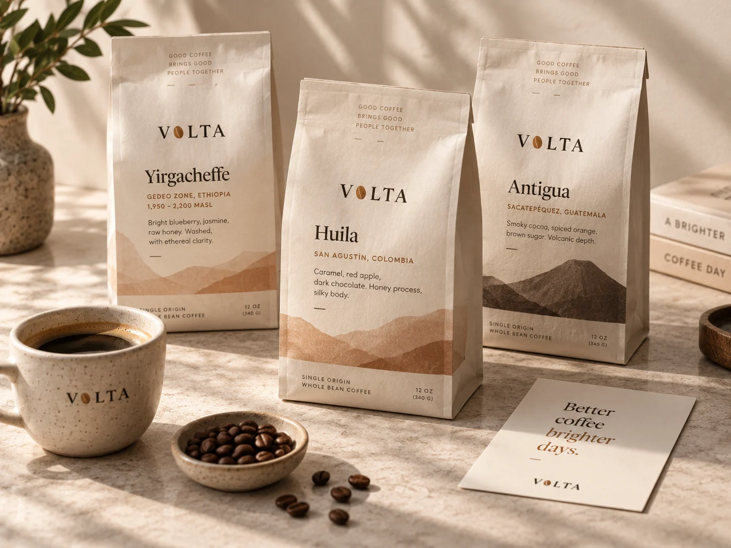
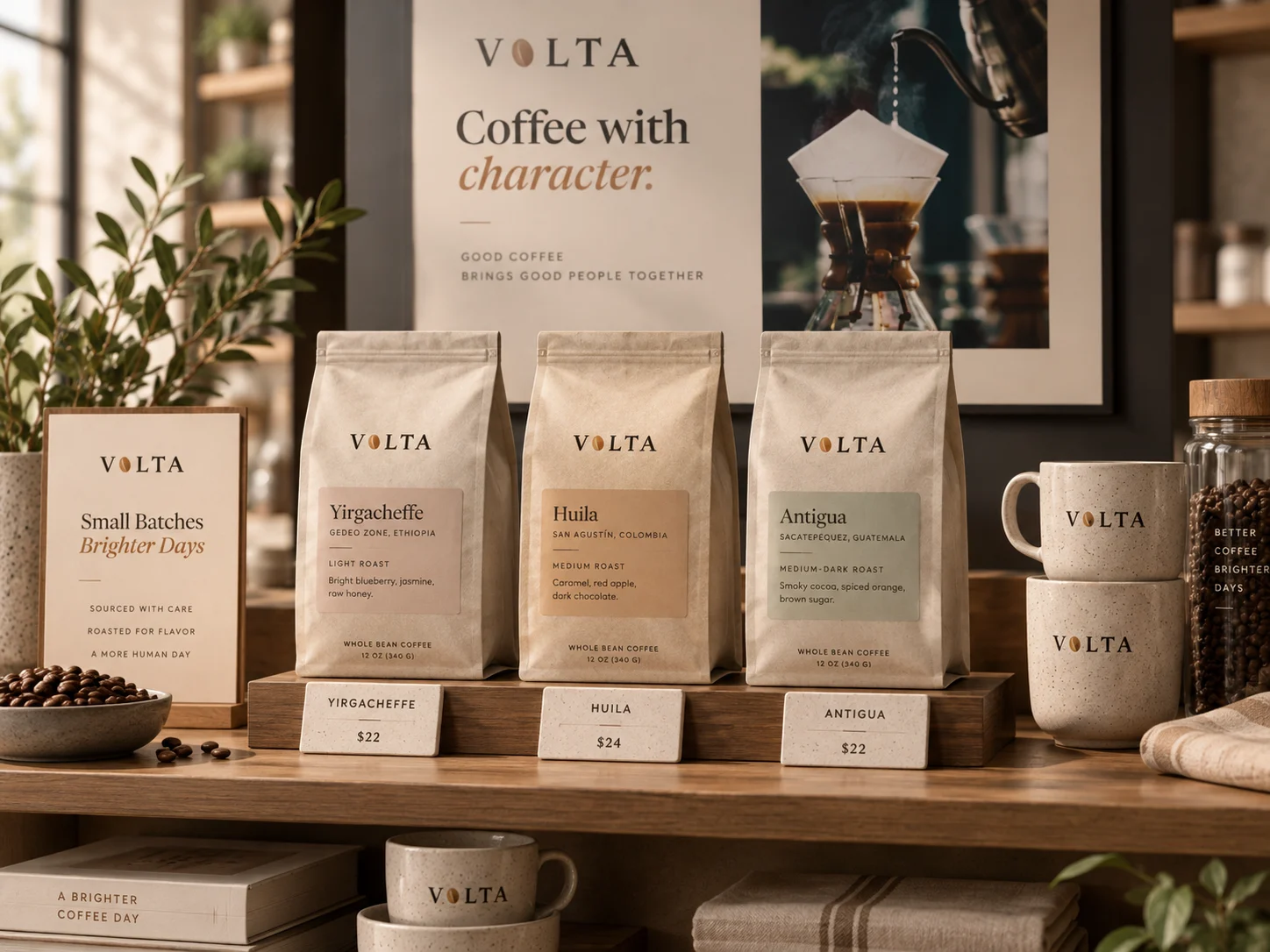
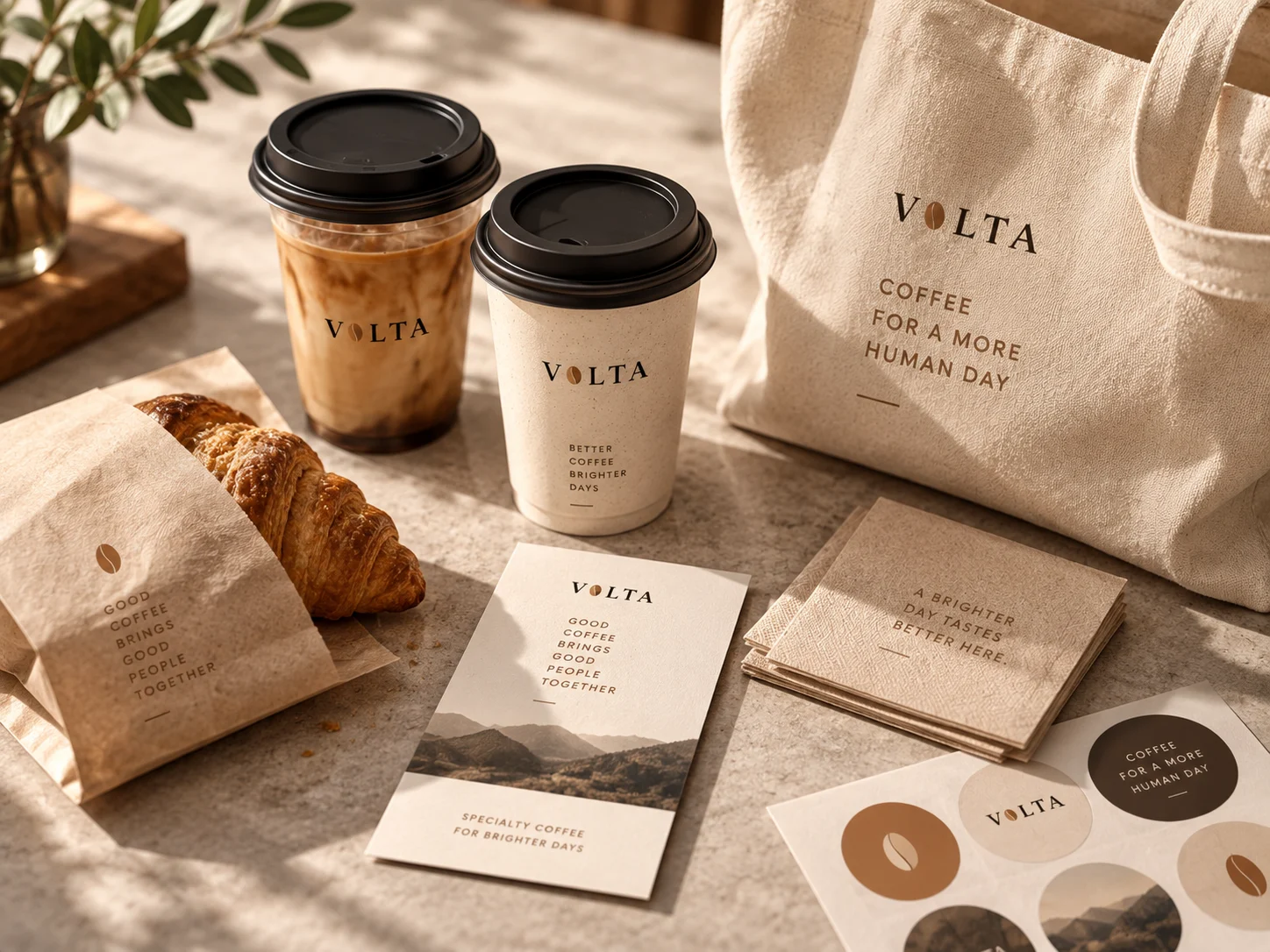
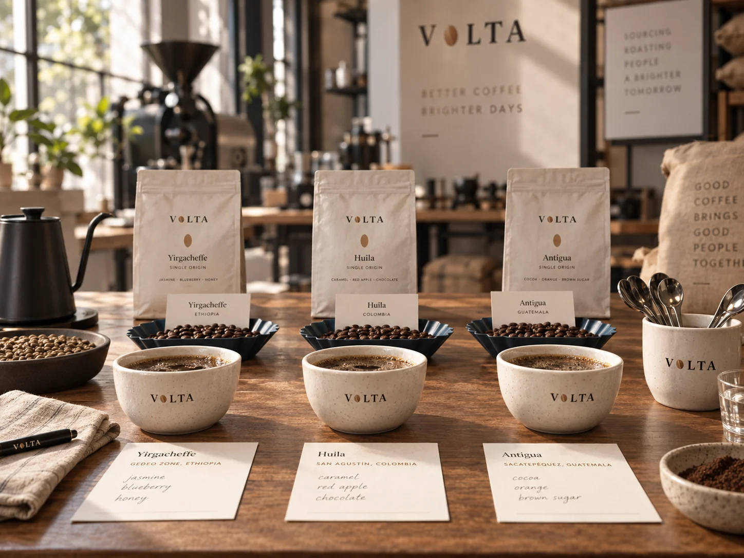
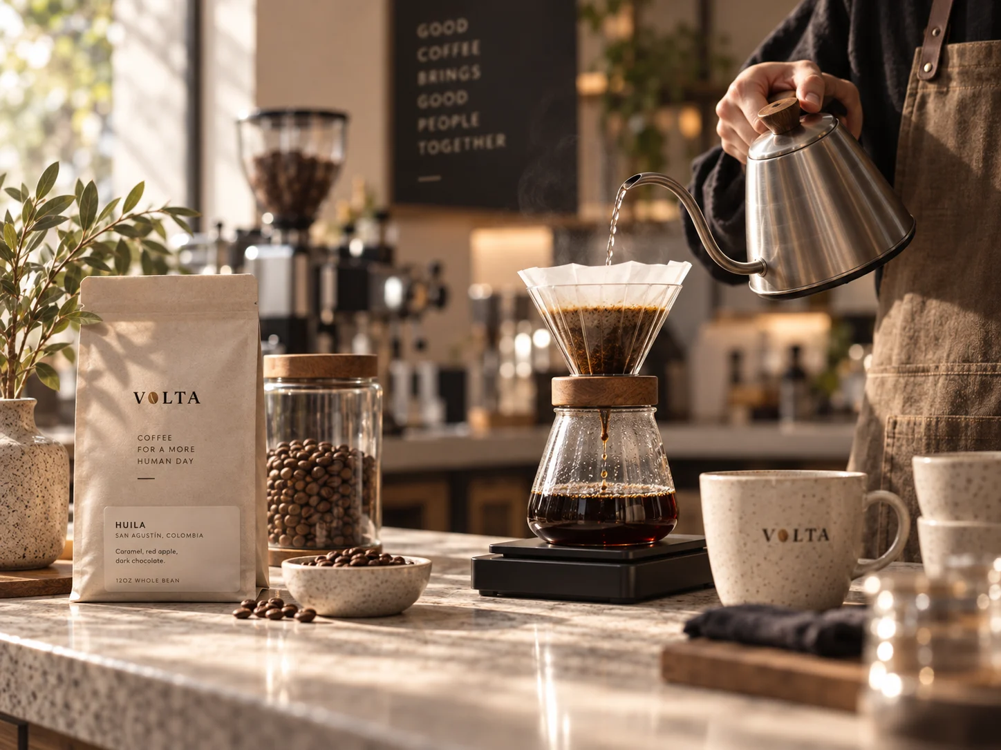
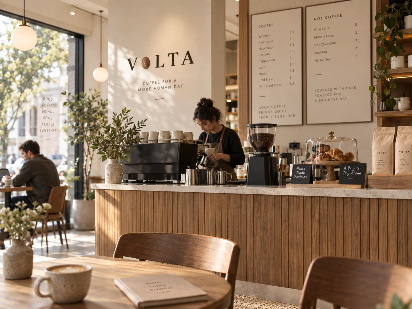
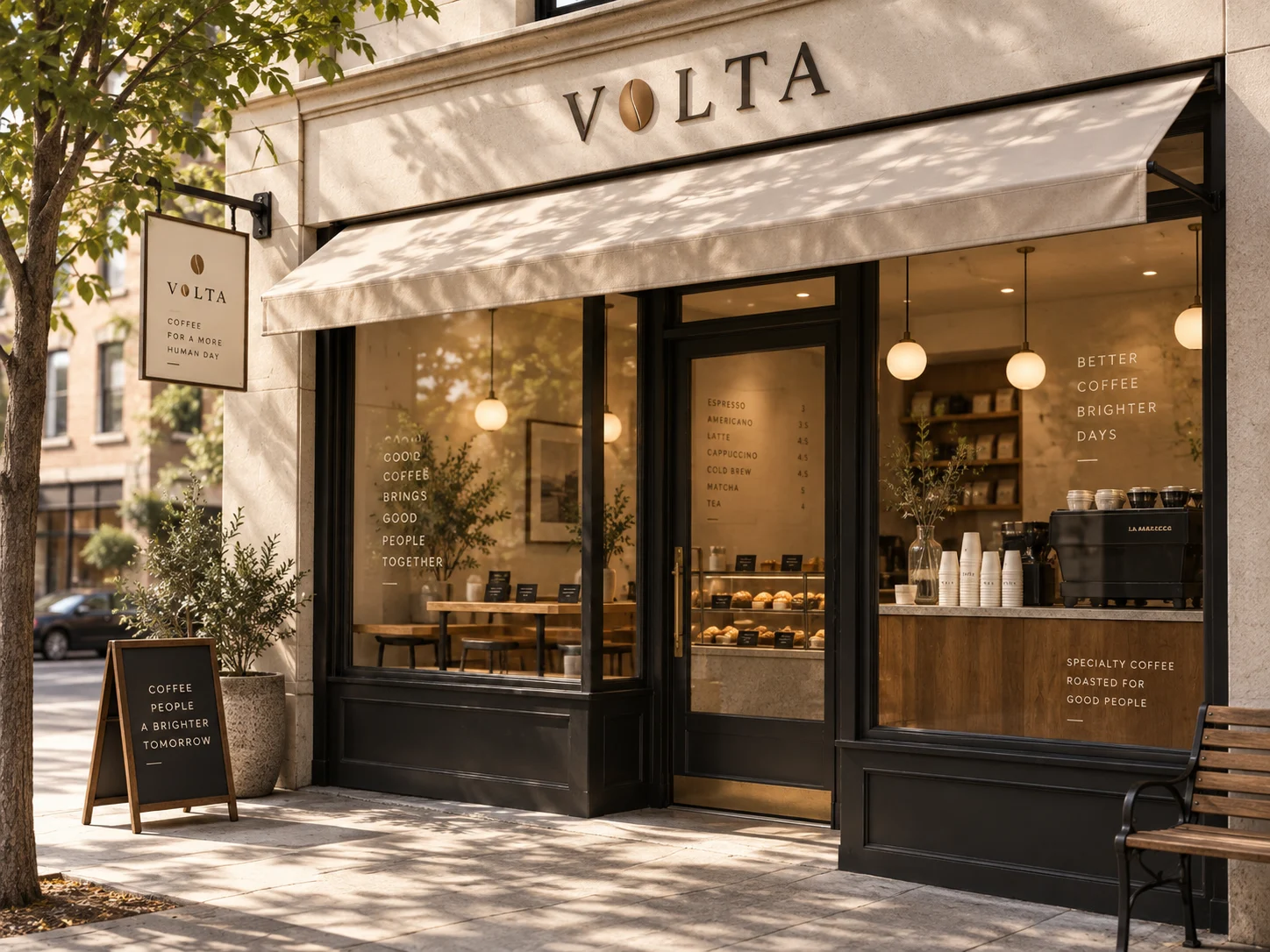
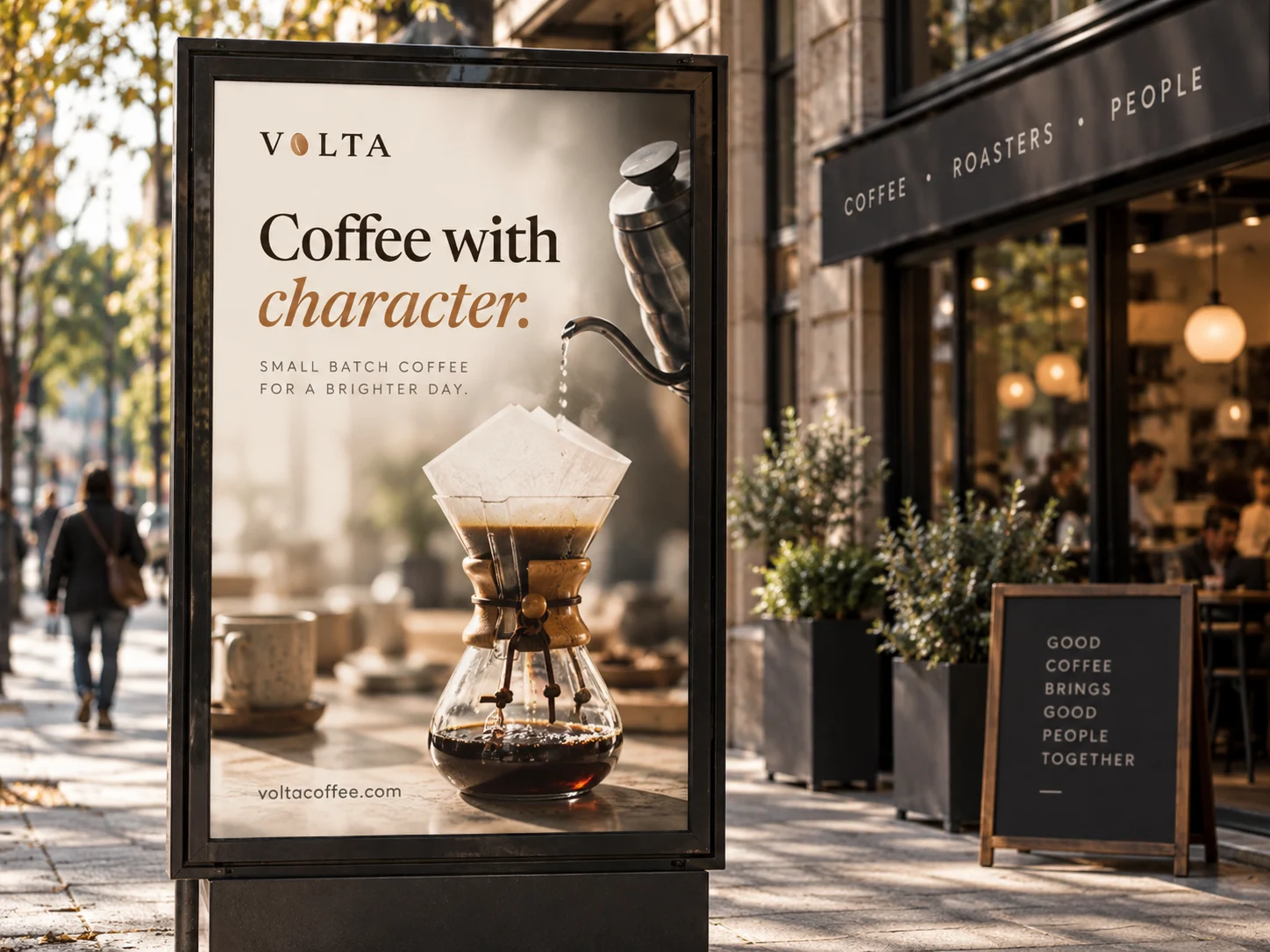
From the bag on the shelf to the sign over the door