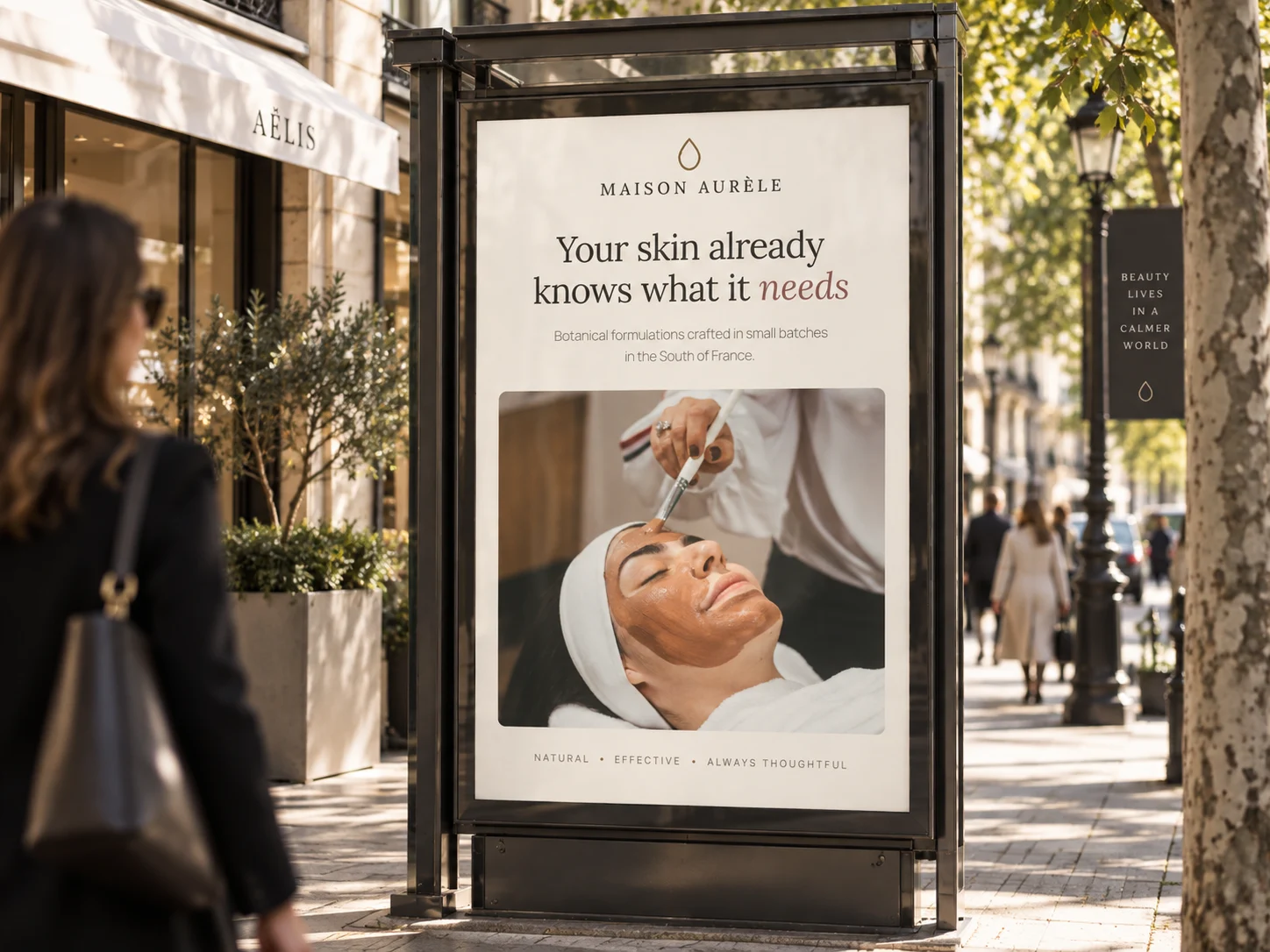
01 · The website
The finished site, running live
Scroll inside the frame. The botanical circles drift on the hero, the product cards reveal their add control on hover, and the clinical figures carry their sample sizes. Everything here is production markup, not a screenshot.
Live embed ↓ scroll inside the frame
02 · Desktop
How the system holds across the page
Four sections at 1440 wide, each anchored to its real position in the page rather than a guessed scroll depth. Pearl throughout, one serif, and gold reserved for numbers and labels so it never becomes decoration.
Hero
Centred, with three botanical circles morphing around the image
Bestsellers
Products at 4:5, each with its active ingredient named
Ingredients
Where things are grown, said plainly, beside the photograph
Proven results
Clinical figures with their sample sizes attached
03 · Mobile
Every state, including the one nobody screenshots
At 390 wide the header carries the wordmark and menu only, then the primary action appears once the visitor scrolls, so nothing wraps at 360. Each screen is anchored to a real section. The navigation panel is captured opening over scrolled content, not over an empty hero.
Hero
The centered headline holds its serif at full size. The third botanical circle is removed below 900px rather than shrunk, so the two that remain keep their scale against the image.
Navigation, mid-scroll
The panel drops over the ingredients section beneath it, on pearl with a linen hairline. Items sit at 44px minimum touch height and return to full opacity, since the desktop 78 percent state would be too faint on a phone.
Bestsellers
Cards keep their 4:5 crop and go full width. The hover-revealed add control becomes permanently visible, because hover does not exist here.
Proven results
The clinical figures stack, and the sample-size note stays attached to each one rather than collapsing into a footnote.
04 · Detail and interaction
The parts a screenshot cannot show
Every element below is the real thing, built to the same spec as the site. Hover them.
Product card
.7s image · .35s control
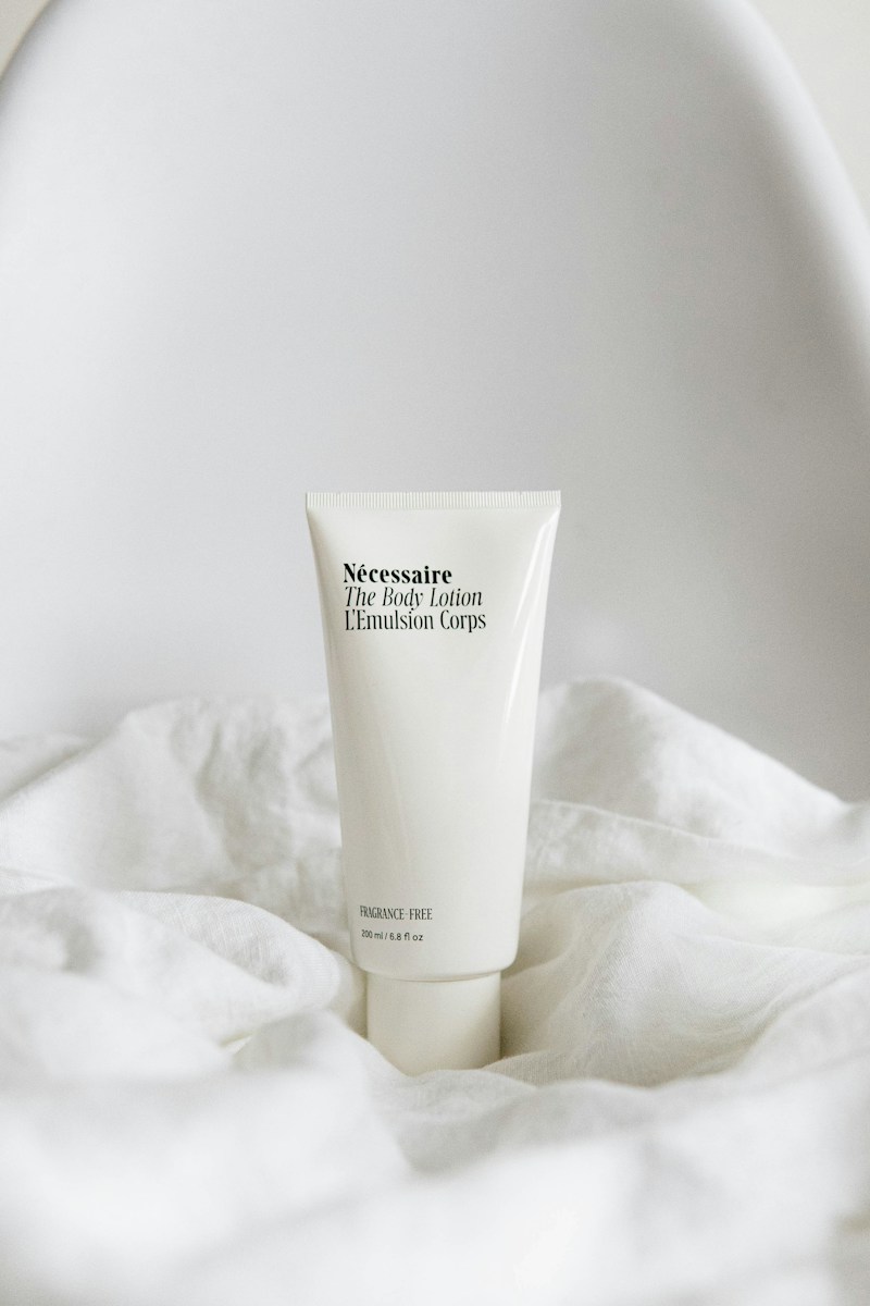
Hovering anywhere on the card scales the photograph to 1.05 over .7s and lifts the add control in from eight pixels below over .35s. The control is deliberately not visible at rest, so the grid reads as a catalog rather than a checkout. On touch it is always shown, because hover does not exist there.
Actions and focus
.3s · gold fills on hover
The filled button is ink, not gold, because ink on pearl is the only pairing that reaches 15.8:1. The outline button rests on a light gold rule and fills with the darker gold on hover, which is a deliberate substitution: white on the light gold measures 3.49:1 and fails, while white on the dark cut reaches 6.03:1.
Botanical circles
9s morph · 2s offsets

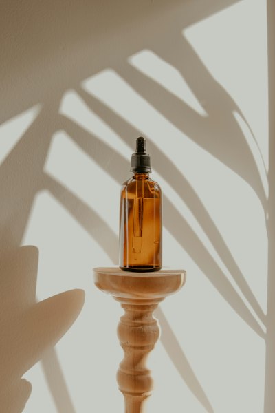
Three circles overlap the hero image, each with a pearl border so they read as cut paper rather than holes. The border radius shifts between four asymmetric states over nine seconds and the middle keyframe lifts twelve pixels, offset two and four seconds apart so they never breathe in unison. This is the only ornamental motion in the system.
Scroll reveal, staggered
.85s · 28px rise
Looping here so the timing is visible. On the site each element rises 28 pixels and fades in over .85 seconds, with two delay classes only, .d1 at .1s and .d2 at .2s. The hero is the exception: it runs its own entrance of six elements at .05s, .18s, .32s, .46s and .6s, with the image itself arriving at .5s over a full second so it lands between the button and the note.
The page in motion
Looping · desktop and mobile together
Both frames scroll on a loop and reverse, so the hero entrance, the morphing circles and the section reveals all play without you touching anything. Record either one straight off the page.
Motion specification
.3s
Buttons and the nav rule. Anything under the cursor.
.7s
Product photography scaling, twice as slow as its card.
.85s
Content arriving on scroll, with .d1 and .d2 offsets only.
9s
The botanical circles morphing, offset 2s and 4s apart.
One easing curve for anything that arrives, cubic-bezier(.22,.61,.36,1), and plain ease for the hero entrance and the ornamental loops, because those are atmosphere rather than response. Under reduced motion every duration collapses to zero, the circles hold a true 50 percent radius and all content renders in its final state.
Part two
The identity system underneath it
Everything above draws on one small set of rules: a wordmark with a drawn seal, a palette of botanical neutrals with three reserved type cuts, and two families across eight roles.
05 · The mark
Three lockups, and when each one is correct
A single leaf drawn as one unbroken stroke, paired with the name in Lora at 500, uppercase, tracked to .24em. The leaf is drawn rather than filled so it reads as a botanical illustration and not as a logo badge, and the wide tracking is what makes a two word name feel composed rather than crowded.
Primary lockup
Site header, cartons, inserts, correspondence. The leaf sits left of the name at .55rem gap, never above it.
The leaf
Favicon, seal on a jar lid, wax stamp, anywhere the wordmark would fall under 14px. In the header lockup, where it renders at 20px, the stroke switches to the darker gold so a 1.5px line does not thin out against pearl.
Maison
Aurèle
Stacked lockup
Narrow surfaces: bottle labels, sample sachets, the spine of a folded insert. The leaf moves above the name only in this one arrangement.
Clear space and minimum size
Clear space equals the height of the leaf on all four sides. The .24em tracking already gives the name internal air, so the lockup only needs protection from what surrounds it.
Minimums: leaf 16px on screen and 8mm in print. Primary lockup 150px wide on screen and 38mm in print, below which the tracking closes and the stroke fills in.
Inverted and single ink
On photography
A photograph has no fixed luminance, so the lockup cannot be placed on one directly and checked once. The rule is a scrim: 72% of ink under the mark, which bounds the ground regardless of what is beneath it.
Direct, no scrim
Not permitted. Contrast here is whatever the photograph happens to be at that point, and it changes with every crop.
Scrim, the rule
Measured 6.25:1 at worst. The scrim is composited over both black and white, so that figure holds over any photograph, not just this one.
Held patch
For busy or high-contrast imagery where a full scrim would flatten the photograph. Clear space rules still apply inside the patch.
Never the primary lockup in its dark ink over a photograph. Where the image is too light for the scrim to hold — snow, overexposed sky, white product on white — use the held patch or move the mark off the image entirely.
06 · Explorations
Eight routes, and why seven were wrong
Every route was drawn at the same optical size, then tested at sixteen pixels and blind embossed on uncoated card before anything was judged on looks. These are the studies as drawn, not cleaned-up versions of the winner.
Single leaf
Chosen
One unbroken stroke, drawn not filled. It reads as botanical at a glance, survives as a 16px favicon, and embosses cleanly on a carton because there is only one contour to register.
Monogram seal
Killed
The default for luxury, and that is the problem. A ringed monogram signals heritage the house does not have, and MA is claimed by dozens of beauty brands already.
Veined leaf
Killed
Botanically accurate and beautiful at large sizes. Below about 24px the veins merge into a gray smudge, which rules it out for the favicon and the jar seal.
Droplet and arc
Killed
Reads as a serum drop, which is on-message, but it also reads as a laboratory pipette. The house sells formulation with botanical provenance, and this lost the second half.
Wordmark alone
Kept as fallback
Correct wherever the leaf would be too small to draw, and it is what the footer uses. On its own it is quiet enough to be forgettable, which is why the leaf leads.
Botanical star
Killed
An abstracted flower that ended up looking like a rating. Any star shape on a commerce site gets read as a review score, which is a costly ambiguity next to a price.
Filled petal
Runner-up
A solid mass with the midrib knocked out. It held at every size and was the strongest alternative, but a filled shape at this scale reads closer to a pharmaceutical mark than a botanical one.
Water line
Killed
Elegant and it spoke to hydration, but a pair of waves belongs to mineral water or a spa. It also gave nothing to hold a monogram or a seal.
The test that decided it: emboss each candidate with no ink at 10mm and see what still registers. Anything with interior detail vanished, because a deboss only holds one contour cleanly at that size. The single leaf survived, and that same constraint is why it is drawn with an unbroken stroke rather than filled.
07 · Color
Botanical neutrals, with a reserved type cut for each accent
Three grounds and three accents. Because the grounds are mostly light, each accent ships in two values: a display value for fills and large type, and a darker cut that clears AA at label sizes. Gold needs a third, because the testimonial band inverts to ink and the direction of the contrast reverses with it. Every hex below is a token in the site stylesheet, and every ratio was measured against the ground it actually sits on.
Pearl
#FBF8F2
The default ground and the body background. Warm off-white rather than paper, so product photography does not look clinical.
Paper
#FFFFFF
Raised surfaces only, one step brighter than pearl, for cards that need to lift.
Ink
#211D18
Body copy, headlines and the filled button. At 15.8:1 on pearl it is the only pairing that carries long reading.
Sub
#6B6258
Supporting copy, captions and clinical sources at 5.64:1 on pearl and 4.74:1 on linen. A solid tone, never a faded ink.
Gold
#A8834B
Display value only: the nav rule and the newsletter focus border. At 3.29:1 on pearl and 2.77:1 on linen it never carries type at any size, which is why the clinical numerals use the dark cut instead.
Gold, type cut
#7D5D32
Every eyebrow, badge and small gold label, the leaf in the header lockup, the clinical numerals, and the hover fill on outline buttons. Clears 5.69 on pearl, 4.97 on blush and 4.78 on linen, so one value works on all three light grounds.
Gold, lifted
#C09A63
The on-dark cut, for the testimonial band where the ground is ink. It reads 6.42:1 there, while the dark cut would collapse to 2.78:1. Gold is the one accent in the system that needs three values, because it appears on both a light and a dark ground.
Rose
#BB8884
Blush accents and fills. At 2.84:1 it fails even the large-text bar, so it never sets type. It does serve as the selection highlight, paired with ink at 5.56:1 rather than white, which would have measured 3.02:1.
Rose, type cut
#94574F
The italic emphasis in the hero headline, at 5.3:1 on pearl. Deeper than the display rose on purpose.
Moss
#6F7C66
The bullet marks in the ingredient list, at 4.17:1 on pearl, which clears the 3:1 bar for a non-text graphic. Display use only, never type.
Moss, type cut
#4F5A48
The ingredient emphasis and the routine badges, at 6.86:1 on pearl and 5.77:1 on linen.
Blush
#F3E7E1
The newsletter band. The one place the palette warms up, and ink on it still reads 13.82:1.
Linen
#ECE4D8
The clinical results band and product placeholders. The darkest ground, which is why the type cuts were tuned against it.
The rule that makes a light palette workable: every accent is defined twice, and the pairing is chosen by type size rather than by taste. Gold at 3.29:1 is wrong for a 13px eyebrow on pearl and equally wrong inverted, where the dark cut drops to 2.78:1 on ink. The system therefore picks by ground first and type size second, and refuses to let either case be decided by eye.
08 · Type
Two families, eight roles, used the same way every time
Lora carries everything that persuades, Manrope carries everything that informs. Nothing on the site is sized by feel, and nothing sits below 13.4px. The specimen below is set in the brand's own faces at its own sizes.
Display · Lora
Aa Ma
what it needs
Headlines, product names, the wordmark, clinical numerals. Italic is reserved for the emphasis phrase in a headline, always in the rose type cut.
Text · Manrope
Aa 0123
17px · body, the site base
15.2px · card copy and notes
13.4px · eyebrows and labels
Body copy, navigation, buttons, badges. Light for reading, 600 for anything tracked out and uppercase.
Eyebrow · 13.4 / 600 / +.24em
New collection · Spring 2026
Page title · 45–80 / Lora 400
One per page, the title
Section heading · 34–52
Opens every section
Product name · 22 / Lora 400
Rosewater Essence
Lead · 16.8 / 1.7
The paragraph under a title, capped at 44 characters so it stays a single thought.
Body · 17 / 1.7
Every paragraph, capped at 74 characters per line.
Button · 13.4 / 600 / +.1em
Shop the collection
Clinical numeral · 42–58 / Lora
94%
09 · In the world
From the box to the boutique