01 · The website
The finished site, running live
Scroll inside the frame. Three color orbs drift behind the page, the feature cards lift on hover, and the playground shows real syntax-highlighted code. Everything here is production markup, not a screenshot.
Live embed ↓ scroll inside the frame
02 · Desktop
How the system holds across the page
Four sections at 1440 wide, each anchored to its real position in the page rather than a guessed scroll depth. Near-black throughout, with the three orbs providing the only color that is not information.
Hero
Headline to 86px with a two-stop gradient on the claim
Features
Five cards in a bento grid, two of them spanning two columns
Playground
A real editor chrome with syntax-highlighted code
Pricing
Three tiers, the middle one marked and outlined
03 · Mobile
Every state, including the one nobody screenshots
At 390 wide the header carries the wordmark and menu only, then the primary action appears once the visitor scrolls, so nothing wraps at 360. Code blocks are the hard problem on a phone, and they scroll horizontally rather than wrapping, because a wrapped line of code is worse than a scrolled one.
Hero
The headline drops from 86px and keeps the gradient on its final phrase. Both buttons go full width and stack, primary first.
Navigation, mid-scroll
The panel drops over the pricing tiers beneath it, carrying four items at 44px minimum touch height. The trial action is not in the panel: it stays in the header row between the wordmark and the menu button, so it is reachable without opening anything.
Features
The bento collapses to one column and the tall and wide spans are dropped, so the five cards read in source order. The one card carrying code keeps it at 13.4px mono, which is the system floor.
Playground
The editor keeps its chrome and its line numbers, and the code pane scrolls sideways instead of reflowing, since white-space is pre.
04 · Detail and interaction
The parts a screenshot cannot show
Every element below is the real thing, built to the same spec as the site. Hover them.
Feature card
.35s · lift, border, shadow
Cards lift four pixels, take a violet border at 30 percent and gain a black shadow, all on .35s. Every card opens with a 40px rounded icon tile in violet at 12 percent, then earns its own evidence: one carries a code sample, one carries live metrics, one carries an image. The spans do the rest, with two cards running two columns wide and one running two rows tall, so a five-item grid never reads as a row of equal boxes.
Actions and focus
.3s · a 40px violet bloom
The primary button fills with the darker violet rather than the display violet, because white on the display value measures 4.06:1 and fails. On hover it lifts two pixels and blooms a 40px violet glow instead of changing color, so the accent keeps one meaning.
The playground
Three accents as syntax
The three brand accents do triple duty as a syntax palette: violet for keywords, cyan for functions, emerald for strings. That is why each had to clear AA on the page independently rather than only look good together. Two colors the rest of the site never uses live here too: amber for numerals, so a threshold value is findable in a block of strings, and a single gray for comments. This is the only place in the system where the palette grows.
The drifting orbs
20s to 26s · 120px blur
The orbs are fixed behind the whole page and drift on three different periods, 22, 26 and 20 seconds, so the background never resolves into a pattern. At 13 percent opacity behind a 120px blur they add depth without ever competing with code, which is the only reason a page this text-heavy can carry color at all.
The page in motion
Looping · desktop and mobile together
Both frames scroll on a loop and reverse, so the orb drift, the status pulse and the section reveals all play without you touching anything. Record either one straight off the page.
Motion specification
.3s
Buttons, nav links, integration pills, FAQ borders.
.35s
Feature cards, which lift slightly slower than a button responds.
.8s
Content arriving on scroll, with .d1 and .d2 offsets only.
20–26s
The three orbs, on deliberately unequal periods.
One easing curve for anything that arrives, cubic-bezier(.22,.61,.36,1), and ease-in-out for the ambient drift. The interaction durations are the shortest of any brand in the book, because the audience is measuring the product on latency and a sluggish interface argues against the pitch. Under reduced motion every duration collapses to zero, the orbs stop and all content renders in its final state.
Part two
The identity system underneath it
Everything above draws on one small set of rules: a three-node mesh mark, three accents that double as a syntax palette, and two families across eight roles.
05 · The mark
Three lockups, and when each one is correct
Three nodes and two edges: one input fanning to two outputs, drawn as open circles so the mark reads as a diagram rather than a badge. The wordmark is lowercase with a violet full stop, which is the only piece of punctuation in the identity and the thing that makes a five-letter generic noun look like a product.
Primary lockup
Site header, docs header, dashboard chrome, npm readme. White wordmark with the mark and the stop in display violet.
The mesh
Used alone wherever the wordmark would fall under 14px. The 1.5px stroke is the constraint: at 16px it is the thinnest line that still survives, which is why the nodes are open rather than filled.
The tile
Shipped as the favicon. On a browser tab the mark needs a ground of its own, so it inverts: near-black mesh on the darker violet at 3.49:1, which clears the 3:1 bar a graphic has to meet and is why the tile carries the mesh alone. The stop and the wordmark are text, so on this ground they take white at 5.7:1 instead.
Clear space and minimum size
Clear space equals the diameter of one node on all four sides. The mark is mostly negative space already, so crowding it makes the edges read as part of whatever sits next to them.
Minimums: the mesh 16px on screen and 8mm in print, which is where the 1.5px stroke stops holding. Primary lockup 96px wide on screen, 24mm in print.
Inverted and single ink
On photography
A photograph has no fixed luminance, so the lockup cannot be placed on one directly and checked once. The rule is a scrim: 72% of black under the mark, which bounds the ground regardless of what is beneath it.
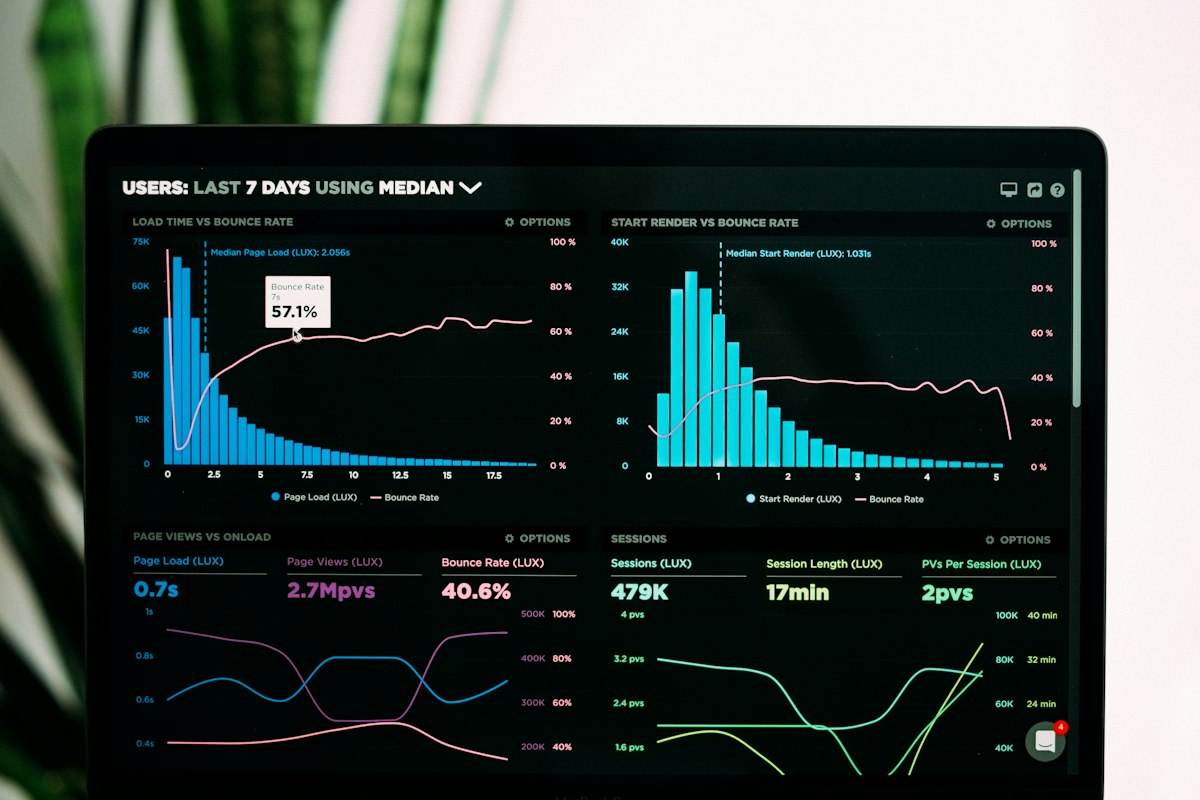
Direct, no scrim
Not permitted. Contrast here is whatever the photograph happens to be at that point, and it changes with every crop.
Scrim, the rule
Measured 8.32:1 at worst. The scrim is composited over both black and white, so that figure holds over any photograph, not just this one.
Held patch
For busy or high-contrast imagery where a full scrim would flatten the photograph. Clear space rules still apply inside the patch.
Never the primary lockup in its dark ink over a photograph. Where the image is too light for the scrim to hold — snow, overexposed sky, white product on white — use the held patch or move the mark off the image entirely.
06 · Explorations
Eight routes, and why seven were wrong
Every route was drawn on the same 120 unit grid and tested at sixteen pixels in a browser tab strip before anything was judged on looks. These are the studies as drawn, not cleaned-up versions of the winner.
Three-node mesh
Chosen
One input fanning to two outputs, which is literally what the product does to a request. Open circles keep it a diagram, it survives at 16px, and it is the only route that said anything specific about the API.
Neural arc
Killed
Reads as a brain, which is the single most contested shape in AI branding. It also sells intelligence, and the whole positioning is that the intelligence is assumed and the integration is the product.
Nested hexagon
Killed
The default developer-infrastructure mark. Technically fine at every size and completely anonymous: it would fit a database, a mesh network or a crypto wallet equally well.
Terminal prompt
Killed
Honest about the audience and it is the direction 1b leans on. As a logo it belongs to the tool rather than the platform, and a chevron plus underscore is already several other developer brands.
Signal wave
Killed
Meant to suggest streaming tokens, which is the product s best feature. Too close to an audio waveform, and Nocturne in this same book had already rejected that shape for the same reason.
Wordmark and stop
Kept as the lockup
The violet full stop does most of the work: it turns a generic noun into a namespace, the way a package name reads. It cannot carry a favicon alone, which is why the mesh exists beside it.
Boxed plus
Killed
Suggests composability, and it tested well small. Killed because a plus in a rounded square is what an app-store tile looks like before anyone has designed it.
Orbit
Runner-up
A hub with three satellites, which matched the integrations story. Strong and it scaled, but it implies Synth is the center of a customer s stack, and the pitch is the opposite: it slots into theirs.
The test that decided it: put each candidate in a tab strip beside the other tools this audience keeps open all day, at 16px. The brain and the wave turned to gray mush, the hexagon and the plus were indistinguishable from what was already there, and the mesh held because three separated nodes stay three separated nodes at any size.
07 · Color
Three brand accents, and a syntax palette of six
Three accents carry the brand, and the code pane extends them to six. Keywords, functions and strings take violet, cyan and emerald, then numerals take an amber that exists nowhere else on the site, and comments and line numbers take two grays. Violet itself ships in three values, because the display cut fails as small type and fails again under white. Every hex below is a token in the site stylesheet.
Background
#09090B
The page. Near-black, and the ground every accent ratio in this section is measured against.
Surface
#111114
Cards, the editor chrome, the FAQ rows. One step up, white on it still reads 18.06:1.
Surface two
#17171C
The deepest raised surface. The tightest ground in the system, which is what the accents were checked against.
White
#FAFAFA
Headlines, card titles, prices, button labels. 19.06:1 on the page.
Dim
#9A9AA2
Every secondary line: body copy in cards, plan descriptions, footer, code comments. 7.12:1 on the page and 6.39:1 on the deepest surface.
Violet, display
#8B5CF6
The mark, the full stop, card borders on hover, the status dot, the orb. At 4.7:1 it passes as type on the page but not on the deepest surface, so it is treated as a display and fill value only.
Violet, type
#A78BFA
The lighter cut at 7.31:1. Every eyebrow, pill label, keyword in a code sample, and any violet text on a card.
Violet, fill
#7C3AED
The darker cut, for any surface carrying white text: the primary button, the popular-plan badge, the favicon tile, selection. White on it reads 5.46:1 where the display value manages only 4.06:1.
Cyan
#22D3EE
Function names in code, and the second stop of the headline gradient. 11.01:1.
Emerald
#34D399
String literals in code, and the check marks in a plan list. 10.35:1, the reason a green reads as confirmation here without a second success color.
Amber
#F59E0B
Numeric literals in code, and nothing else anywhere on the site. At 8.78:1 on the editor surface it sits fourth of the seven colors in a code block, behind the plain code text at 18.06, cyan at 10.43 and emerald at 9.8. Its job is exclusivity rather than brightness: amber marks one token type and only that, so a threshold or a latency figure is findable in a line otherwise full of strings.
Comment
#84848E
Comments in code samples and the playground, at 5.09:1 on the editor surface. Quieter than body copy but comfortably above AA, because a comment in a developer product is usually the line explaining what the sample does.
Border
RGBA(255,255,255,.08)
Every card edge and divider. White at 8 percent, so one value works across all three grounds.
Gutter
#7C7C86
Line numbers in the playground, at 4.56:1 against the surface the editor actually sits on. The dimmest text in the system, but still above AA, because a line number is read in order to reference a line rather than skimmed past.
The rule is that violet is picked by context, not by preference: display value on a dark ground at large sizes, light cut for any small text, dark cut under white. The four code colors never move, because changing one would change what a piece of code means.
08 · Type
Two families, eight roles, used the same way every time
Plus Jakarta Sans carries the argument, IBM Plex Mono carries the evidence. On this site the mono is not decoration: it appears wherever the content is literally code, a version number or a latency figure. Nothing sits below 13.4px.
Eyebrow · 13.4 / 600 / +.14em
Built for engineers
Page title · 44.8–86.4 / 800
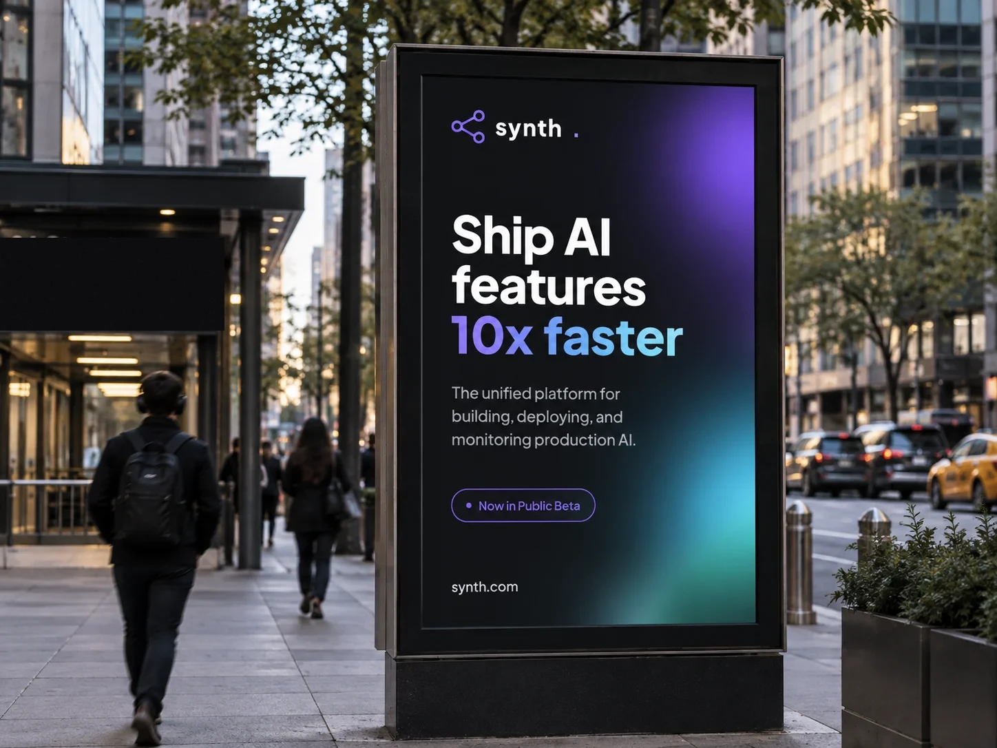
Ship AI features
Section title · 32–44.8 / 800
Everything you need
Stat numeral · 30.4 / 800
99.99%
Plan price · 44.8 / 800
$49
Card title · 17.6 / 700
Streaming by default
Body · 16 / 1.7
Every paragraph, capped at 74 characters per line.
Button · 13.6 / 600
Start building free
Code · 13.4 mono / 1.85
const out = synth.stream("prompt")
09 · In the world
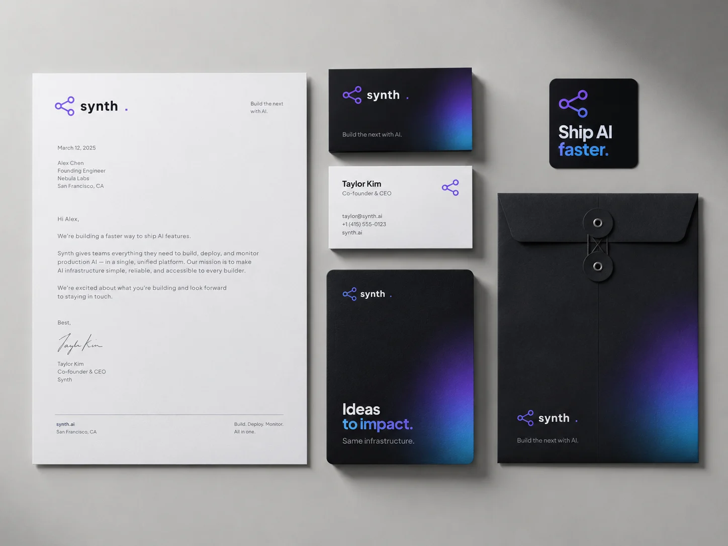
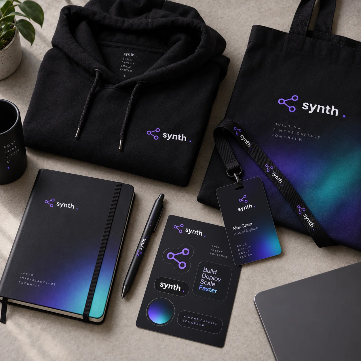
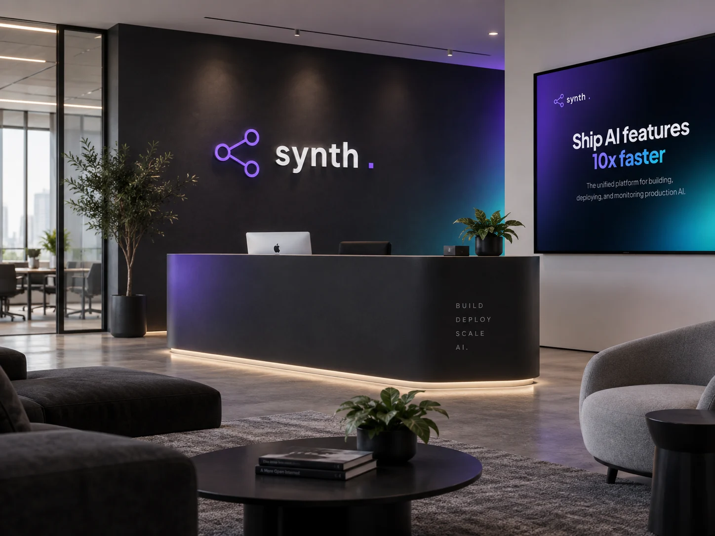
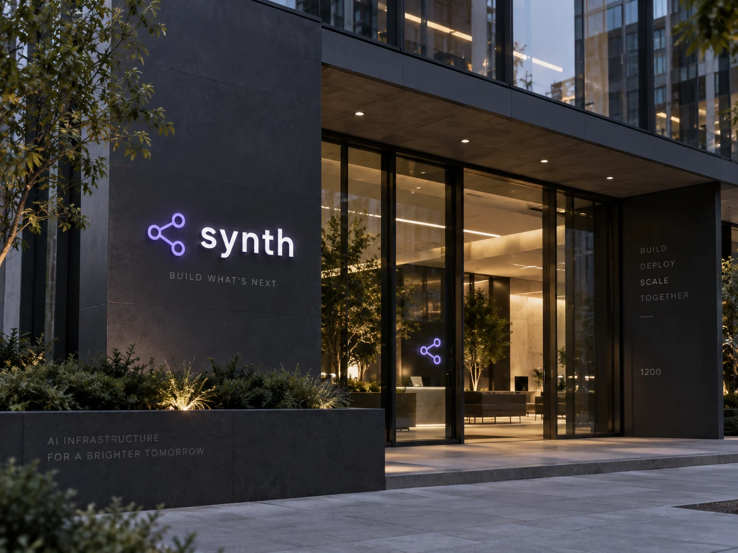
From the letterhead to the conference floor