01 · The website
The finished site, running live
Scroll inside the frame. Move through the three rooms, each with its own rate, then the experiences, the gallery and the booking panel. Everything here is production markup, not a screenshot.
Live embed ↓ scroll inside the frame
02 · Desktop
How the system holds across the page
Four sections at 1440 wide, each anchored to its real position in the page. One serif that speaks, one sans that informs, and terracotta reserved for a price or an action.
Hero
The guest count stated before anything is sold
Rooms
Three named places, alternating ground, a rate on each
Experience
Four things the property does, set as a row, not as cards
Booking
The reservation stays on the property's own domain
03 · Mobile
Every state, including the ones that break
At 390 wide the header carries the wordmark and the menu only. The rate stays visible on every room, because the price is the argument.
Hero
The headline holds its serif at small size. Nothing wraps into a second CTA.
Navigation open
The menu covers the ground rather than pushing it, so the scroll position survives.
Rooms
The alternating ground becomes a stack. The rate never leaves the card.
Booking
One action, full width, terracotta. No competing partner link anywhere on the screen.
04 · Detail and interaction
The parts a screenshot cannot show
Every element below is the real thing, built to the same spec as the site. Hover them.
Primary action
Reserve your stayLifts two pixels and casts a terracotta shadow. The only filled button on the page.
Room rate
The Canopy Suite
Serif for the number, sans for the unit. The rate is never smaller than the name.
Quiet link
Check availabilityA rule under the word rather than a second button. Secondary actions never compete.
Section label
Boutique retreats · Costa Rica
Where the earth meets stillness
Italic terracotta carries the emphasis. It appears once per section at most.
05 · The mark
Two peaks, one behind the other
Two triangle outlines, the second set back and lighter, drawn in terracotta at a single stroke weight. It reads as a ridge line from a distance and as a tent up close. The wordmark is Cormorant Garamond, uppercase, letterspaced so the two words hold as one block.
Horizontal lockup, on bone
Nova
Stacked lockup, on forest
Mark alone, for the favicon and the key card
On photography
A photograph has no fixed luminance, so the lockup cannot be placed on one directly and checked once. The rule is a scrim: 72% of charcoal under the mark, which bounds the ground regardless of what is beneath it.
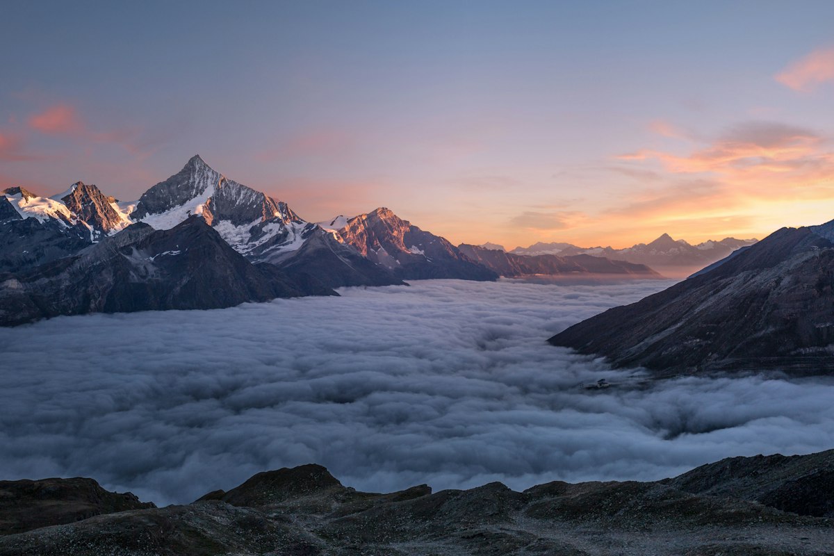
Direct, no scrim
Not permitted. Contrast here is whatever the photograph happens to be at that point, and it changes with every crop.
Scrim, the rule
Measured 6.00:1 at worst. The scrim is composited over both black and white, so that figure holds over any photograph, not just this one.
Held patch
For busy or high-contrast imagery where a full scrim would flatten the photograph. Clear space rules still apply inside the patch.
Never the primary lockup in its dark ink over a photograph. Where the image is too light for the scrim to hold — snow, overexposed sky, white product on white — use the held patch or move the mark off the image entirely.
06 · Color
A palette taken from the property, not from a trend
Bone and paper are the plaster. Sand is the raw linen. Forest and deep are the canopy after dusk. Terracotta is the only color that asks for anything, so it is reserved for a price or an action.
Bone
#f4efe7 · page ground
Paper
#faf6ef · raised cards
Sand
#d8c9b6 · rules and labels
Terracotta
#b06a4a · price and action
Terracotta deep
#985638 · labels on light
Forest
#2b3a2e · alternating ground
Deep
#1d281f · location and footer
Charcoal
#1c1a17 · body text
Warm grey
#6b6157 · secondary text
07 · Type
Two families, one that speaks and one that informs
Cormorant Garamond carries the names and the numbers. Karla carries labels, navigation and anything a guest has to read twice. Body copy never goes below fifteen pixels.
Display · 90 / 500
Where the earth meets stillness
Room name · 45 / 500
The Garden Villa
Rate · 21 / 500
$680 / night
Label · 12 / 500 · .24em
Boutique retreats · Costa Rica
Body · 15 / 300
Fourteen guests at a time across three properties. Every rate is stated on the page, and every reservation is taken on this domain.
08 · In the world
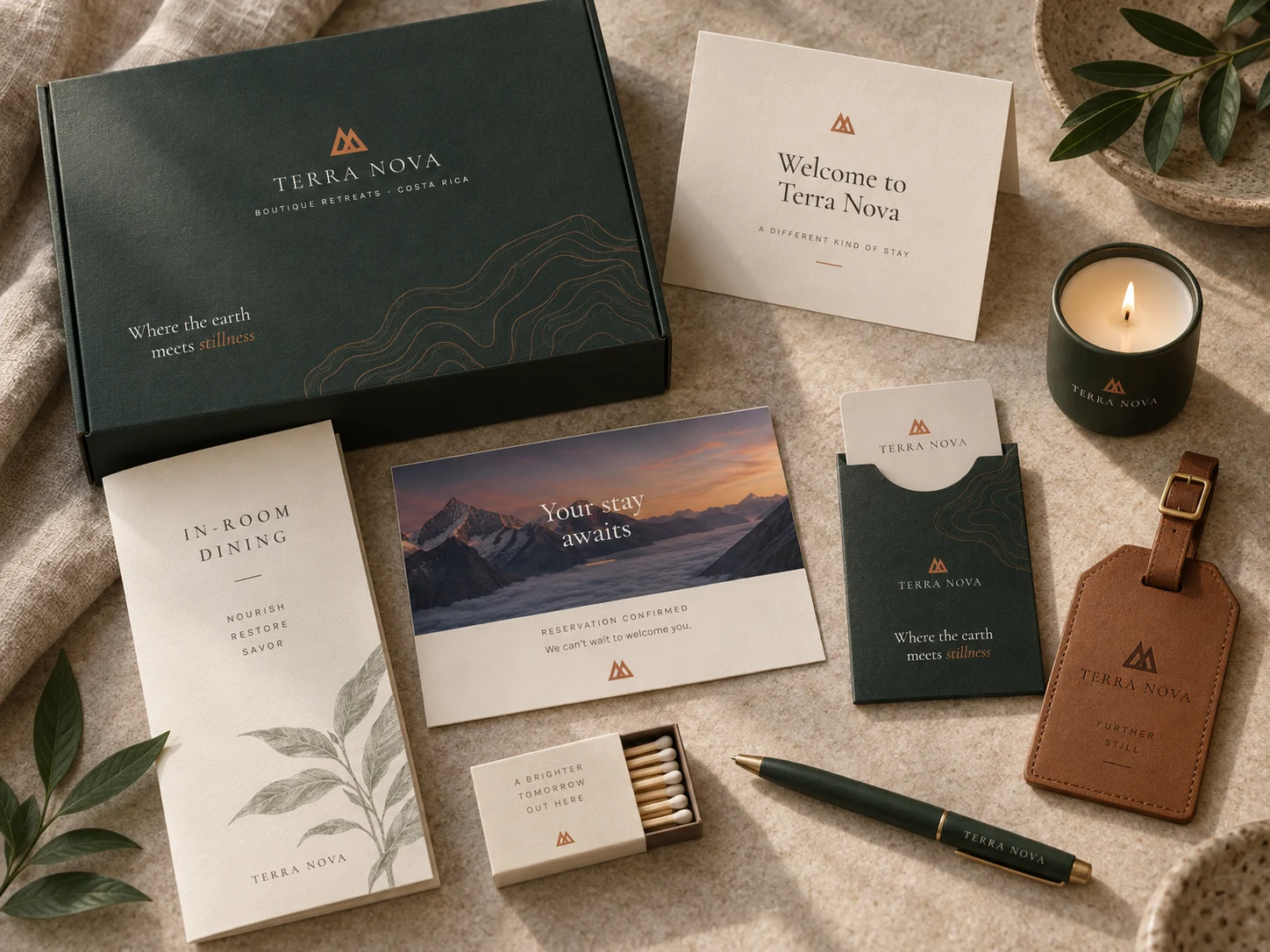
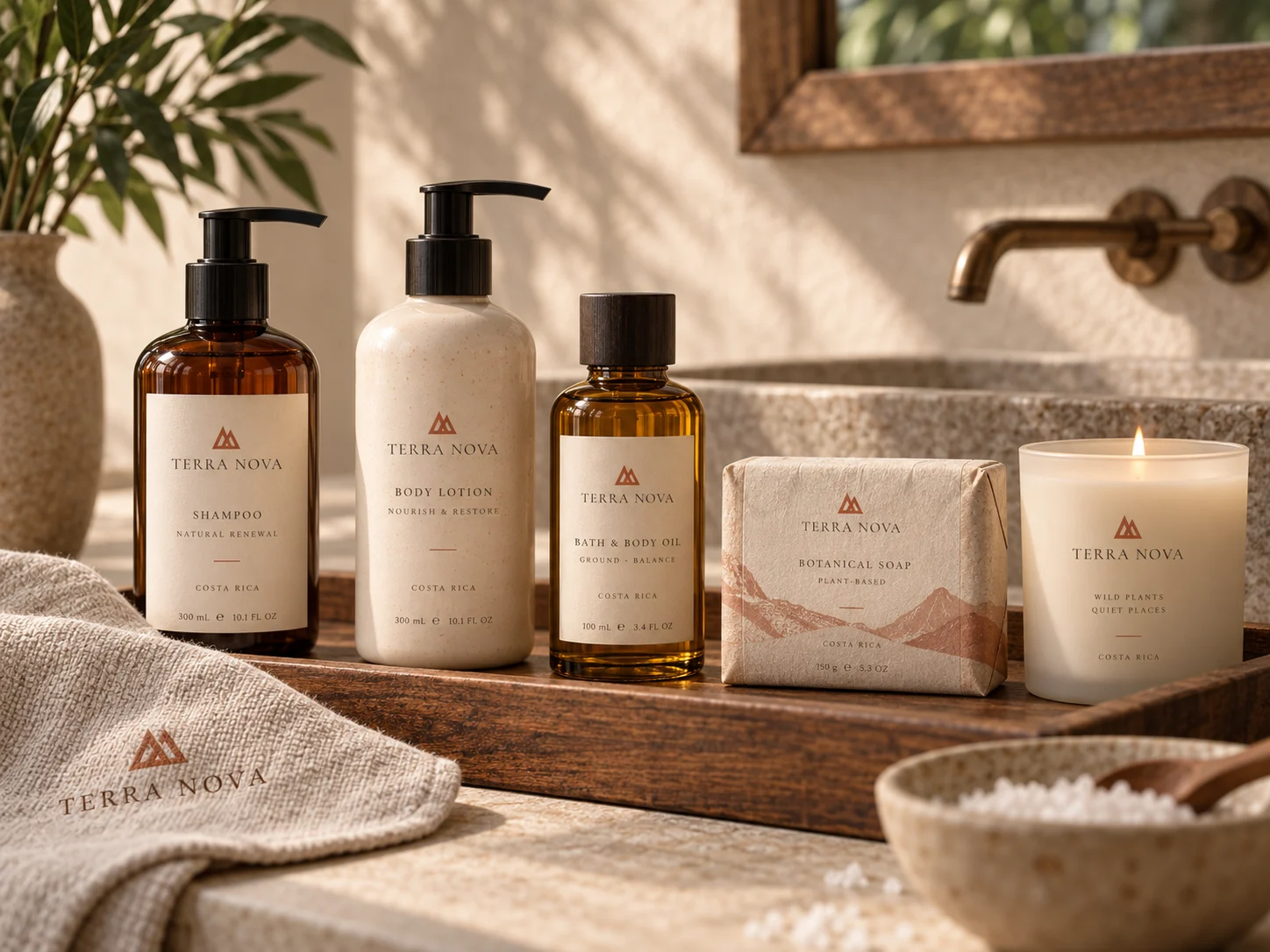
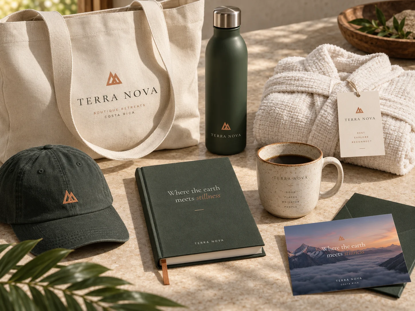
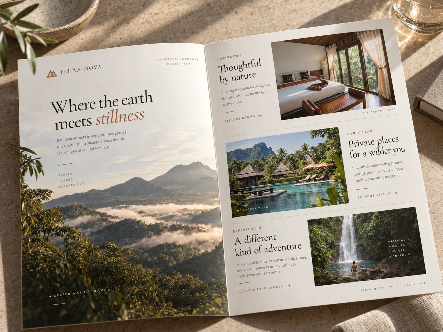
From the welcome kit to the arrival