01 · The website
The finished site, running live
Scroll inside the frame. The header is a terminal tab strip, the config file is real syntax-highlighted TypeScript, and the benchmark bars fill as they enter view. Everything here is production markup, not a screenshot.
Live embed ↓ scroll inside the frame
02 · Desktop
How the system holds across the page
Four sections at 1440 wide, each anchored to its real position in the page rather than a guessed scroll depth. Near-black throughout, and green used only where something is live, passing or installable.
Hero
Headline to 64px, then the install command as the only action
Benchmarks
Four measured figures with their units, bars filling on entry
Features
Six cards, each labeled with the function it exposes
Close
The same install command, no form and no button
03 · Mobile
Every state, including the one nobody screenshots
At 390 wide the terminal tab strip collapses behind the burger, and the tabs drop as a full-width column at 48px each. Code is the hard problem on a phone: the config window scrolls sideways rather than reflowing, because a wrapped line of TypeScript is worse than a scrolled one.
Hero
The headline drops from 64px and the install command goes full width, with the copy button staying at 44px so it is still a target rather than a label.
Navigation, mid-scroll
The tab strip drops over the feature grid as a column, each tab 48px tall with a top border instead of the desktop left border.
Benchmarks
The four figures stack to one column and keep their units, because a number without a unit is the thing this audience distrusts most.
Close
The closing command is identical to the hero command, deliberately, so a visitor who scrolled the whole page never has to scroll back up to act.
04 · Detail and interaction
The parts a screenshot cannot show
Every element below is the real thing, built to the same spec as the site. Hover them.
The install command
.3s · the only call to action
npx create-conduit@latest my-api
This is the entire call to action, in the hero and again at the close. There is no filled button and no form anywhere on the site, because the audience is the person who will run the command and a signup step would be a step backwards. The only buttons on the page are the copy control and the menu toggle, both of which help you act on the command rather than replacing it. The copy control is a real button at 44px, not a styled label, and the command itself is marked up as code.
Benchmark card
.3s · lift and green border
Every figure carries its unit and a sentence of provenance underneath, which is the whole argument of the section: a number this audience cannot check is worth nothing. Cards lift four pixels and take a green border at 25 percent on hover.
The config window
Five accents as syntax
The pitch is that the gateway is configured in code rather than YAML, so the config file is the hero image. Five colors do the highlighting: blue keywords, purple functions, green strings, amber numerals and a gray for comments. Green doubles as the string color and the status color, which is deliberate: both mean the thing is working.
Scroll reveal, staggered
.8s · 24px rise
Looping here so the timing is visible. On the site each element rises 24 pixels and fades in over .8 seconds, with three delay classes at .08s, .16s and .24s, which is the tightest stagger in the book because a four-card benchmark row should resolve as one row rather than four arrivals.
The page in motion
Looping · desktop and mobile together
Both frames scroll on a loop and reverse, so the terminal cursor blink, the benchmark count-ups and the section reveals all play without you touching anything. Record either one straight off the page.
Motion specification
.3s
Cards, pills and the copy button. Anything under the cursor.
.8s
Content arriving on scroll, with three offsets to .24s.
1.5s
The cursor and the status dot, on step-start so they snap.
4s
The green glow behind the hero, the only ambient motion.
One easing curve for anything that arrives, cubic-bezier(.22,.61,.36,1), and step-start for both blinks so they read as hardware indicators rather than fades. There is no ease on the cursor for the same reason a real terminal cursor does not fade. Under reduced motion every duration collapses to zero, the blinks stop and all content renders in its final state.
Part two
The identity system underneath it
Everything above draws on one small set of rules: a wordmark built from a shell prompt, a single green that means working, and two families where the mono does most of the talking.
05 · The mark
Three lockups, and when each one is correct
A chevron and an underscore: the shell prompt, drawn as two strokes on the same 20 by 18 grid. It is the one symbol this audience reads without being taught, and it is lowercase throughout because that is how the package is typed.
Primary lockup
Site header, docs, npm readme, CLI banner. Mark and wordmark both in green, which is the only lockup in the book where the name takes the accent rather than the ink.
The prompt
Used alone wherever the wordmark would fall under 14px. Two strokes at 2.5px with round caps, which is the heaviest weight in any mark here and the reason it holds at 16px.
The tile
Shipped as the favicon. Keeps the near-black ground rather than inverting, because a green tile in a tab strip would read as a notification badge.
Clear space and minimum size
Clear space equals the height of the chevron on all four sides. In a terminal context the mark is usually preceded by a real prompt, so it needs enough room not to read as part of the command line.
Minimums: the prompt 16px on screen and 8mm in print. Primary lockup 104px wide on screen, 26mm in print.
Inverted and single ink
On photography
A photograph has no fixed luminance, so the lockup cannot be placed on one directly and checked once. The rule is a scrim: 72% of navy under the mark, which bounds the ground regardless of what is beneath it.

Direct, no scrim
Not permitted. Contrast here is whatever the photograph happens to be at that point, and it changes with every crop.
Scrim, the rule
Measured 6.87:1 at worst. The scrim is composited over both black and white, so that figure holds over any photograph, not just this one.
Held patch
For busy or high-contrast imagery where a full scrim would flatten the photograph. Clear space rules still apply inside the patch.
Never the primary lockup in its dark ink over a photograph. Where the image is too light for the scrim to hold — snow, overexposed sky, white product on white — use the held patch or move the mark off the image entirely.
06 · Explorations
Eight routes, and why seven were wrong
Every route was drawn on the same 120 unit grid, then tested at sixteen pixels in a tab strip and as monochrome ASCII in a terminal banner. These are the studies as drawn, not cleaned-up versions of the winner.
Shell prompt
Chosen
A chevron and an underscore. The one symbol this audience reads instantly, it survives at 16px on two heavy strokes, and it sets up the terminal tab strip the whole header is built on.
Globe
Killed
The default for anything with edge in the pitch. It says distributed and nothing else, and at small sizes the meridians close up into a striped disc.
Stacked layers
Killed
Reads as a database or a stack rather than a gateway, and it is the single most common shape in developer infrastructure. Nothing about it is Conduit.
Pipe and junction
Killed
Literal about the name, which is the trap. A pipe with a cross-connection is a plumbing diagram, and it promises routing without saying anything about speed or configuration.
Wordmark alone
Kept as fallback
The mono wordmark holds at any size and is what the footer uses. On its own it looks like any npm package, which is exactly the problem the prompt solves.
Latency trace
Killed
Draws the benchmark rather than the product, and a spiking line is a strange thing to promise when the claim is 8ms and flat. It also reads as a heart monitor.
Checked hexagon
Runner-up
A gateway that validates, which is accurate. Strong at every size, but it belongs to the security category and Conduit competes on configuration speed, not on being a guard.
Terminal window
Killed
The same idea as the winner, drawn as furniture. A window frame wastes most of its area on a border, so the prompt inside it is too small to read exactly where it matters.
The test that decided it: render each candidate as a CLI banner in plain monospace. The prompt is the only one that survives, because it is already a character set: a chevron and an underscore exist in every font on every machine, so the mark works in a terminal without being an image.
07 · Color
One green that means working, and a terminal palette behind it
Green is the only color with a job in the interface: it marks what is live, what passed, and what you can install. The other four exist because a config file has to be syntax highlighted and a window chrome has to have three dots. Every hex below is a token in the site stylesheet, and every ratio is measured against the ground it sits on.
Background
#0B0C0E
The page. Near-black with a faint blue cast, which is what a terminal actually looks like rather than pure black.
Surface
#131418
Cards, the config window, the command box. White on it reads 14.89:1.
Surface two
#1B1D22
The window title bar and the active tab ground. The tightest surface, which is what the accents were checked against.
White
#E6E7EA
Headlines, card titles, the command itself. 15.83:1 on the page.
Dim
#8B8F96
Every secondary line: tab labels, benchmark descriptions, the footer. 6.03:1 on the page and 5.19:1 on the deepest surface.
Green
#2EE06A
The mark, the wordmark, live status, benchmark figures, string literals, the active tab underline. 11.17:1 on the page, and near-black on it reads the same figure inverted, so it needs no second value.
Blue
#4D9FFF
Keywords in the config file, and nothing else. 7.19:1.
Purple
#C084FC
Function names in the config file, and nothing else. 6.97:1 on the surface the editor sits on.
Amber
#F5A623
Numeric literals in the config, and the middle window dot. 9.08:1.
Red
#EF4444
The left window dot only. It is the one color in the system that never touches type, because a red string in this context would read as an error.
Comment
#868A92
Comments in the config file, at 5.32:1 on the surface. Quieter than body copy but comfortably above AA, because the comment is the line explaining the deploy step.
Gutter
#80848C
Line numbers, at 4.91:1. The dimmest text in the system, still above AA, because a line number is referenced rather than read.
The deliberate overlap is that green is both the string color and the status color. In a terminal those two things mean the same thing, so the system lets them share rather than inventing a second green, and that is also why green is the only accent allowed outside the code pane.
08 · Type
Two families, eight roles, and the mono does most of the talking
This is the only brand in the book where the monospace outnumbers the sans. JetBrains Mono carries the wordmark, the tabs, every number, the command and the config. Inter is reserved for headlines and prose, so the moment type stops being mono is the moment the page is making an argument rather than stating a fact.
Eyebrow · 13.4 mono +.12em
Performance
Page title · 38.4–64 Inter 800
Ship APIs faster
Section title · 28.8–38.4 Inter 800
Blazing fast, for real
Benchmark figure · 32 mono 800
8ms
Card title · 16 Inter 700
Configured in code
Body · 16 Inter / 1.7
Every paragraph, capped at 74 characters per line.
Command · 13.6 mono
$ npx create-conduit@latest
Code · 13.4 mono / 2.0
import { Gateway } from 'conduit'
09 · In the world
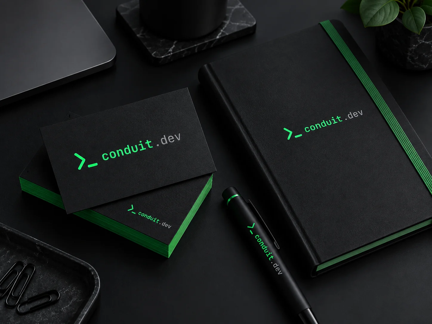
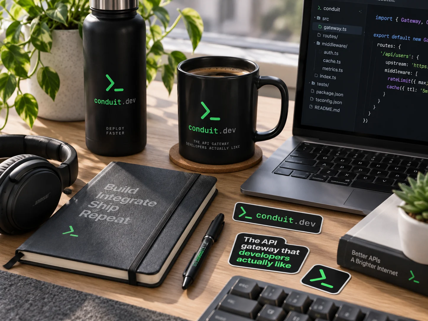
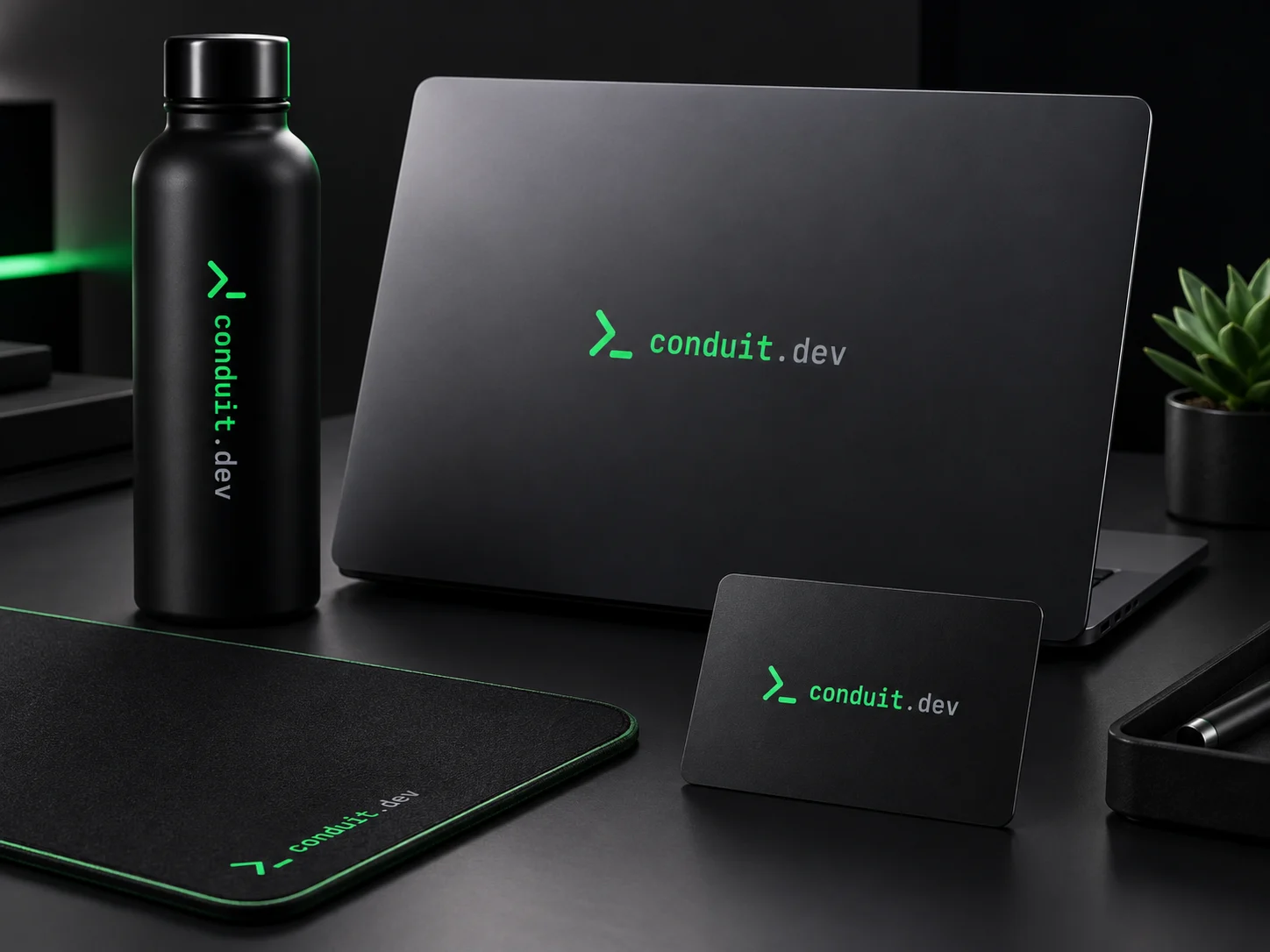
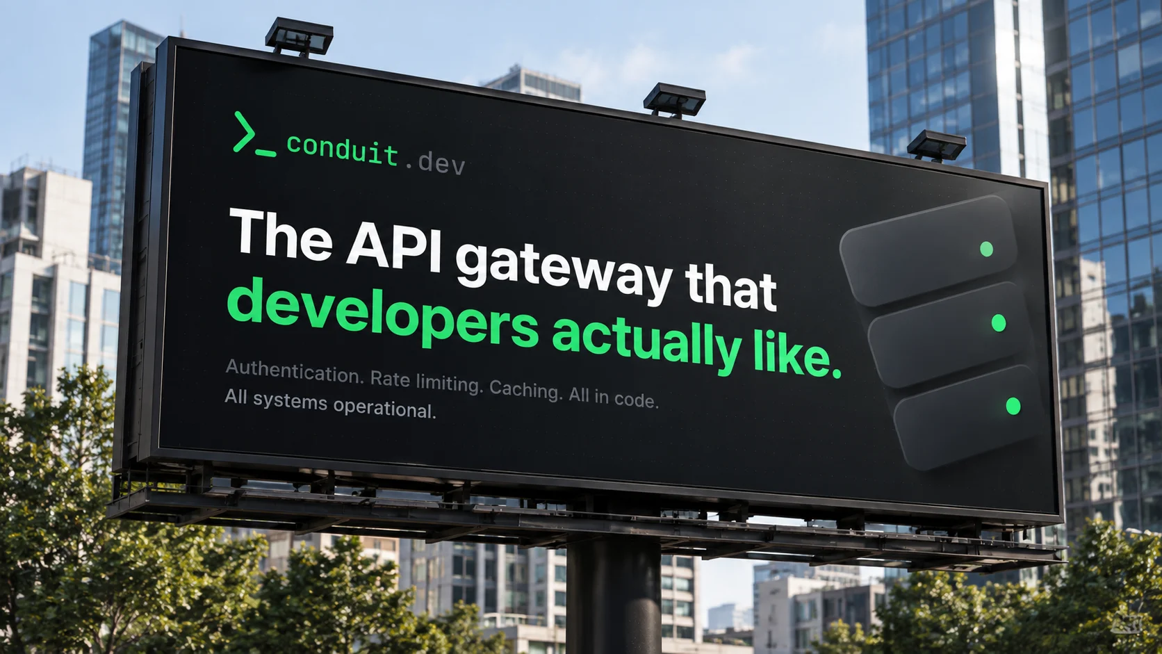
From the business card to the conference floor