01 · The website
The finished site, running live
Scroll inside the frame. The wordmark cycles its gradient, the now-playing bar stays pinned to the bottom, and the catalog art responds to hover. Everything here is production markup, not a screenshot.
Live embed ↓ scroll inside the frame
02 · Desktop
How the system holds across the page
Four sections at 1440 wide, each anchored to its real position in the page rather than a guessed scroll depth. Near-black throughout, with the three accents distributed by section so no screen carries all of them at once.
Hero
The wordmark sized to the measured width of the word, gradient-clipped and cycling
Catalog
Album art at 1:1, artist and year, nothing else
Roster
Circular portraits, each artist named with their city
Events
Date first, then venue, then the ticket link
03 · Mobile
Every state, including the one nobody screenshots
At 390 wide the header carries the wordmark and menu only, then the primary action appears once the visitor scrolls, so nothing wraps at 360. The now-playing bar stays pinned through all of it, which is the one element that had to be designed for the smaller viewport first.
Hero
The wordmark drops from 192px to the viewport width and keeps its gradient. The now-playing bar sits above the home indicator rather than under it.
Navigation, mid-scroll
The panel drops over the roster beneath it. Four items at 44px minimum touch height, in mono at 13.4px, and the labels now match their destinations.
Catalog
Album art goes to two columns rather than one, because cover art at full phone width dwarfs the track listing underneath it.
Events
Event cards stack with the date block staying left, so a run of dates still scans vertically as a calendar.
04 · Detail and interaction
The parts a screenshot cannot show
Every element below is the real thing, built to the same spec as the site. Hover them.
The gradient wordmark
8s cycle · 200% background
All three accents run through the wordmark as a 120 degree gradient clipped to the text, sized to 200 percent so there is somewhere to travel, then cycled over eight seconds. It is the same treatment at 192px in the hero and at 20.8px in the header, which is why the accents were chosen to be legible individually rather than only as a blend.
Actions and focus
.35s · magenta on hover
There is exactly one button style on the whole site: an outline that takes a magenta border and a soft magenta bloom on hover. No filled button exists, because a solid accent block would fight the album art that the page is built to sell. The status dot pulses its own ring outward over two seconds rather than blinking.
Catalog art and track rows
.5s scale · .3s row indent
- 01 · Slow Dissolve 6:12
- 02 · Blue Hour 4:48
- 03 · Phosphene 7:01
Album art scales to 1.06 and gains saturation over half a second, so the artwork brightens rather than moves. Track rows indent six pixels and lift from dim to white over .3s, which is enough to feel clickable without a button treatment on every line.
The now-playing bar
3s glow · pinned
A persistent bar pinned to the bottom of the viewport at 94 percent opacity with a blur behind it. The artwork carries a blurred purple to magenta bloom that breathes between 30 and 50 percent opacity over three seconds, which is the only place in the system where two accents sit directly on top of each other.
The page in motion
Looping · desktop and mobile together
Both frames scroll on a loop and reverse, so the gradient cycle, the pulsing status dot, the breathing now-playing bloom and the section reveals all play without you touching anything. Record either one straight off the page.
Motion specification
.35s
The button, and the only place the system uses a blanket transition.
.8s
Content arriving on scroll, with three offsets at .08s, .16s and .24s.
8s
The wordmark gradient cycling, the slowest deliberate loop.
26s
The hero drift, behind an image already dimmed to 34 percent.
One easing curve for anything that arrives, cubic-bezier(.22,.61,.36,1), and four ambient loops that never stop: the gradient cycle at 8s, the status pulse at 2s, the now-playing bloom at 3s and the scroll cue at 2.2s. They are deliberately on different periods so the page never appears to beat in time, which would read as a loading state. Under reduced motion every one of them stops, the gradient parks at its starting position and all content renders in its final state.
Part two
The identity system underneath it
Everything above draws on one small set of rules: a wordmark that is nothing but type and a gradient, three accents that each have to survive alone, and two families across eight roles.
05 · The mark
Three lockups, and when each one is correct
There is no drawn symbol at display size. The mark is the name set in Syne at 800, uppercase, with a three-stop gradient clipped to the letterforms, and a single letterform is cut from a square only where type would be illegible. A label's identity is its roster, so the brand deliberately owns a treatment rather than a shape, and that treatment can be applied to a sleeve, a poster or a track title without redrawing anything.
Primary wordmark
Site header, sleeve backs, poster footers, socials. Tracked to .16em at small sizes so the gradient has room to read across the letters.
Display wordmark
The hero, and nothing else. Tracking goes negative at display size because Syne's 800 weight closes up on its own once the letters are large. Its size is not a round vw value but clamp(2.15rem, calc((100vw - 110px) / 9.9), 12rem), derived from the measured ink width of this exact eight-letter word: it renders 9.75 times its font size, so the calc fills the line at every viewport without overflowing it. The floor takes over below about 400px, where the word would otherwise get too small to lead the page.
The N
Shipped as the favicon, as a small SVG sitting next to the page. Gradients do not survive at 16px, so the small mark takes one flat accent and magenta is the default. The app tile and the stamped record center label are specified here but not yet produced.
Clear space and minimum size
Clear space equals the cap height of the wordmark on all four sides. The gradient makes crowding worse than it would be for flat type, because a neighbouring color reads as part of the blend.
Minimums: the N 16px on screen and 8mm in print. Primary wordmark 140px wide on screen and 35mm in print, below which the gradient stops being readable as three colors and the flat variant should be used.
Flat and single ink
On photography
A photograph has no fixed luminance, so the lockup cannot be placed on one directly and checked once. The rule is a scrim: 72% of black under the mark, which bounds the ground regardless of what is beneath it.

Direct, no scrim
Not permitted. Contrast here is whatever the photograph happens to be at that point, and it changes with every crop.
Scrim, the rule
Measured 6.93:1 at worst. The scrim is composited over both black and white, so that figure holds over any photograph, not just this one.
Held patch
For busy or high-contrast imagery where a full scrim would flatten the photograph. Clear space rules still apply inside the patch.
Never the primary lockup in its dark ink over a photograph. Where the image is too light for the scrim to hold — snow, overexposed sky, white product on white — use the held patch or move the mark off the image entirely.
06 · Explorations
Eight routes, and why seven were wrong
Every route was drawn at the same optical size, then tested at sixteen pixels and stamped on a 12 inch center label before anything was judged on looks. These are the studies as drawn, not cleaned-up versions of the winner.
Gradient wordmark
Chosen
Type and a treatment, no symbol. It carries all three accents at once, applies to a sleeve or a poster without redrawing, and gives the label a signature that a roster of unrelated artists can share.
Record and spindle
Killed
Immediately legible as music and immediately generic. Every label and every podcast has drawn this circle, and it says nothing about electronic or ambient in particular.
Waveform
Killed
The runner-up for a while, and the direction 1c was built on. As a mark it reads as an audio editor rather than a label, and it collapses into a flat line below 20px.
Half moon
Killed
On brief for the name and genuinely attractive. Killed because a crescent is the most contested shape in nocturnal branding, sitting on bars, sleep apps and a dozen other labels.
Boxed N
Kept for small sizes
Cannot lead, because a letter in a box is what a software company does. It ships as the favicon, where a gradient would turn to mud. The record center label is the same drawing at 8mm, specified but not yet produced.
Prism
Killed
Meant to suggest light splitting into the three accents, which is the idea behind the gradient. As a drawn shape it is inert, and the gradient expresses it better without an icon at all.
Room and speakers
Killed
An attempt at the room rather than the record. Too much interior detail to survive small sizes, and it needed a caption to be understood at all.
Struck N
Killed
Clean and it held at every size, but a struck initial is the Raze solution in this same book. Reusing it would have made two unrelated brands look like the same studio signing its work.
The test that decided it: put each candidate next to three sleeves by three unrelated artists and ask whether it belonged to all of them. Every pictorial route picked a genre. The gradient wordmark did not, because a treatment can sit on anything the label signs, and that is the actual job.
07 · Color
Three accents that each have to survive alone
The wordmark blends purple, magenta and cyan, so it would be easy to treat them as one gradient and stop thinking. They are instead specified individually, because each one appears on its own elsewhere on the site and has to clear AA on near-black by itself. Every hex below is a token in the site stylesheet.
Void
#070709
The page. Near-black with a blue cast rather than true black, so the three accents read as light rather than as ink.
Panel
#101017
Feature panels and cards, one step off the page. White on it still measures 16.3:1.
Panel two
#16161F
The deepest raised surface, for a card sitting on a panel. The tightest ground in the system, which is what the accents were checked against.
White
#EFEDF2
Headlines, album titles, track names on hover. At 17.32:1 on void it carries everything that must be read quickly.
Dim
#928E9C
Every secondary line: artist names, durations, venues, the footer. At 6.3:1 on void and 5.62:1 on the deepest panel, so it holds everywhere.
Purple
#8A6BC4
Fills and borders only. At 4.26:1 on the deepest panel it is the weakest of the three, so it is never used as type and never carries a label on its own.
Magenta
#E05AA0
Section labels, event months, pull-quote emphasis, the hover border on the button, and the flat small mark. 5.88:1 on void.
Cyan
#4BD0D0
Live and status signals only: the streaming indicator, the hero eyebrow, ticket links, the scroll cue, and the hover state on nav links and track rows. At 10.77:1 it is the brightest accent, which is why it is reserved for what is happening now or responding to the cursor. Prices are white and pull-quote emphasis is magenta, so neither borrows the live color.
Line
RGBA(255,255,255,.08)
Every divider and card border. A white at 8 percent rather than a gray, so it works over void, panel and panel two without a second value.
The rule that keeps three accents from becoming noise is assignment by meaning, not by mood. Cyan means now or under the cursor, magenta means a label, a category or an emphasis, purple is structural and never speaks. A designer picking between them is answering what the element is, not which color looks better in that spot.
08 · Type
Two families, eight roles, used the same way every time
Syne carries the name and the headlines, IBM Plex Mono carries everything factual: track numbers, durations, dates, prices. Nothing on the site is sized by feel, and nothing sits below 13.4px. The specimen below is set in the brand's own faces at its own sizes.
Eyebrow · 13.4 mono +.3em
Independent music since 2018
Wordmark · fluid to 192 Syne 800
NOCTURNE
Section heading · 25.6–35.2 Syne 800
Upcoming Events
Featured title · 32–44.8 Syne 800
Phosphene
Album title · 15.7 Syne 700
Phosphene
Body · 16 mono / 1.7
Every paragraph, capped at 74 characters per line.
Pull quote · 22–34 Syne 600
Every release is a conversation
Track row · 13.4 mono
01 · Slow Dissolve 6:12
Button · 13.4 mono +.14em
Listen to Latest
Event date · 32 Syne 800
14
09 · In the world
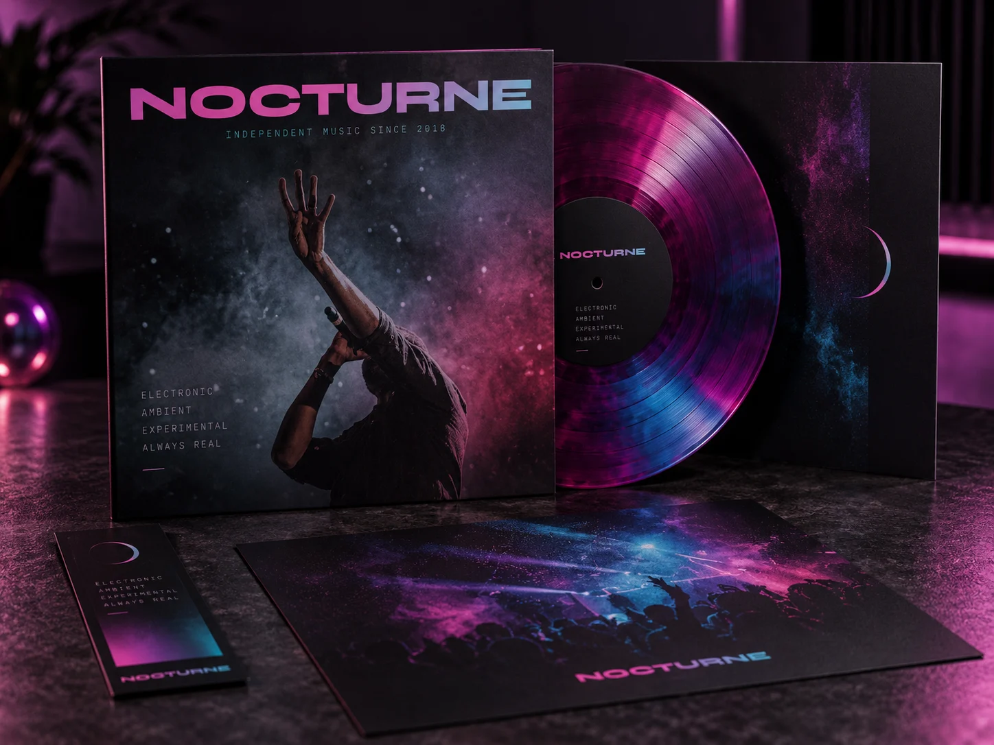
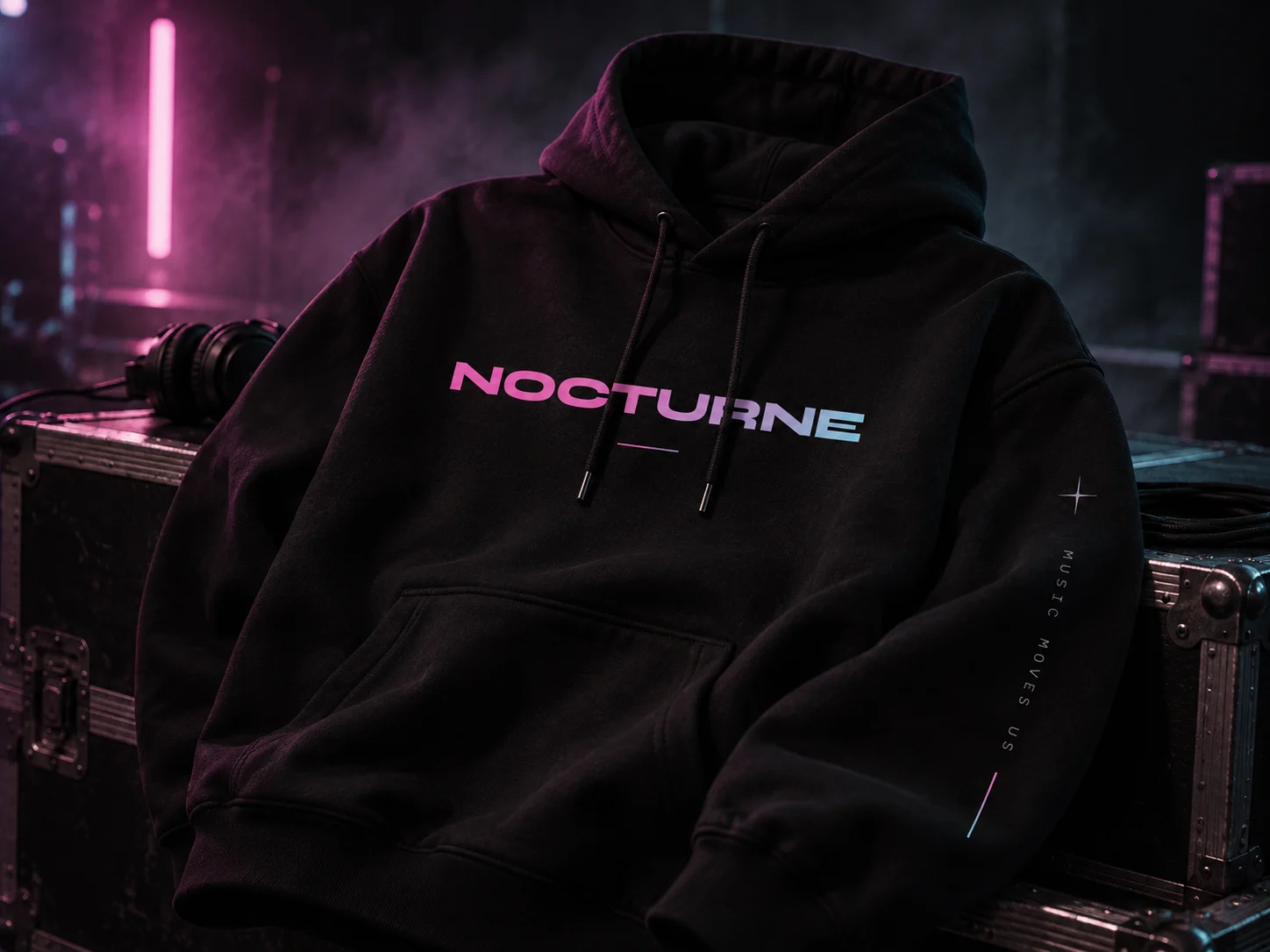
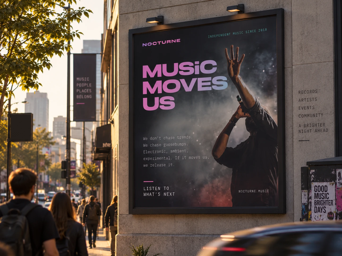
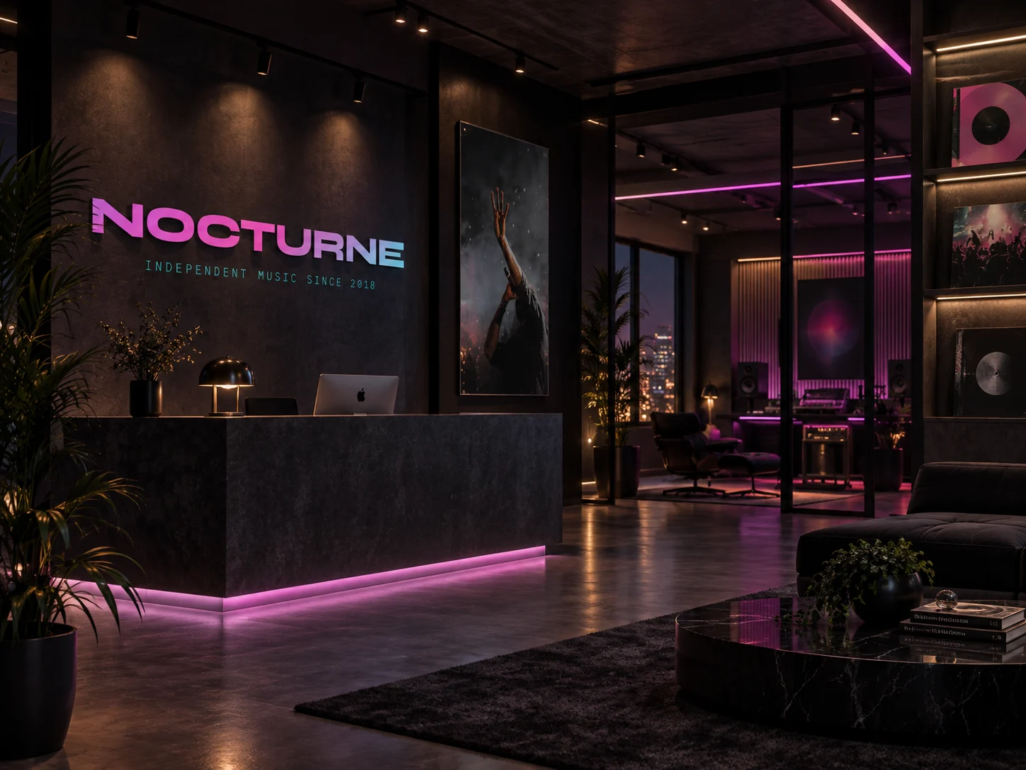
From the record sleeve to the stage