01 · The website
The finished site, running live
Scroll inside the frame. Hover the project index to swap the preview image, move through the practice list, reach the offices. Everything here is production markup, not a screenshot.
Live embed ↓ scroll inside the frame
02 · Desktop
How the system holds across the page
Four sections at 1440 wide, each anchored to its real position in the page rather than a guessed scroll depth. One serif, one sans, and terracotta appearing only where something is numbered or actionable.
Hero
Wordmark over a scrim, the photograph drifting behind it
Selected work
A numbered index, hover swaps the sticky preview
The practice
Services set as a list, not as cards with icons
Contact
Three offices, one address each, nothing more
03 · Mobile
Every state, including the one nobody screenshots
At 390 wide the header carries the wordmark and menu only, then the primary action appears once the visitor scrolls, so nothing wraps at 360. Each screen is anchored to a real section. The navigation panel is captured opening over scrolled content, not over an empty hero.
Hero
Wordmark and burger only. The serif headline stays large and the scrim carries it, so contrast holds on any frame of the photograph.
Navigation, mid-scroll
The panel drops over the practice list beneath it. Four items, each at 44px minimum touch height, with the action last.
Selected work
The sticky preview cannot work on a phone, so the index becomes inline thumbnails with the project number kept as the anchor.
Contact
Offices stack in reading order with the email as a target rather than a line of text.
04 · Detail and interaction
The parts a screenshot cannot show
Every element below is the real thing, built to the same spec as the site. Hover them.
Project index row
.35s row · .7s image crossfade
The row indents 1.2rem and shifts to terracotta over .35s, while the sticky image beside it crossfades at .7s and settles its scale over 1.4s. The image is the slowest thing on the page, so browsing the index feels like turning a page rather than operating a control.
Actions and focus
.3s · the fastest transition here
The email link changes color over .3s and keeps its terracotta rule underneath, which is exactly what the site does. Terracotta is reserved for interaction and numbering so it never competes with the photography, and every control carries a 2px terracotta focus ring at 3px offset.
Navigation, two states
Switches past the fold
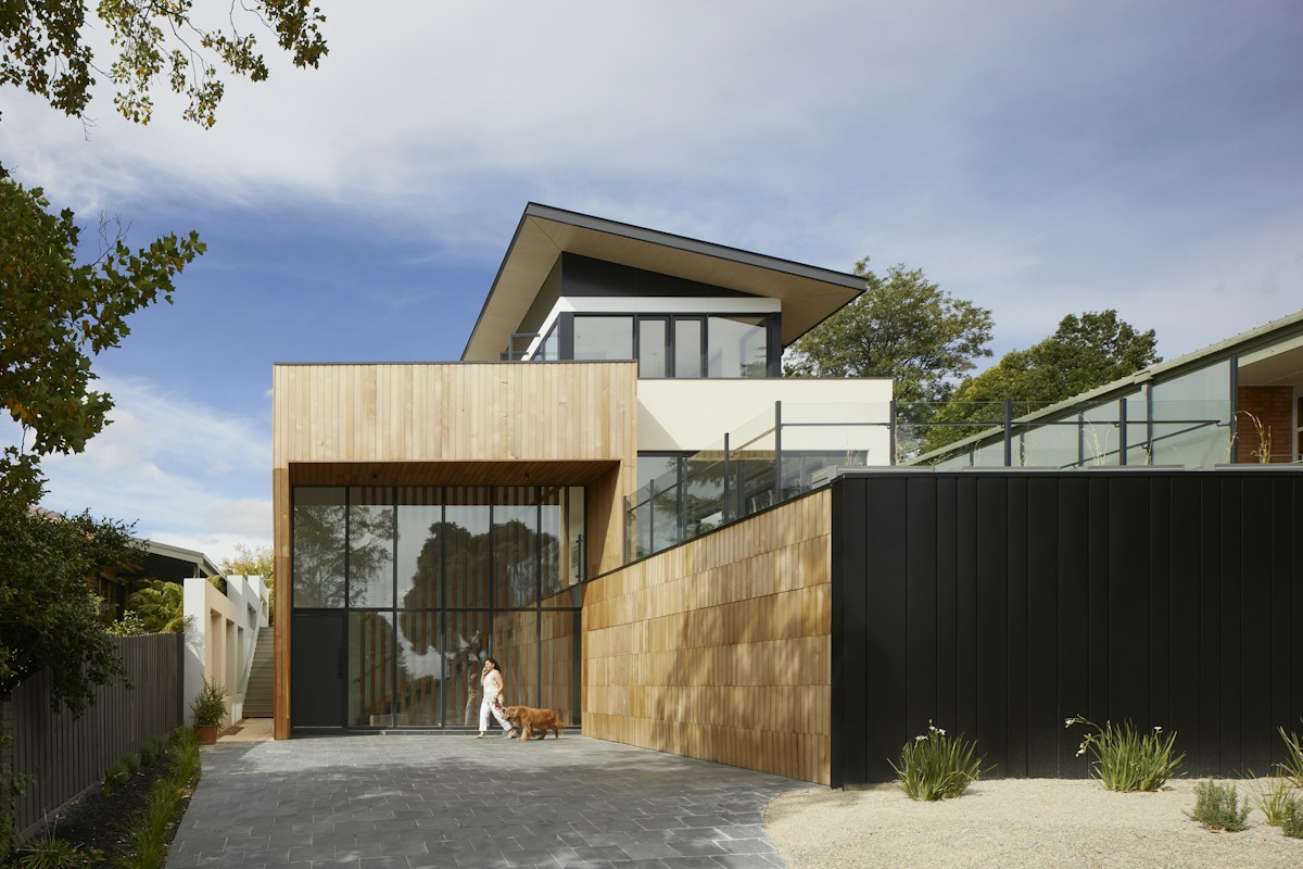
White with a text shadow over the photograph, then paper with a hairline once the hero clears. The shadow is what keeps the wordmark legible on a bright interior rather than hoping the image stays dark.
Scroll reveal, staggered
.9s · 28px rise
Looping here so the duration is visible. On the site each element rises 28 pixels and fades in over .9 seconds on one shared curve. There is no stagger: an IntersectionObserver at a 0.12 threshold adds the class once and stops observing, so a section arrives as a whole and never replays.
The page in motion
Looping · desktop and mobile together
Both frames scroll on a loop and reverse, so the nav state change, the parallax on the hero, and the stagger between sections all play without you touching anything. Record either one straight off the page.
Motion specification
.3s
Links and the burger. The fastest transition in the system.
.35s
Index rows and the nav underline, the only UI that responds quickly.
.9s
Content arriving on scroll, and the hero entrance at 1.1s.
22s
The hero drift, scaling 1.02 to 1.12. Barely perceptible, which is the intent.
One easing curve across the whole site, cubic-bezier(.22,.61,.36,1), on everything that is not a plain linear fade. Imagery is deliberately the slowest layer: the project preview settles its scale over 1.4s and the service images scale over 1.2s, against .3s for anything under the cursor. The practice sells patience, and fast imagery is the quickest way to contradict that. Under reduced motion every duration collapses to zero and all content renders in its final state.
Part two
The identity system underneath it
Everything above draws on one small set of rules: a wordmark with three lockups, a palette taken from building materials, and two type families across eight roles.
05 · The mark
Three lockups, and when each one is correct
The name carries a macron, and that bar is the mark. It reads as a lintel, a shadow line, a level. Set in Cormorant Garamond at a light weight so it behaves like a signature on a drawing rather than a logo stamped on a building.
Primary wordmark
Site header, drawing title blocks, proposal covers, correspondence. The default everywhere the name has room to sit on one line.
Monogram
Anywhere the wordmark would fall under 14px: favicon, avatar, stamp on a photograph, embossed on a site hoarding. The macron is what makes a single letter legible as this practice.
Ōkubo
Architecture
Stacked lockup
First contact with an audience that does not know the practice: tender documents, awards submissions, signage. The descriptor is set in the sans so it reads as information, not as part of the name.
Clear space and minimum size
Clear space equals the cap height of the wordmark on all four sides. Nothing enters it, and the wordmark never sits closer than that to a photograph edge.
Minimums: monogram 16px on screen and 8mm in print. Primary wordmark 110px wide on screen, 28mm in print, below which the macron starts to fill in.
Inverted and single ink
On photography
A photograph has no fixed luminance, so the lockup cannot be placed on one directly and checked once. The rule is a scrim: 72% of ink under the mark, which bounds the ground regardless of what is beneath it.
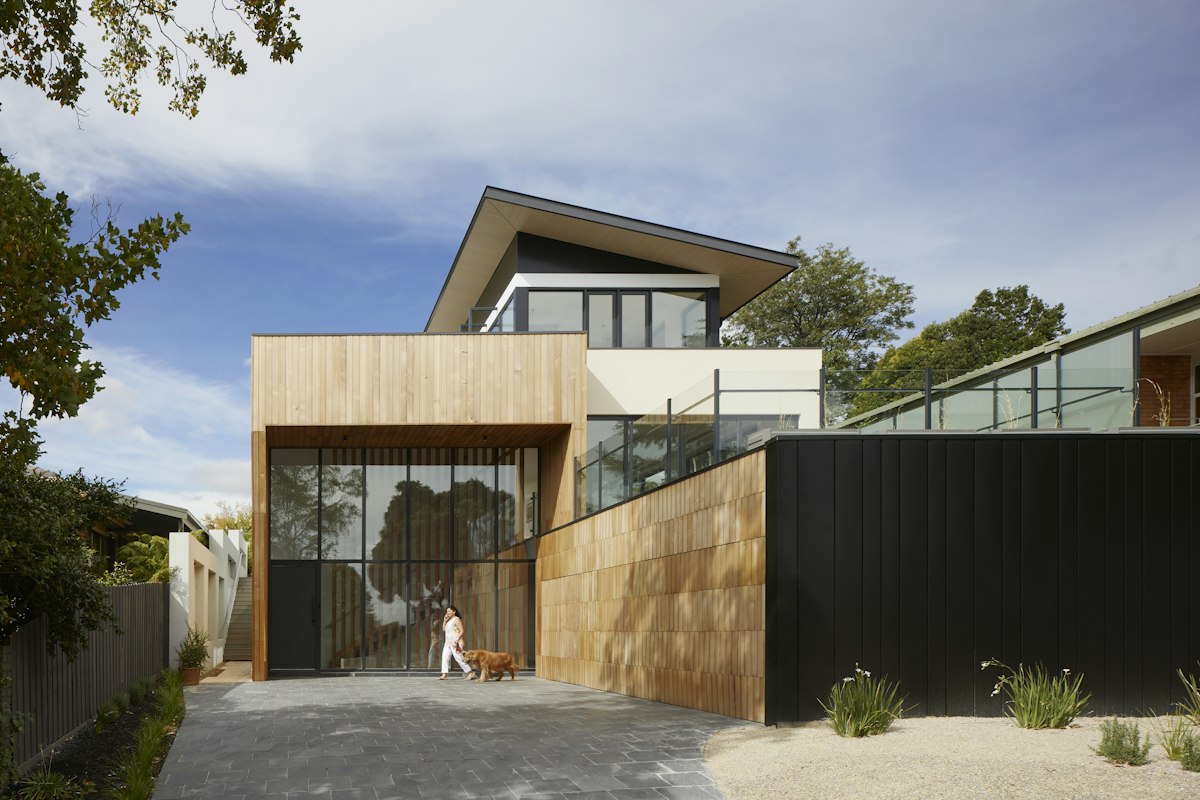
Direct, no scrim
Not permitted. Contrast here is whatever the photograph happens to be at that point, and it changes with every crop.
Scrim, the rule
Measured 6.38:1 at worst. The scrim is composited over both black and white, so that figure holds over any photograph, not just this one.
Held patch
For busy or high-contrast imagery where a full scrim would flatten the photograph. Clear space rules still apply inside the patch.
Never the primary lockup in its dark ink over a photograph. Where the image is too light for the scrim to hold — snow, overexposed sky, white product on white — use the held patch or move the mark off the image entirely.
06 · Explorations
Eight routes, and why seven were wrong
Every route was drawn at the same optical size and tested at sixteen pixels before anything was judged on looks. These are the studies as drawn, not cleaned-up versions of the winner.
Macron wordmark
Chosen
The name set plainly, with the macron doing the work. It is the only route that says architecture without drawing a building, and it survives on a title block, a hoarding and a favicon.
Roof in a frame
Killed
Every practice draws this. A pitched roof also misrepresents the work, which is almost entirely flat-roofed and urban.
Nested corners
Killed
Reads as plan drawing and had real promise, but at small sizes the three strokes merged into a gray block and the idea disappeared.
Circle and horizon
Killed
Elegant and close to the macron idea, but a ringed horizon belongs to a landscape studio or a hotel group. It also collides with a dozen existing marks.
Three bars
Killed
Abstracted the macron into a system of levels. Clean, but it says nothing specific and would work equally for a publisher or a bank.
ŌKUBO
Sans wordmark
Kept for small sizes
The sans cut holds at sizes where the serif loses its hairlines. It survives as the caption lockup on drawings and in the site footer, never as the primary.
A-frame monogram
Killed
Confuses the initial. The practice is named for a person, not for a form, and the triangle imports an alpine register the work does not have.
Solid with void
Runner-up
A mass with an opening cut from it, which is close to how the practice actually talks about buildings. Strong, but too heavy beside the photography and it fought the wordmark rather than supporting it.
The test that decided it: put each candidate next to a photograph of one of the buildings and ask which one the eye goes to second. Every pictorial route won that contest, which is the wrong outcome for a practice whose pitch is the work. The wordmark lost it on purpose.
07 · Color
A palette taken from materials, not from a screen
Every color here is something the practice actually builds with: lime plaster, stained cedar, unfinished oak, terracotta tile, planted courtyards. Nothing was chosen on a color wheel, and there is no blue anywhere in the system. Every hex below is a token in the site stylesheet, and every ratio was measured against the ground it actually sits on.
Bone
#F4EFE8
The default ground and the body background, taken from lime plaster. Warm enough that photography of timber and concrete sits on it without a color cast.
Ink
#16150F
Body text and dark grounds, the color of stained cedar rather than black. Bone on ink measures 15.98:1, so it carries long reading.
Terracotta
#8F4A2E
The type cut of the accent, at 5.76:1 on bone. Section numbers and service numbers use this so 16px terracotta clears AA, which the lighter tile value does not.
Tile
#B0603D
The accent as drawn from roof tile. Fills, rules, focus rings, selection, and headline emphasis at 24px and above, where 4.03:1 on bone is sufficient. Never set small type in it on bone.
Forest
#2D3A2E
Courtyard planting. Used once per page, as the full-bleed contact band, where bone text on it measures 9.9:1.
Sand
#D9CBB8
Unfinished oak. The preview placeholder, the office list on forest, and the philosophy attribution. Not used for small text on bone.
Warm gray
#6B6155
Secondary information: dates, locations, captions, footer, service copy. A solid tone at 5.29:1 on bone rather than a faded ink.
Paper
#FAF7F2
One step lighter than bone, for any surface that needs to lift off the page.
The rule that keeps it honest: terracotta has exactly two jobs, numbering and interaction. It also ships in two values for one reason, which is contrast. Tile at 4.03:1 on bone is fine for a 40px numeral and fails for a 16px label, so the darker cut exists purely so the system can keep its accent without dropping below AA.
08 · Type
Two families, eight roles, used the same way every time
Cormorant Garamond carries everything that speaks, DM Sans carries everything that informs. Nothing on the site is sized by feel. The specimen below is set in the brand's own faces at its own sizes.
Display · Cormorant Garamond Light
Aa Ōk
Light, material, permanent
Headlines, project names, the philosophy statement. Set at 300 weight and never below 1.5rem, because the hairlines close up.
Text · DM Sans
Aa 0123
18px · body, the site base
15px · captions, dates, locations
14px · section numbers and labels
Body copy, navigation, metadata. Light weight throughout so it never competes with the serif for authority.
Label · 14 / 500 / +.14em
01 Selected work
Page title · 56–88 / serif 300
One per page, the title
Section heading · 34–46
Opens every section
Project name · 26–30
Kiyosumi House
Lead · 22 / serif italic
A studio of twenty-four architects, building across three continents.
Body · 18 / 1.7
Every paragraph, capped at 74 characters per line.
Caption · 15 / 400
Tokyo · 2025 · Residential. Body copy never goes below this.
Numeral · 40–56 / serif
24
09 · In the world
From the letterhead to the project proposal