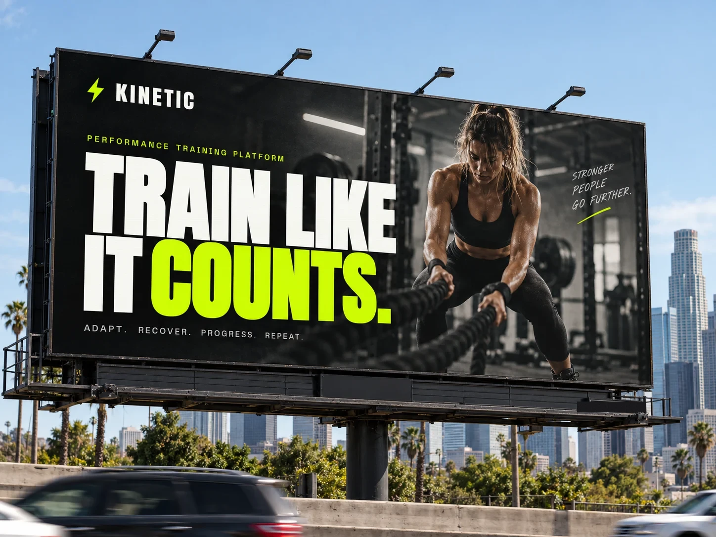
01 · The website
The finished site, running live
Scroll inside the frame. The stat bar runs on its own, the phone screens sit in the product section, and the testimonial cards respond to hover. Everything here is production markup, not a screenshot.
Live embed ↓ scroll inside the frame
02 · Desktop
How the system holds across the page
Four sections at 1440 wide, each anchored to its real position in the page rather than a guessed scroll depth. Near-black throughout, with volt used as a full-bleed band exactly once so it still lands when it appears.
Hero
Anton at up to 160px, bottom aligned over the photograph
The product
Three app screens, shown at device scale rather than as icons
Voices
Named athletes with their sport, not anonymous praise
Join
One decision, at the largest type on the page
03 · Mobile
Every state, including the one nobody screenshots
At 390 wide the header carries the wordmark and menu only, then the primary action appears once the visitor scrolls, so nothing wraps at 360. Each screen is anchored to a real section. The navigation panel is captured opening over scrolled content, not over an empty hero.
Hero
The display headline keeps its full weight and simply reflows to more lines. The gradient scrim carries it, so contrast holds on any frame of the photograph.
Navigation, mid-scroll
The panel drops over the testimonials beneath it. Items sit at 44px minimum touch height, in mono at 13.4px, with the join action last.
The product
The three app screens stack to one column, which is the honest arrangement: on a phone you are looking at the product at roughly its real size.
Join
Both actions go full width and stack, each above 44px, with the volt button first because it is the one decision the page wants.
04 · Detail and interaction
The parts a screenshot cannot show
Every element below is the real thing, built to the same spec as the site. Hover them.
Actions and focus
.25s · ease
Volt on near-black measures 16.87:1, and black on volt is the same figure inverted, so the accent works as both ink and ground without a second value. These are the large buttons the page actually leads with, 18.4px Anton at 56px tall; a 16px variant exists for the nav only. The volt button lifts two pixels and gains a centered 28px glow rather than a drop shadow, so it reads as switching on. The ghost button rests on a white border at 32 percent and takes the accent only on hover, which is the whole payoff and would be invisible if its resting border were already volt.
Live signals
1.6s blink · 2.4s shimmer
Three ambient signals, all in volt and all on step or ease loops rather than linear ones. The status dot blinks on a 1.6 second step so it reads as a hard indicator light, not a fade. The shimmer under the headline runs 2.4 seconds and is the only decorative motion on the page.
The stat bar
28s linear · the one volt band
Volt appears as a full-bleed band exactly once, carrying the numbers in Anton with black text at 16.87:1. It scrolls on a 28 second linear loop with the content duplicated so the seam never shows. Linear is correct here because a marquee that eases reads as broken.
Scroll reveal, staggered
.8s · 28px rise
Looping here so the timing is visible. On the site each element rises 28 pixels and fades in over .8 seconds, the shortest reveal of any brand in the book, because a training product should feel like it responds immediately. Two delay classes only, .d1 and .d2.
The page in motion
Looping · desktop and mobile together
Both frames scroll on a loop and reverse, so the hero entrance, the scrolling stat bar and the section reveals all play without you touching anything. Record either one straight off the page.
Motion specification
.25s
Buttons and nav links. Anything under the cursor.
.8s
Content arriving on scroll, with .d1 and .d2 offsets only.
1s
The hero entrance, staggered .2s to .66s across four elements.
22s
The hero drift, scaling 1.05 to 1.16 behind the headline.
One easing curve for anything that arrives, cubic-bezier(.22,.61,.36,1), and deliberate exceptions for the ambient loops: step-start on the status dot so it snaps, and linear on the stat bar so it never appears to stall. Under reduced motion every duration collapses to zero, the loops stop and all content renders in its final state.
Part two
The identity system underneath it
Everything above draws on one small set of rules: a wordmark built from the display face, a single acid accent, and three type families that never trade jobs.
05 · The mark
Three lockups, and when each one is correct
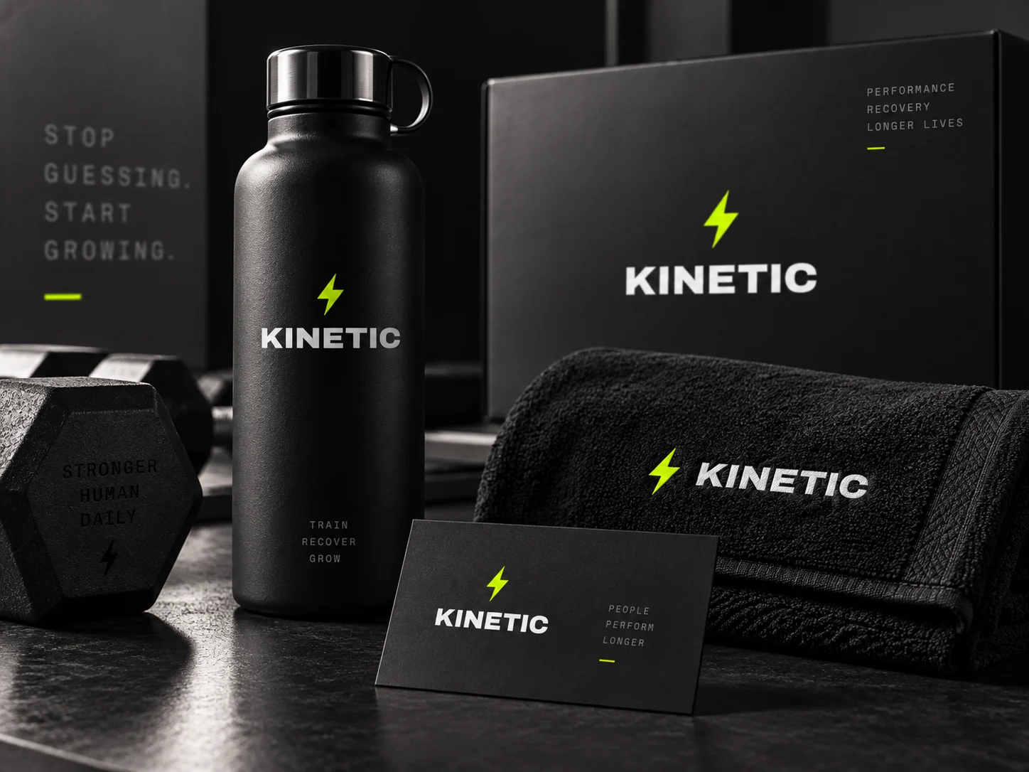
The name sets in Anton, uppercase, tracked at .12em, which is the same face the headlines use at ten times the size and six times the tracking, because a wordmark needs air where a headline needs mass. There is no separate logo typeface, because a training brand should look like it owns one voice and shouts in it.
Primary wordmark
Site header, app splash, store listing, kit. White on near-black is the default pairing everywhere.
The K
App icon, favicon, watch face, anywhere the wordmark would fall under 14px. The stem and two strokes are cut out of a volt square so it reads at 16px.
Volt lockup
Used once per surface, as a full-bleed band or a sticker. It is the loudest thing the brand can do, so it never appears twice on one screen.
Clear space and minimum size
Clear space equals the height of the K on all four sides. Anton is already tightly set, so crowding it is the fastest way to make the brand look cheap.
Minimums: the K 16px on screen and 8mm in print. Primary wordmark 104px wide on screen, 26mm in print.
Inverted and single ink
On photography
A photograph has no fixed luminance, so the lockup cannot be placed on one directly and checked once. The rule is a scrim: 72% of black under the mark, which bounds the ground regardless of what is beneath it.
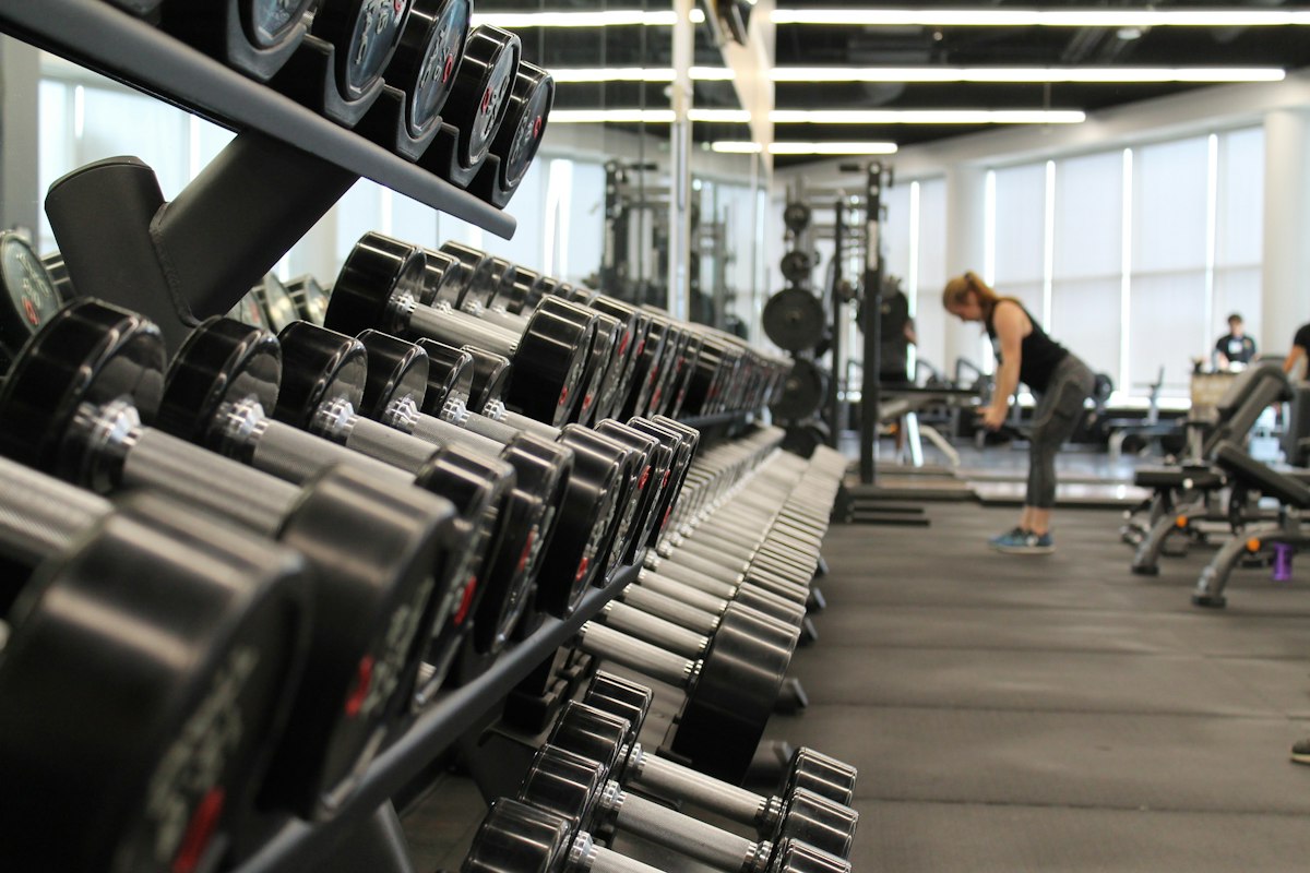
Direct, no scrim
Not permitted. Contrast here is whatever the photograph happens to be at that point, and it changes with every crop.
Scrim, the rule
Measured 7.35:1 at worst. The scrim is composited over both black and white, so that figure holds over any photograph, not just this one.
Held patch
For busy or high-contrast imagery where a full scrim would flatten the photograph. Clear space rules still apply inside the patch.
Never the primary lockup in its dark ink over a photograph. Where the image is too light for the scrim to hold — snow, overexposed sky, white product on white — use the held patch or move the mark off the image entirely.
06 · Explorations
Eight routes, and why seven were wrong
Every route was drawn at the same optical size and tested at sixteen pixels on a crowded home screen before anything was judged on looks. These are the studies as drawn, not cleaned-up versions of the winner.
K cut from volt
Chosen
A single letter knocked out of the accent square. It survives at 16px, works as an app icon without a second drawing, and the diagonal strokes carry the movement the name promises.
Performance graph
Killed
Every fitness app draws a rising line. It also promises a specific outcome the product cannot guarantee, which is the one claim a training brand should not make in its logo.
Interval clock
Killed
Honest and specific to how the product works, but a clock face says scheduling, and it collides with every timer app icon on the same home screen.
Barbell
Killed
Narrows the product to one discipline. Kinetic is used by runners and climbers as much as lifters, so equipment in the mark excludes most of the audience.
Bolt
Killed
Reads as energy drink. It is also the most contested shape in the category, and at small sizes it is indistinguishable from a dozen other marks.
Wordmark only
Kept as primary
The correct answer for the header and every wide surface, and it is what the site actually uses. It simply cannot hold a 16px app icon, which is why the K exists alongside it.
Peak
Runner-up
Fitted the language the site already uses, since the final section is headed Your peak starts now. Lost because a triangle is passive: you look at a summit rather than moving toward it.
Pulse trace
Killed
Medical, not athletic. A heart rate line belongs to a monitoring device, and it made the brand feel like something that watches you rather than trains you.
The test that decided it: put each candidate on a phone home screen beside the apps this one competes with, at 16px. The graph, the bolt and the pulse all turned into the same gray squiggle. The K held because it is a letter, and a letter is the one shape a person can still name at that size.
07 · Color
One accent, bright enough to work as ink and as ground
This is the only palette in the book with a single accent and no darker type variant, and that is possible because volt is light enough to clear AA on near-black while black clears AA on volt. Both directions measure 16.87:1. Every hex below is a token in the site stylesheet.
Volt
#C8FF00
The accent, and the only chromatic color. Buttons, the stat band, status dots, focus rings, the K. Works as ink on black and as a ground under black.
Black
#080908
The page. Not pure black, so photography keeps its shadow detail and volt does not vibrate against it.
Panel
#131511
Raised surfaces, one step off the page, with a faint green cast picked up from the accent.
White
#F4F6F0
Headlines and body copy at 18.32:1 on black. Slightly warm so it does not glare in a dark interface.
Silver
#8B9184
Shapes only, and currently one shape: the scroll cue arrow. At 6.16:1 it would pass as text, but the system keeps a second gray for that so body copy always gets the higher ratio. Borders and dividers are not this color, they use --line, which is volt at 14 percent.
Ash
#A8AE9F
The type cut of the gray, a token in its own right at 8.76:1 on black. Captions, role labels, bullet copy, testimonial quotes and the footer.
The rule that keeps volt effective is scarcity, not saturation. It appears as a full-bleed band once per page, on one button per decision, and on the live signals. Decorative elements are denied it, which is why the scroll cue is silver and every border is --line rather than the accent itself. The moment a second volt band appears on the same screen, neither one reads as the thing to look at.
08 · Type
Three families, eight roles, and no overlap
Anton shouts, Work Sans reads, Space Mono labels. Three families is one more than the rest of the book allows, and it earns its place because the mono is doing a specific job: it makes numbers and labels look measured rather than marketed.
Display · Anton
Aa Kn
Train harder
Headlines, the wordmark, the stat band, buttons and athlete names. One weight only, because Anton has one. Buttons run 1.15rem on the page and 1rem in the nav, which is the floor for the whole family.
Text · Work Sans
Aa 0123
17px · body, the site base
19px · hero subhead
Body copy and testimonial quotes. The only family allowed to run at multiple weights.
Label · Space Mono
Aa 0123
13.4px · the hero tag, tracked .16em
13.8px · the label under each heading
13.4px · nav, roles, footer
Navigation, the hero tag, section labels, athlete roles, the footer. Buttons are set in Anton, not here. The family spans exactly two sizes, 13.4px and 13.8px, and nothing sits below 13.4px.
Tag · 13.4 mono 700 +.16em
Performance Training Platform
Page title · 58–160 Anton
One per page, the title
Section heading · 40–72
Opens every section
Stat · 24 Anton on volt
+23% faster gains
Lead · 19 / 1.6
The paragraph under a title, one per section at most.
Body · 17 / 1.6
Every paragraph, capped at 74 characters per line.
Button · 18.4 Anton, 16 in nav
Start Free
Caption · 13.4 mono
Trail runner, Boulder. Nothing goes below this.
09 · In the world
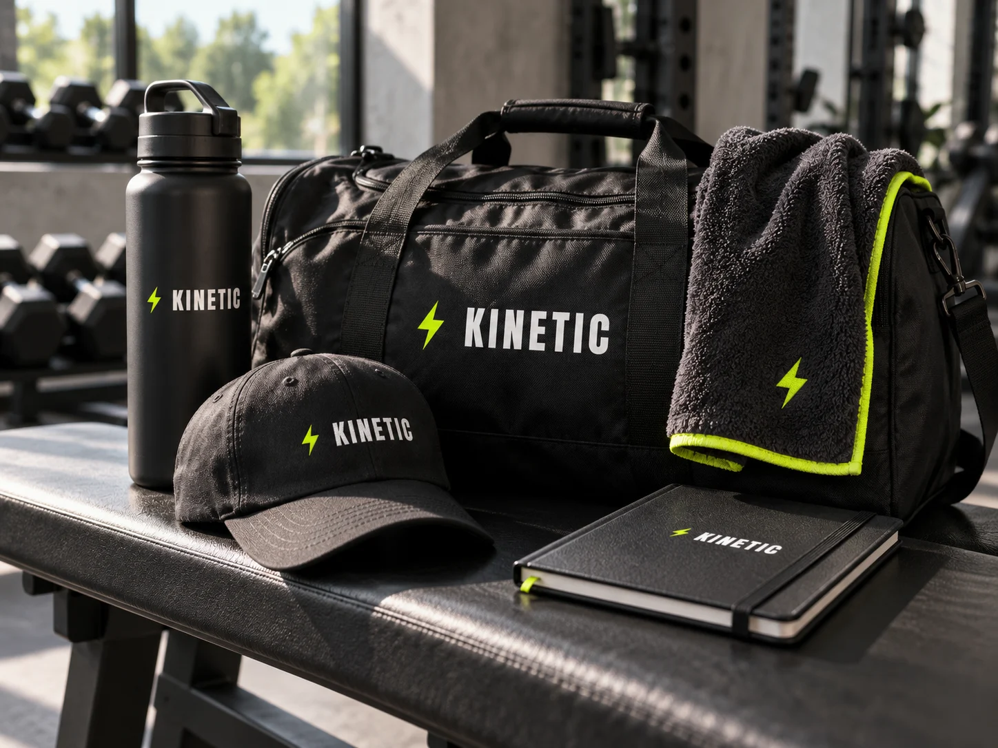
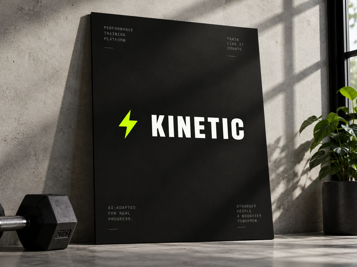
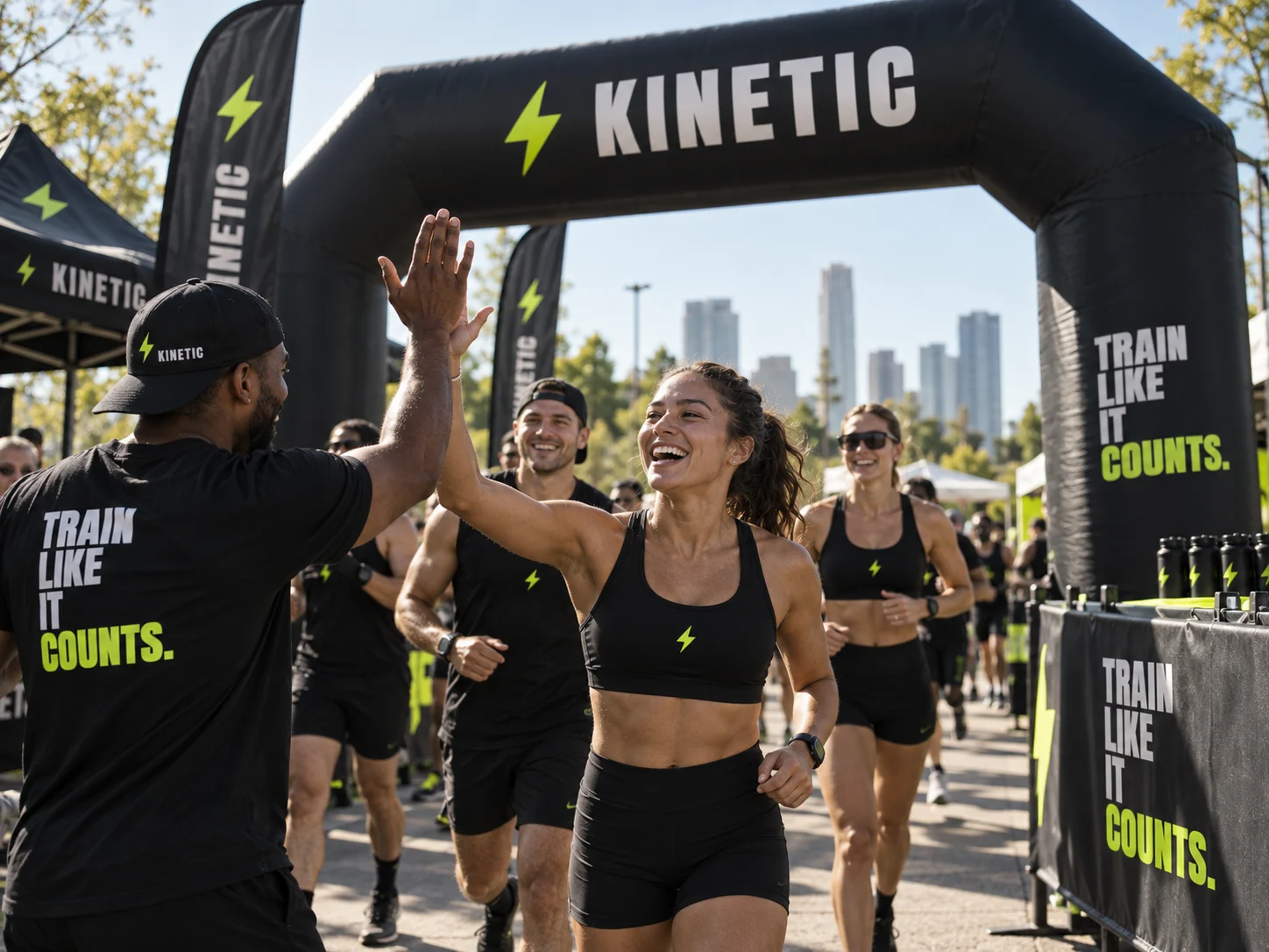
From the gym bag to race day