01 · The website
The finished site, running live
Scroll inside the frame. A conic gradient rotates behind the console, two data callouts drift over it on different periods, and the feature cards lift on hover. Everything here is production markup, not a screenshot.
Live embed ↓ scroll inside the frame
02 · Desktop
How the system holds across the page
Four sections at 1440 wide, each anchored to its real position in the page rather than a guessed scroll depth. Near-black with a green cast throughout, and mint reserved for figures, the mark and the single filled button.
Hero
Centred headline capped at 16 characters per line, then the console
Features
Six cards, from expense controls to forecasting to security
Platform
The one full-bleed band, with the feature list beside an image
Customers
Named finance leads with their company and role
03 · Mobile
Every state, including the one nobody screenshots
At 390 wide the header carries the wordmark and menu only, then the primary action appears once the visitor scrolls, so nothing wraps at 360. The console is the hard problem here: it is a wide screenshot, and shrinking it to phone width would make the product look unusable.
Hero
The headline keeps its 16-character measure and simply runs to more lines. The two drifting callouts move inside the console frame so they cannot overlap the copy.
Navigation, mid-scroll
The panel drops over the feature grid beneath it, with items at 44px minimum touch height. The header row keeps Log in and Get Started visible alongside the burger, so the primary action is reachable without opening anything.
Platform
The band keeps its list and image stacked rather than side by side, and the list items stay full width so each claim reads as its own line.
Customers
Testimonial cards go to one column and keep the name, role and company together, because an unattributed finance quote is worth nothing.
04 · Detail and interaction
The parts a screenshot cannot show
Every element below is the real thing, built to the same spec as the site. Hover them.
Actions and focus
.3s · one filled button only
Mint fills exactly one button per decision, with near-black text at 11.23:1, and it lifts two pixels into a mint shadow rather than changing color. These are the site’s two real hero actions, Start Free Trial and Watch Demo. The secondary button sits on the surface with a white border and takes only a brighter border on hover, so at a glance there is never a question about which action the page wants.
Feature card
.3s · lift, mint border, shadow
Auto Reconciliation
Bank feeds, invoices, and receipts matched automatically. Close the books 5x faster.
Cards lift four pixels, take a mint border at 30 percent and gain a shadow, all on .3s. The icon sits in a 40px well filled with mint at 12 percent and no border at all, and the glyph inherits currentColor from the well, so an icon can never drift off the accent.
The console frame
7s conic spin · 6s and 7s drift

The frame pads the image by one and a half pixels and fills that gap with mint at 26 percent, so the edge is a constant thin line that no part of the animation can erase. On top of it a conic gradient rotates once every seven seconds, transparent for most of its sweep and carrying a short indigo-into-mint glint, which is the only place indigo appears on the whole site. The rotating square is sized to twice the frame so its corners never come into view. Two callouts drift ten pixels on six and seven second periods, offset a second apart so they never move together.
Scroll reveal, staggered
.8s · 26px rise
Looping here so the timing is visible. On the site each element rises 26 pixels and fades in over .8 seconds, with two delay classes at .08s and .16s. The console gets its own slower entrance at one second with a half second hold, so the product lands after the sentence that introduces it.
The page in motion
Looping · desktop and mobile together
Both frames scroll on a loop and reverse, so the conic ring, the drifting callouts and the section reveals all play without you touching anything. Record either one straight off the page.
Motion specification
.3s
Buttons and cards. Anything under the cursor.
.8s
Content arriving on scroll, with .d1 and .d2 offsets only.
1s
The console, delayed half a second so it lands last.
6–7s
The conic ring and the two callouts, on unequal periods.
One easing curve for anything that arrives, cubic-bezier(.22,.61,.36,1), ease-in-out for the drifting callouts, and linear for the conic ring, because a rotation that eases looks like it is struggling. Under reduced motion every duration collapses to zero, the ring and the callouts stop and all content renders in its final state.
Part two
The identity system underneath it
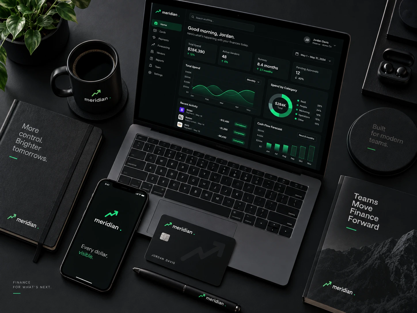
Everything above draws on one small set of rules: a wordmark built from a rising line, a single mint that means money moved, and two families where the display face is reserved for numbers and names.
05 · The mark
Three lockups, and when each one is correct
A four-point line with an arrowhead at the top right: the trend line every finance tool draws, with one deliberate difference. The third point dips before the final rise, because a chart that only goes up is the thing a controller does not believe. The wordmark is lowercase with a mint full stop, the same namespace convention the product uses.
Primary lockup
Site header, product chrome, statements, board decks. White wordmark with the line and the stop in mint.
The line
Used alone wherever the wordmark would fall under 14px. Two strokes at 2px with round joins, and the dip is the first thing to go if it is scaled below 16px, which is why that is the floor.
The tile
Shipped as the favicon. Keeps the near-black ground rather than filling with mint, because a green tile beside a banking app reads as a balance alert.
Clear space and minimum size
Clear space equals the height of the line on all four sides. The mark is mostly diagonal, so a tight crop reads as a fragment of a chart rather than a logo.
Minimums: the line 16px on screen and 8mm in print. Primary lockup 128px wide on screen, 32mm in print.
Inverted and single ink
On photography
A photograph has no fixed luminance, so the lockup cannot be placed on one directly and checked once. The rule is a scrim: 72% of ink under the mark, which bounds the ground regardless of what is beneath it.

Direct, no scrim
Not permitted. Contrast here is whatever the photograph happens to be at that point, and it changes with every crop.
Scrim, the rule
Measured 7.79:1 at worst. The scrim is composited over both black and white, so that figure holds over any photograph, not just this one.
Held patch
For busy or high-contrast imagery where a full scrim would flatten the photograph. Clear space rules still apply inside the patch.
Never the primary lockup in its dark ink over a photograph. Where the image is too light for the scrim to hold — snow, overexposed sky, white product on white — use the held patch or move the mark off the image entirely.
06 · Explorations
Eight routes, and why seven were wrong
Every route was drawn on the same 120 unit grid, then tested at sixteen pixels and inside a bank statement header. These are the studies as drawn, not cleaned-up versions of the winner.
Trend line with a dip
Chosen
The category shape, with one honest change: the third point falls before the last rise. It is the only route that says something about the audience rather than the product, and it still holds at 16px.
Straight ascent
Killed
The default fintech line, up and to the right with no interruption. Finance buyers have seen this on every deck that later missed its numbers, so it reads as a claim rather than a mark.
Meridian line
Killed
Literal about the name: the line of longitude. Also a globe, which promises international coverage the product does not lead with, and at small sizes it is a circle with a slash.
Bar chart
Killed
Says reporting rather than operating. The product is a live console, and three rising bars describe a monthly summary, which is the thing Meridian replaces.
Wordmark and stop
Kept as the lockup
The mint full stop turns a long word into a product name, and it is what the footer uses alone. Nine letters cannot hold a 16px favicon, which is why the line exists beside it.
Checked shield
Killed
Security is on the page, as one card in six, and that is the right amount of space for it. A shield as the mark makes the whole brand about audit rather than about cash position, and it is the sixth card that mentions SOC 2, not the first thing a visitor sees.
Two discs
Runner-up
Reconciliation as two overlapping sets, which is exactly what the product does. Abstract enough to scale well, but indistinguishable from a dozen payment brands using the same overlap.
Ledger arch
Killed
An attempt at gravitas through architecture, and it landed closer to a bank from 1890. Meridian is selling a live tool to people who already have a bank.
The test that decided it was not legibility, since most of these scale fine. It was whether a finance lead would believe the mark. The straight ascent, the bars and the shield all promise something, and the trend line with a dip is the only one that shows a number going the wrong way before it recovers, which is what a real cash position does.
07 · Color
One mint that means money moved
This is the shortest palette in the book: six values, one of them an accent. Green in a finance interface already carries meaning, so mint is reserved for figures, the mark and the single filled button, and the grounds carry a faint green cast so the accent reads as part of the surface rather than dropped onto it. Every hex below is a token in the site stylesheet.
Background
#0B0E0C
The page. Near-black with a green cast rather than a blue one, which is what keeps mint from looking like a notification color.
Surface
#141A16
Cards, testimonials, the secondary button, the console frame. White on it reads 15.73:1.
Surface two
#1B2320
The deepest raised surface. The tightest ground in the system, which is what every accent was checked against.
White
#EEF3EF
Headlines, card titles, quotes, the callout labels. 17.28:1 on the page.
Dim
#8B978F
Every secondary line: hero description, card copy, roles, the footer. 6.39:1 on the page and 5.29:1 on the deepest surface.
Mint
#2FE08A
The mark, the stop, every statistic, section eyebrows, the compliance pill, the one filled button. 11.23:1 on the page, and near-black on it reads the same figure inverted, so it needs no second value.
Indigo
#8B86F5
One use on the entire site: the middle stop of the conic gradient behind the console, and the dot on the second drifting callout. It exists so the ring reads as a gradient rather than a flat mint halo, and it never sets type.
Border
RGBA(255,255,255,.09)
Every card edge, divider and the secondary button. White at 9 percent, so one value works across all three grounds.
Two colors were cut from the original palette during this pass: a darker mint and a coral, both declared as tokens and never referenced anywhere in the stylesheet. A dead token in a design system is worse than a missing one, because the next person to open the file assumes there is a sanctioned way to show a negative number when there is not.
08 · Type
Two families, eight roles, and a strict line between them
Space Grotesk appears in six places and nowhere else: the wordmark, the hero headline, the three section headings, and the statistics. Everything else is Manrope, including the card titles. The rule is that the display face is for the name and the numbers, so a figure on this site always looks like a figure.
Eyebrow · 13.4 / 700 / +.1em
Platform
Page title · 41.6–73.6 Grotesk 700
Close the books faster
Section heading · 32–44.8 Grotesk
Built for the close
Statistic · 32 Grotesk 700 mint
$1.4B
Hero description · 17.3 / 1.7
One paragraph under the headline, capped at 56 characters.
Card title · 16.8 Manrope 700
Auto Reconciliation
Body · 16 Manrope / 1.7
Every paragraph, capped at 74 characters per line.
Quote · 14.7 Manrope / 1.7
"Meridian cut our monthly close from 8 days to 2."
09 · In the world
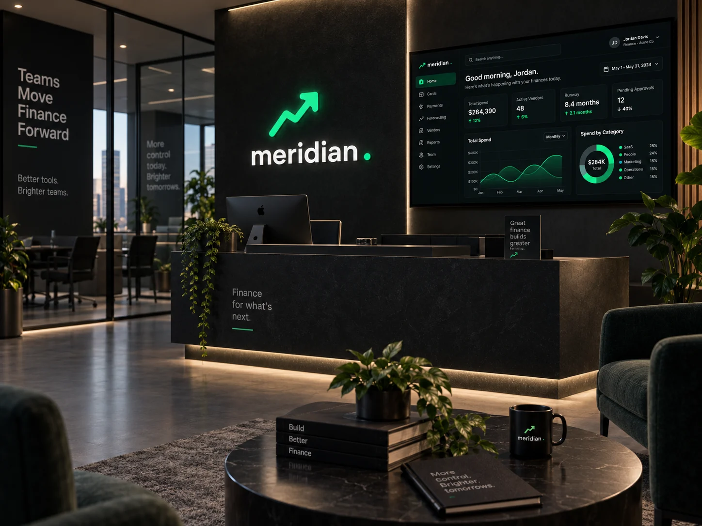
From the card in hand to the conference floor