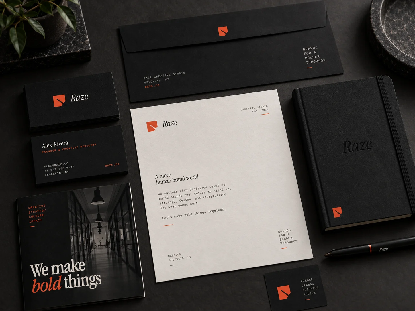
01 · The website
The finished site, running live
Scroll inside the frame. Hover the work cards, open the navigation, reach the contact block. Everything here is production markup, not a screenshot.
Live embed ↓ scroll inside the frame
02 · Desktop
How the system holds across the page
Four sections at 1440 wide, each anchored to its real position in the page rather than a guessed scroll depth. The same two faces throughout, and red appearing only where something is actionable or being named.
Hero
The one place the display serif runs at full size
Selected work
Cards are real links, desaturated until hover
Capabilities
Hairline grid, mono throughout, no decorative icons
Contact
One action, stated plainly, red reserved for it
03 · Mobile
Every state, including the one nobody screenshots
At 390 wide the header carries the mark and menu only, then the primary action appears once the visitor scrolls, so nothing wraps at 360. Each screen is shown at close to native size, anchored to a real section. The navigation panel is captured opening over scrolled content, not over an empty hero.
Hero
Mark and burger only. The headline sets at 2.6rem over a scrim so it clears contrast on any frame of the photograph.
Navigation, mid-scroll
The panel covers the capabilities grid beneath it. Four items, each at 44px minimum touch height, with the action last.
Selected work
Projects stack to one column at full width. Captions sit on the image gradient rather than below it, so the card stays a single object.
Contact
One mail link, sized as a target rather than a line of text, with the footer grid collapsing beneath it.
04 · Detail and interaction
The parts a screenshot cannot show
Every element below is the real thing, built to the same spec as the site. Hover them.
Work card
1.2s · one shared easing curve

Desaturated at rest so the grid reads as one object, then color and a five percent scale on hover. Slow enough to feel deliberate rather than reactive. The whole card is a single link, so keyboard order matches reading order.
Actions and focus
180ms · ease-out
Buttons lift three pixels and gain a red cast rather than swapping color, so the accent keeps one meaning. Every interactive element carries a two pixel focus ring at three pixel offset, and hover is never the only signal that something is actionable.
Navigation, two states
Switches past the fold
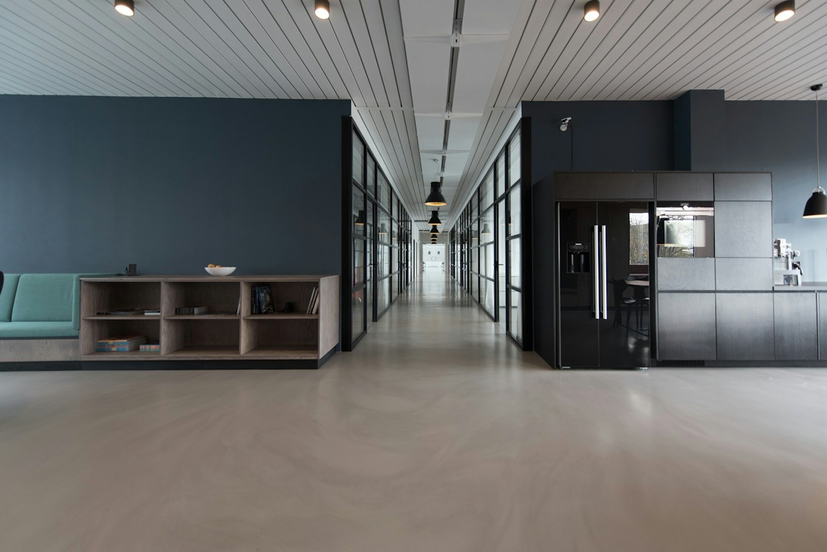
Transparent with a text shadow over the photograph, then a solid blurred bar with a hairline once the hero clears. The shadow is what keeps the wordmark legible on a bright frame instead of hoping the image stays dark.
Scroll reveal, staggered
0.9s · 28px rise
Looping here so the timing is visible. On the site each element rises 28 pixels and fades in over 0.9 seconds, offset 120 milliseconds apart so a section resolves as a sequence rather than a block. Triggered once on entry, never replayed, and skipped entirely under reduced motion.
The page in motion
Looping · desktop and mobile together
Both frames scroll on a loop and reverse, so the nav state change, the parallax on the hero, and the stagger between sections all play without you touching anything. Record either one straight off the page.
Motion specification
180ms
Anything under the cursor. Fast enough to feel connected to the hand.
0.9s
Content arriving on scroll, with a 120ms stagger between siblings.
1.2s
Imagery transitions. Slow, so a photograph never feels flicked.
24s
The hero drift. Long enough to notice depth, not movement.
One easing curve across the whole site, cubic-bezier(.2,.8,.2,1), so every transition shares a character. Under reduced motion every duration collapses to zero and all content renders in its final state, which means the page never depends on animation to be readable.
Part two
The identity system underneath it
Everything above draws on one small set of rules: a single mark with three lockups, five colors with one job each, and two type families across eight roles.
05 · The mark
Three lockups, and when each one is correct
A solid block with one corner removed and the cut left visible. It draws the verb in the name rather than the initial, which matters for a studio that competes on what it does to a brand. Use the primary lockup unless a rule below applies.
Primary lockup
Site header, deck covers, card fronts, email signatures. The default on anything a client sees first.
Mark alone
Anywhere the wordmark would fall under 14px: favicon, avatar, app icon, a stamp over imagery, merch labels.
Secondary wordmark
Wide, short spaces where a square mark fights the layout: footers, banners, spine prints, tape.
Clear space and minimum size
Clear space equals the length of the cut corner on all four sides. Nothing enters it: no type, no rules, no image edge.
Minimums: mark 16px on screen and 8mm in print. Primary lockup 96px wide on screen, 24mm in print.
Inverted and single ink
On photography
A photograph has no fixed luminance, so the lockup cannot be placed on one directly and checked once. The rule is a scrim: 72% of black under the mark, which bounds the ground regardless of what is beneath it.
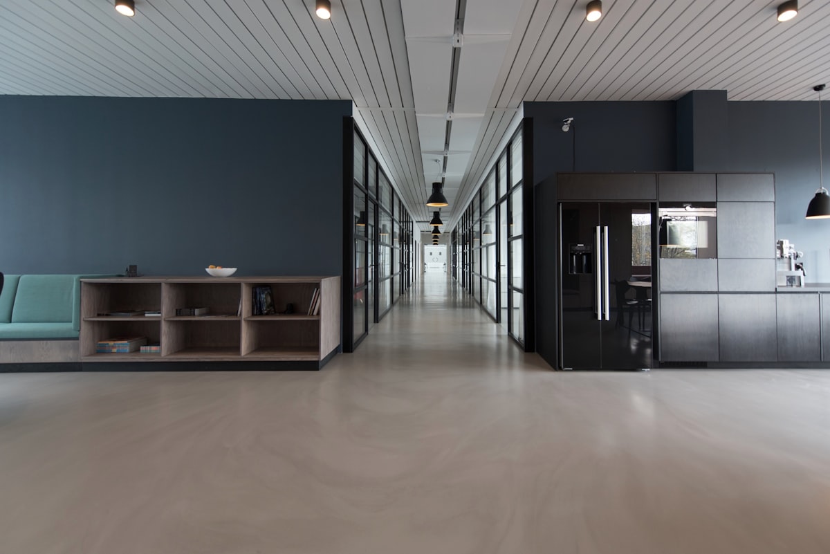
Direct, no scrim
Not permitted. Contrast here is whatever the photograph happens to be at that point, and it changes with every crop.
Scrim, the rule
Measured 7.38:1 at worst. The scrim is composited over both black and white, so that figure holds over any photograph, not just this one.
Held patch
For busy or high-contrast imagery where a full scrim would flatten the photograph. Clear space rules still apply inside the patch.
Never the primary lockup in its dark ink over a photograph. Where the image is too light for the scrim to hold — snow, overexposed sky, white product on white — use the held patch or move the mark off the image entirely.
06 · Explorations
Eight routes, and why seven were wrong
Every route was drawn to the same construction and tested at sixteen pixels before anything was judged on looks. These are the studies as drawn, not cleaned-up versions of the winner.
Sliced block
Chosen
A solid mass with a corner removed and the cut left showing. It draws the verb rather than the initial, survives at sixteen pixels, and works as a stamp, a favicon and a full-bleed panel.
Boxed monogram
Killed
Legible but generic. A letter in a box is the default solution for any agency, and it says nothing about what the studio does.
RZ ligature
Killed
The join between the two letters never resolved at small sizes. Below about twenty four pixels it read as a smudge rather than a pair.
Blade edge
Killed
Too literal, and it reads as a weapon. The studio razes work to rebuild it, so violence was the wrong register for a client-facing mark.
Struck wordmark
Kept as secondary
Strong and unmistakably typographic, but it needs horizontal room. It survives as the secondary wordmark for footers, banners and spines.
Chevron stack
Killed
Implies upward progress, which belongs to a consultancy or a fund. It also collides with every other arrow mark in the category.
Negative-space Z
Killed
The closest runner-up. Held together at size, but the three strokes made it busier than the sliced block and the Z is the weaker letter to lead on.
Seal
Killed
Craft-adjacent and warm, but a roundel signals heritage and provenance. Wrong for a studio whose pitch is that it removes what came before.
The test that decided it: render each candidate at sixteen pixels, then ask whether the silhouette alone still carries meaning. Only the sliced block and the negative-space Z passed, and the block won because a single removal is easier to protect across a system than three strokes that can drift.
07 · Color
One chromatic color, so red always means something
The studio shows other people's work for a living, so the identity stays near-monochrome and gets out of the way. Every pairing below was measured against its real rendered background rather than assumed.
Signal red
#F0563B
Raze is an act of force, so the accent runs hot. Red-orange rather than true red: heat without reading as a warning sign. Ink on it measures 5.55:1, so small copy is safe.
Ink
#100F13
Near-black with a violet cast, not pure black. Keeps the red from vibrating and lets photography hold its depth.
Bone
#EDEAE4
Warm off-white at 15.8:1 on ink. Pure white would make the palette feel like a UI shell instead of a printed object.
Stone
#9A948B
Secondary labels and metadata. A solid warm gray, chosen to replace faded transparent grays, which is how contrast quietly fails.
Panel
#16161B
Raised surfaces, one step off the page ground. Separates cards without a border doing the work.
08 · Type
Two families, eight roles, used the same way every time
Instrument Serif Italic carries display, Geist Mono carries everything that reads. Nothing on the site is sized by feel. The specimen below is set in the brand's own faces at its own sizes.
Display · Instrument Serif Italic
Aa Rr
We make bold things
Headlines, section titles, project names, the numerals in the stat bar. Never below 1.4rem, never used for body copy.
Text · Geist Mono
Aa Rr 0123
17px · body and hero subhead
15px · card copy and captions
14px · kickers and labels
Everything that reads. Mono against the serif signals craft plus rigour, which is what a client is buying.
Kicker · 14 / 600 / +.14em
Selected work
Page title · 44–72 / serif italic
One per page, the title
Section heading · 30–40
Opens every section
Subheading · 20–24
Names a project or service
Lead · 18 / 1.7
The paragraph under a title, one per section at most.
Body · 17 / 1.75
Every other paragraph, capped at 74 characters per line.
Caption · 15 / 500
Metadata and frame labels. Body copy never goes below this.
Numeral · 32–40 / serif
24