The opening: from a nameplate to a practice
Before
The founder's name at 19px in Georgia, over a 9px subtitle, on a page locked to 760 pixels wide. The largest type here is smaller than most sites set their body copy.
After
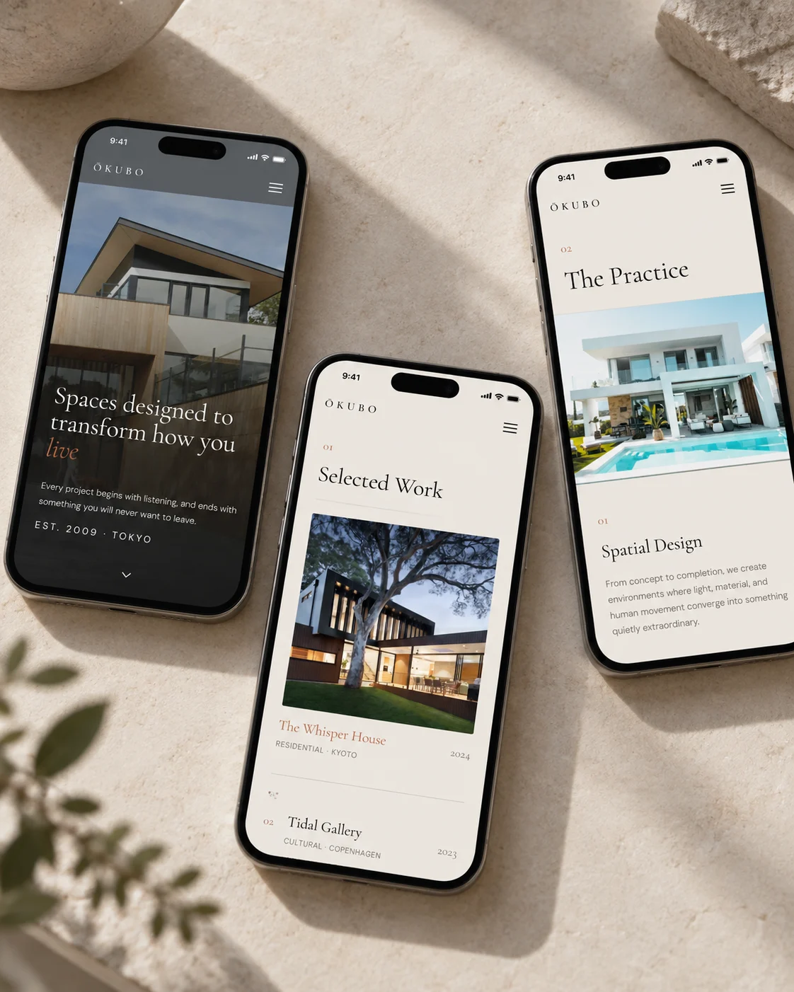
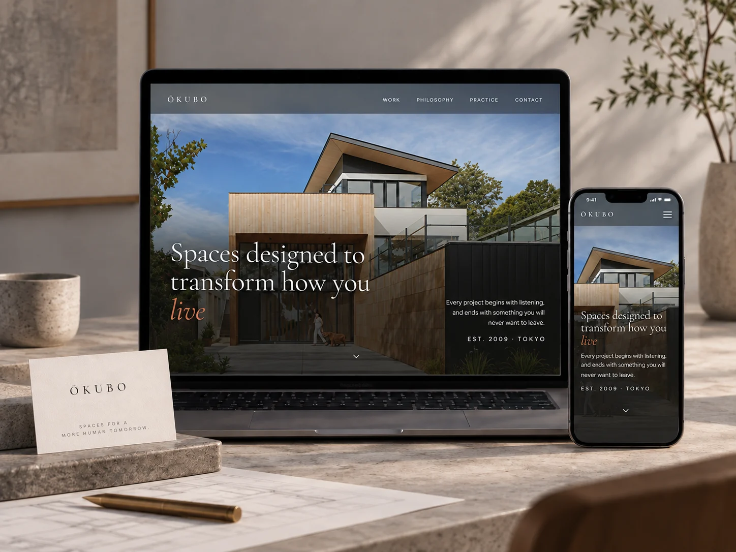
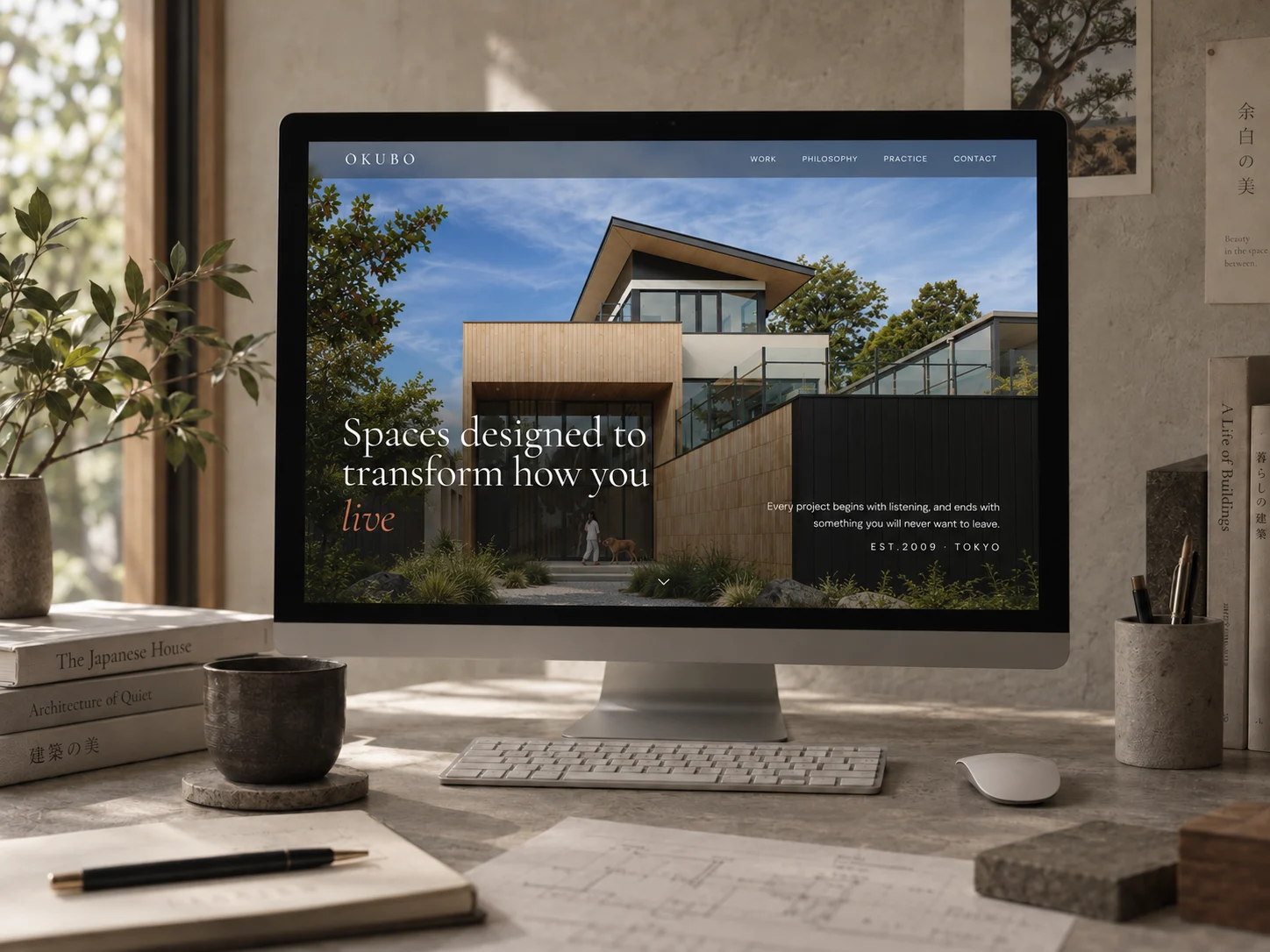
A claim about what the building does to the person inside it, at 94px. Directly beneath: a studio of twenty-four architects, building across three continents.
The work: from a table of names to buildings at scale
Before
Six rows of text and four thumbnails measuring 86 by 62 pixels. A note offers photographs of completed work on request, by telephone or facsimile.
After
Four projects with their program and city: residential in Kyoto, cultural in Copenhagen, hospitality in Patagonia, public in Oslo. Range no sole practitioner can claim.
The founder: from the whole website to one attributed voice
Before
A 110-pixel portrait beside three paragraphs of biography. This is a curriculum vitae, the right document for a person seeking work and the wrong one for a firm being appointed.
After
He appears once, as a 48px quotation signed Kenji Ōkubo, Founder. A named position inside an institution, which is exactly what lets a successor exist.
The identity
For a practice selling timelessness, looking a decade old is not a cosmetic problem.
Georgia at 12px, dotted rules, a blue underlined link and a hit counter. None of it was badly made. All of it contradicted the argument the firm was trying to make.
Architecture should be quiet.
Type ran from 9 to 19 pixels, a ten-pixel range across the whole document. The founder's name and the fax number were set within a few pixels of each other, so nothing ranked.
Spaces designed to transform how you live
The scale now runs from 11.5 to 94 pixels, so a building can outrank an address. One terracotta, a bone ground, and no rules at all: hierarchy is carried by size and space.
The wordmark decision was the succession decision. Setting the founder's full name makes the brand inseparable from the man. Setting the surname alone makes it a practice name a second generation can sign. Same six letters either way, and it was the only part of this engagement he needed to sleep on.
A founder who could not step back now has a brand that exists beside him.
Two open items. The new page carries a 2024 copyright, which is the same staleness the audit criticized, two years shallower, and it wants a build step rather than a designer remembering. And the firm's own headline figures deserve the scrutiny we applied to the old ones: 47 projects and 8 awards are counts the practice can substantiate, but a selection committee will ask which, and the page does not yet say.
Legibility, measured on the page
Eighty-two of the eighty-eight text elements were set below thirteen pixels.
Nothing on the old page was larger than nineteen pixels, and the body of the work sat at nine, ten and eleven. The captions carrying the only project information measured 2.73 to 1 against their background, where WCAG asks 4.5 to 1 of body text. This is that type at its rendered size.
Specimen · every size on the old homepage
Forty-two elements at eleven pixels, twenty-five at ten, eleven at nine. A client reading a project description was reading it at a size the page never meant to be read at length.
Fourteen of the twenty-four actions sat above the fold, and all twenty-four had a touch target under forty-four pixels. The page asked for a decision it had not made legible first.
Text elements below 13px
Architects, as stated
Actions above the fold
Largest type, in pixels
The explorations
Three directions were designed. One shipped.
Each was built as a full working page, not a mood board, so the choice was made against real type, real spacing and real interaction. All three are shown here, with the reason the two that lost did not ship.
Monograph
warm editorial · elegant serif · hover-swap project index
Reads as one architect, working quietly, which is what the practice actually is.
Open full page ↗Nocturne
dark cinematic gallery · Space Grotesk · immersive slabs
Made a one-person practice look like a large studio. Cinematic slabs promise a scale the office does not have, and does not want.
Open full page ↗Blueprint
structural Swiss grid · Archivo + mono · project index table
The project table was efficient and turned the work into a schedule, losing the stillness the practice is known for.
Open full page ↗In context