The scoreboard it kept
Four numbers, and not one of them about training.
Downloads, store rating, workout count, countries. Every one measures the top of the funnel or the size of the library. None tells a prospective subscriber whether people like them are still training in March, and that is the only question a subscription business needs answered.
Uses of the word download
Three identical buttons, two of them above the fold
App screens actually shown
Three device frames held stock photos of strangers
Named athletes in the proof
Was Jake_92, fitmomlife and Dan R., at 11px
The opening: from an install to a commitment
Before
"Get fit with the #1 fitness app" is a claim about the app store, not about the visitor. Two Download Free buttons compete above the fold.
After
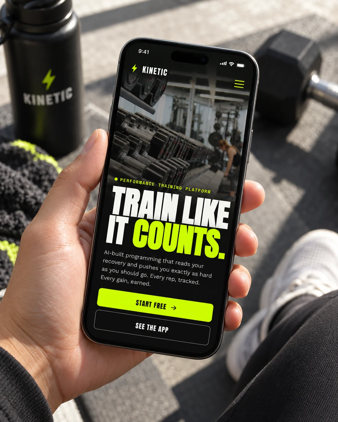
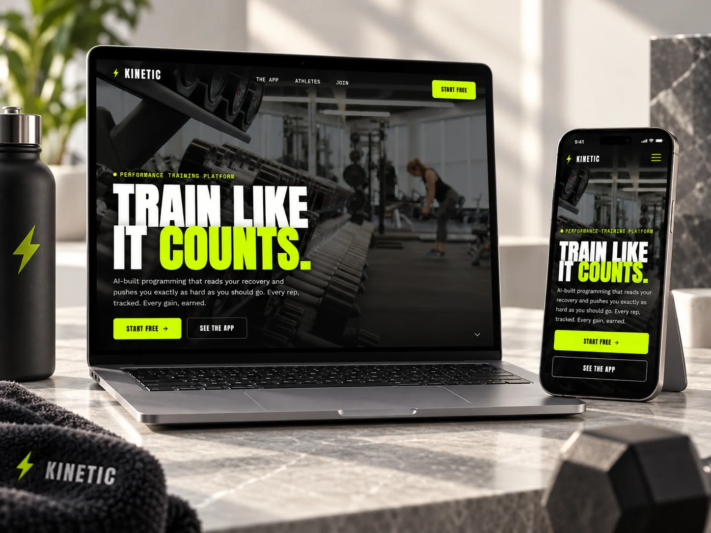
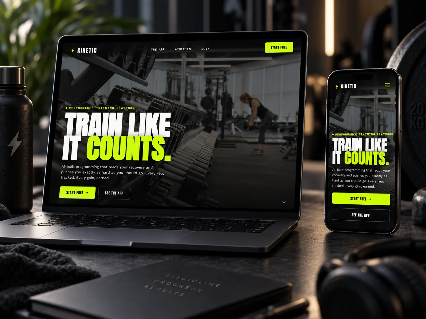
One action. The headline addresses the person rather than the ranking, and the figures under it are retention and strength gain.
The product: from stock photos to the actual screens
Before
Six feature cards, half of them headed by a single noun: Workouts, Tracking, Community. The page asks for a download while never showing what gets downloaded.
After
The app running mid-workout at device scale, beside three named capabilities stated as what they do over time rather than what they contain.
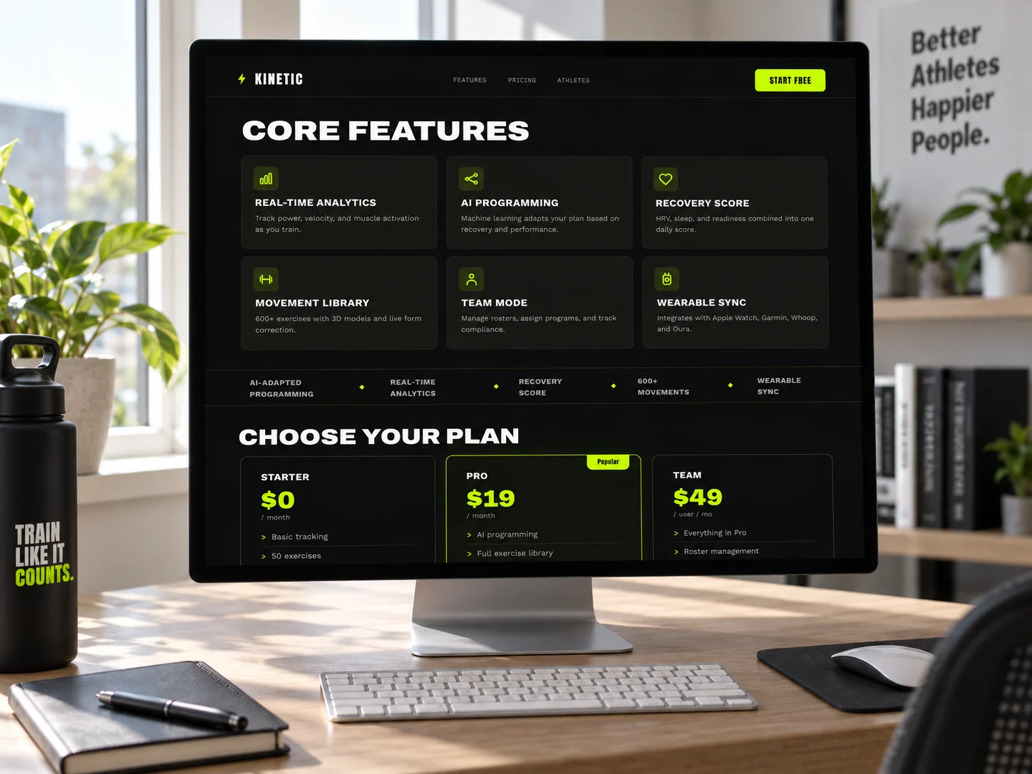
On desktop
The features grid and the plans, on a desktop monitor.
Proof: from first-week reviews to people still training
Before
Three app-store handles at 11px, each praising the app in its first week. That is precisely the review a churning product collects.
After
A powerlifter, a D1 track coach, a gym owner. Every quote carries a figure and two carry a timeframe, so the proof answers the retention question directly.
The identity
A gradient that promised ease, for a product that requires work.
Coral to tangerine, twelve-pixel corners and Poppins throughout: the visual language of a habit tracker. It made a strength platform look friendly, and friendly is not what makes somebody finish a twelve-week block.
Get fit with the #1 app
The gradient ran through the mark, the buttons, the metric numerals and the closing band, so it never marked anything. No color on the page meant this is the thing to do next.
Train harder
One flat volt, bright enough to work as ink on near-black and as a ground under black at the same ratio. It is rationed to one full-bleed band, one button per decision, and the live status signals.
The mark was decided on a phone home screen rather than a moodboard. Every candidate went to 16px beside the apps this one competes with, and the graph, the bolt and the pulse line all resolved into the same gray squiggle. A letter knocked out of the accent square held, because a letter is the one shape a person can still name at that size.
Changing which moment the site is written for changes which customers it attracts.
One row deserves an honest note. Two of the four figures in the new stat band, fifty thousand athletes and six hundred movements, are still an arrival count and a catalog size, which is the shape this document criticizes. They earned their place because scale is a real objection for a training platform, but the ratio is the thing to watch: two of four, not four of four.
The explorations
Three directions were designed. One shipped.
Each was built as a full working page, not a mood board, so the choice was made against real type, real spacing and real interaction. All three are shown here, with the reason the two that lost did not ship.
Command Center
dark · volt-lime · live animated bento dashboard hero
Put the dashboard first. An animated bento of training data appeals to someone already training, not to the person deciding whether to start.
Open full page ↗Field Athlete
cinematic hype · full-bleed athlete photography · stat marquee
Earns the install before it shows the product, which is the gap the old site never closed.
Open full page ↗Bright Signal
clean light-mode SaaS · product frame + floating chips · FAQ
Read like software rather than training, and the FAQ answered objections nobody had formed yet.
Open full page ↗In context