The opening: from a category to a console
Before
A wordmark, five nav items, two account links and three buttons, one of which says Get Started Free and appears twice on the same screen.
After
Nine, down from eleven, and only one of them is the primary action. The console itself carries the opening rather than an illustration of it.
The product: from an illustration to the interface itself
Before
An illustrated dashboard standing in for the dashboard, and adjectives standing in for figures. One photograph on the entire page, and none of the product.
After
The console is built in the page rather than drawn, and each capability carries a figure. The interface does the arguing, which is the only argument this audience accepts.
Proof: from a stock photo to people with job titles
Before
A stock photograph of a meeting, above a quote with no name attached to it. Nothing here can be checked, which for this buyer means nothing here counts.
After
Named people with their roles, and a figure attached to each. A controller can look them up, which is the whole point.
The identity
Soft blues and rounded corners, in a category where precision is the product.
The old palette was the default of every B2B SaaS deck of its year. It read as approachable, which is not the adjective a finance team is shopping for when the thing being bought reconciles their ledger.
Finance, simplified.
Poppins over Inter, a violet gradient on 24-pixel pills, and a charcoal ink. The fourth swatch is the grey that carried every supporting paragraph, at 2.54 to 1 on white. It is the first line of the specimen above.
The finance command deck for modern teams
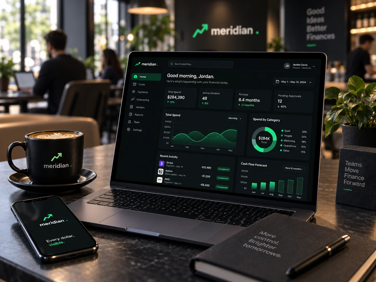
Space Grotesk for display over Manrope for body, a near-black ground, and one signal green reserved for live figures and the single primary action.
A finance buyer believes only what they can check.
Every change on this page follows from that one sentence. Show the product instead of an illustration of it, attach a name to every claim, and set the terms in type a person can actually read. The outcome figures at the top of this document come from the client's own reporting rather than from our measurement, and they are the one set of numbers here we cannot reproduce in a browser.
Specimen · the old body grey at its rendered size and value
Empower your finance team with a unified platform that unlocks insight, drives efficiency, and scales with your business.
© 2021 Meridian Financial Technologies, Inc. Privacy · Terms · Cookies · Security
Both lines above are set exactly as they shipped.
The hero sentence measures 2.54 to 1 at sixteen pixels on white. The footer line under it, on the tinted ground it shipped against, measures 1.81 to 1 at eleven, closer to a watermark than to text. Ten separate rules set type below 13px, including every section label. This is the page that asked a controller to trust it with the month-end close.
Text elements below 13px
Smallest type, px
Lowest body contrast
Actions above the fold
The explorations
Three directions were designed. One shipped.
Each was built as a full working page, not a mood board, so the choice was made against real type, real spacing and real interaction. All three are shown here, with the reason the two that lost did not ship.
Ledger
clean light SaaS · card-stack hero · bento + interactive ROI calculator
Asked the visitor to do arithmetic in an ROI calculator before giving them a reason to trust the numbers going into it.
Open full page ↗Command Deck
dark finance console · mint glow · dashboard-forward hero
Shows the console itself, so competence is demonstrated rather than asserted.
Open full page ↗Statement
warm editorial · forest + mint · big figures, arched imagery
The warmth was the problem. Arched imagery and big soft figures read as reassuring, and a finance console has to read as exact.
Open full page ↗In context