Everything the old portfolio said about its work
Hexal
Branding
Nova Kitchen
Identity
Field Notes
Digital
Atlas
Motion
A title and one word. Zero of four carried a result.
No brief, no problem, no outcome. A prospect could admire the photography for a full minute and leave knowing nothing about whether hiring this studio would work. Agencies are not hired for taste alone; they are hired on evidence that the taste moves a number.
Projects with an outcome
Smallest type, px
Thirty-five elements rendered below 13px
Label opacity on photos
Set on the image with no scrim behind it
The work: from a gallery to a body of evidence
Before
Photography at full bleed, with the category set at 10px in white over whatever happened to be in the image behind it.
After
Each project keeps its photograph and gains the brief, the move, and the number it produced.
The opening: from a mood to a claim
Before
An opening that establishes the studio has taste, which every studio in the consideration set also has.
After
A stated position, and the work ranked behind it by what it did rather than by how it photographs.
The identity
The gallery aesthetic was the problem, not the execution of it.
Work that resonates
Warm paper, a serif, and an editorial red. Handsome, and indistinguishable from forty other Brooklyn studios working the same reference.
Work that moves a number
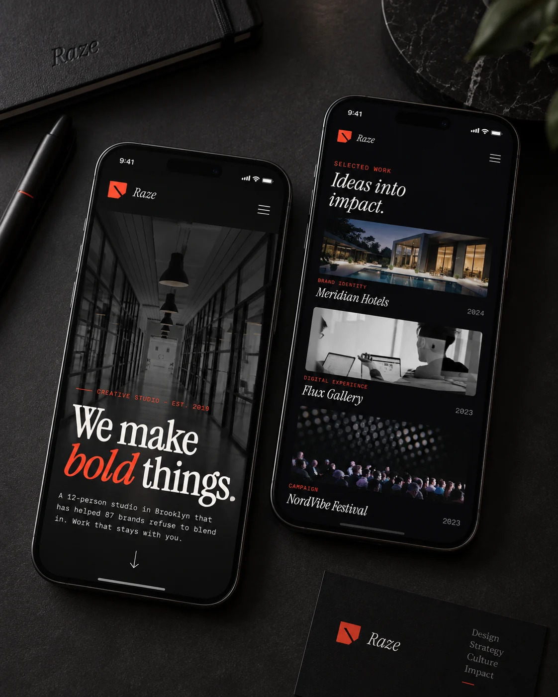
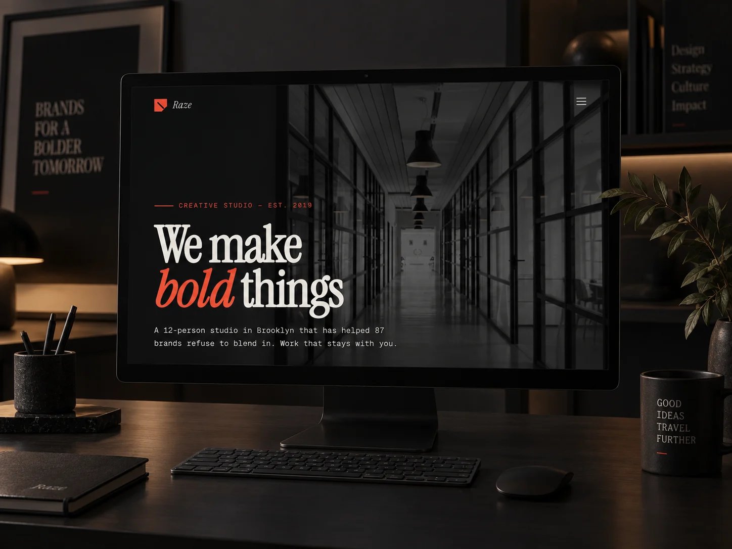
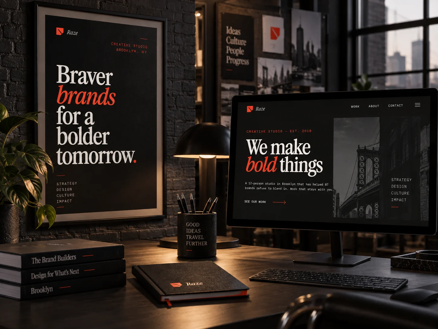
The same serif, moved onto near-black so the work is the only lit thing on the page, with one orange reserved for the figure in each case.
An agency portfolio that will not name a result is asking to be judged on taste alone.
That is a contest with no tiebreaker, which is why a studio this good was losing pitches to studios that were not. The outcome figures at the top of this document come from the client's own reporting rather than from our measurement.
The explorations
Three directions were designed. One shipped.
Each was built as a full working page, not a mood board, so the choice was made against real type, real spacing and real interaction. All three are shown here, with the reason the two that lost did not ship.
Broadsheet
editorial newspaper grid · Instrument Serif + mono · staggered work
An even editorial grid gave every project equal weight, so the four with real outcomes did not lead.
Open full page ↗Gallery Noir
dark cinematic portfolio · full-bleed work slabs · image-forward
Puts the work at full bleed and lets the strongest outcomes lead.
Open full page ↗Primary
Swiss color-blocking · red / blue / yellow · structured grid
Primary red, blue and yellow competed with the work they were framing. A studio portfolio cannot out-shout its own images.
Open full page ↗In context