Where the links went
Nine companies the label was renting its audience from.
Seven of the forty-five links stayed on the domain, and five of those were the navigation. Every other route sent a listener the label had paid to attract into a database it would never see.
Links off the domain
Out of forty-five before, out of fourteen now
Borrowed players
Two Spotify, one SoundCloud, one Bandcamp
Prices on the page
Vinyl from 22 euros, where the margin actually lives
The opening: from an instruction to a point of view
Before
"Stream Our Latest Releases" is an instruction, and the activity it describes happens on someone else's website.
After
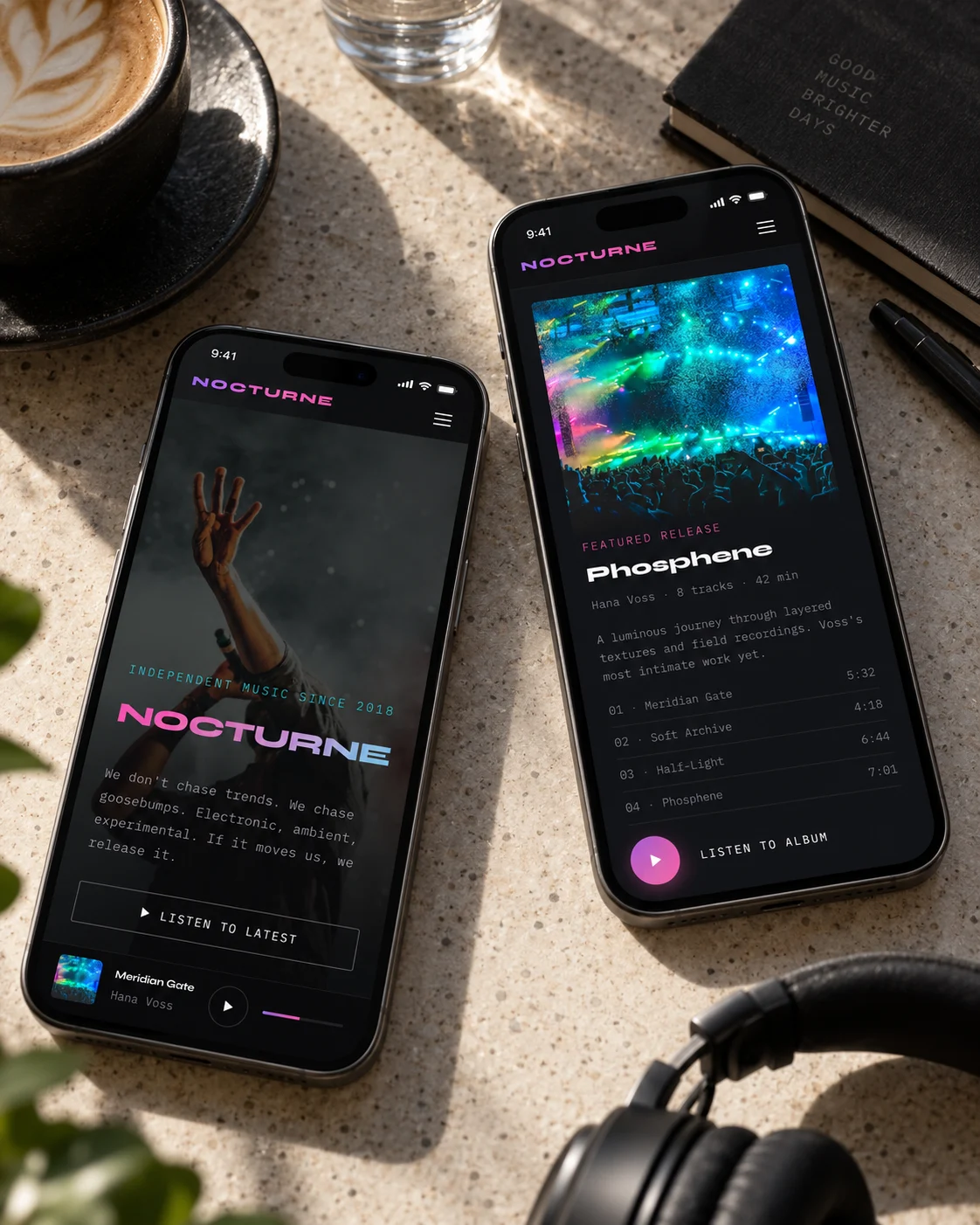
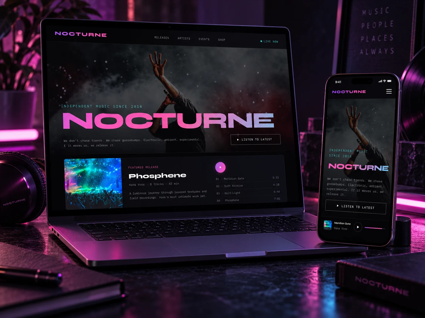
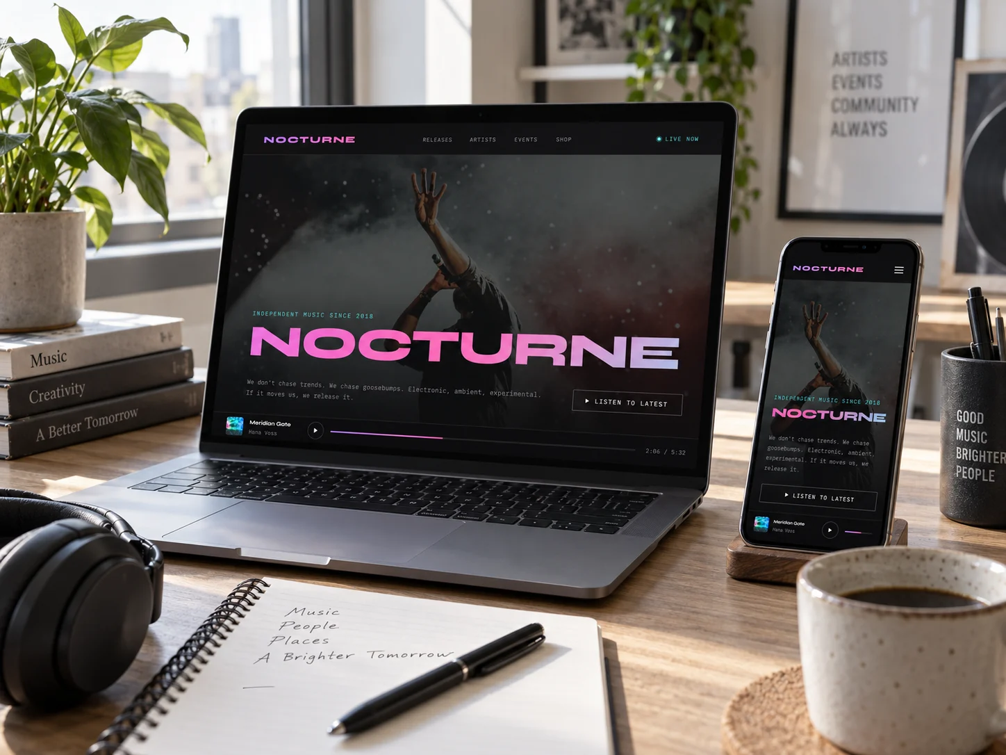
The wordmark at 134px and a line about taste, not distribution. One action, and the player it opens stays on the page.
The catalog: from four embeds to a record you can read
Before
Four identical player cards, each labeled with the company that owns it at 9px and 2.36 to 1, each ending in a link called Open.
After
One record given the space an album deserves: eight tracks, forty-two minutes, and the first four listed with their running times.
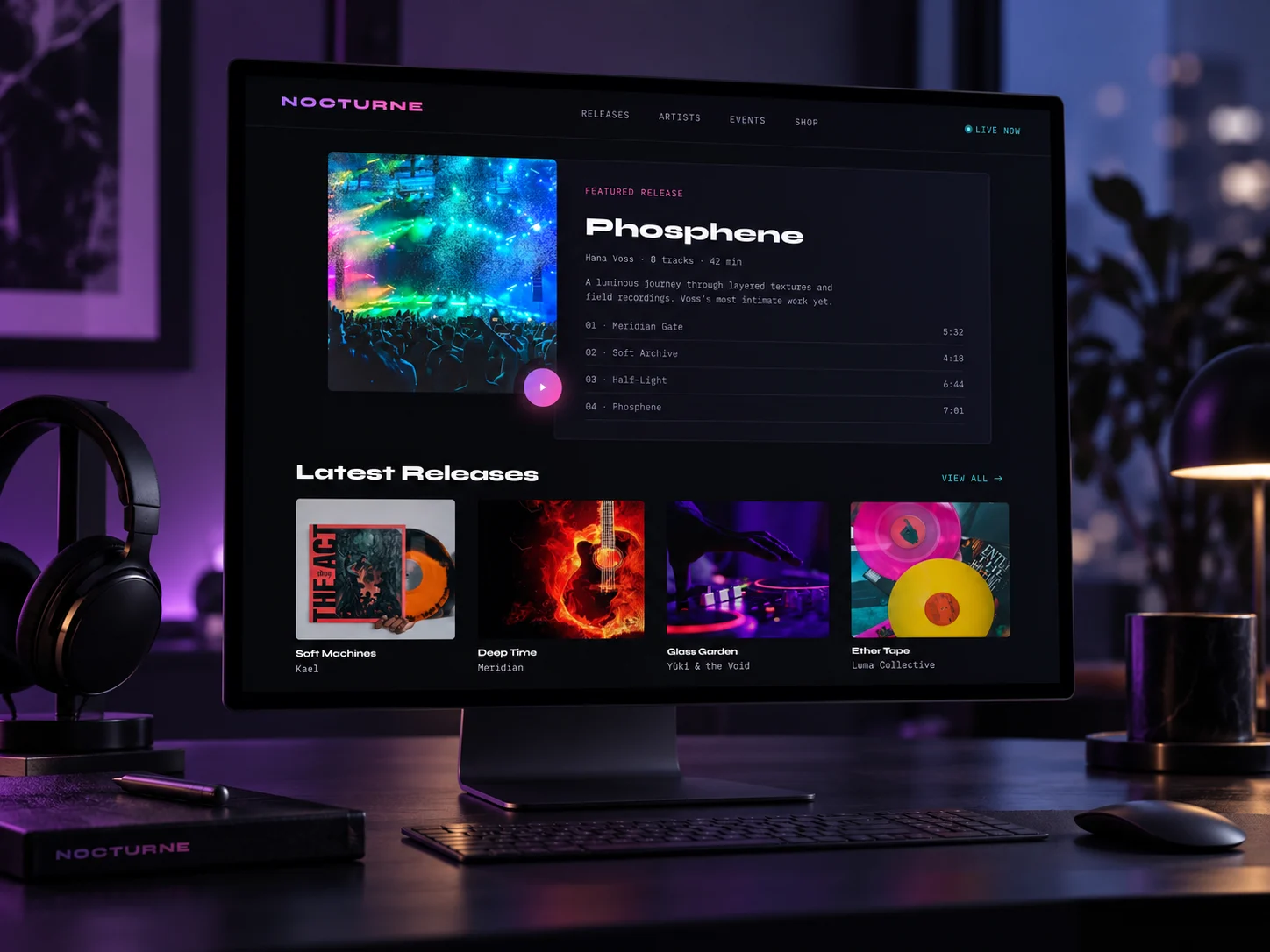
On desktop
The featured release and the latest releases, on a desktop monitor.
The money: from two outbound cards to goods and dates
Before
Two gray boxes. One describes vinyl without showing or pricing it, the other announces that shows are announced elsewhere.
After
A 180-gram pressing at 28 euros. Four shows with a city and a venue, from Berghain Kantine to SAT in Montreal, each with a ticket link.
The identity
A label whose whole argument is taste cannot look like a template.
Oswald caps over a violet-to-pink gradient on forty-pixel pills is the house style of a festival poster and a playlist cover, which is to say the house style of the platforms Nocturne was trying to be independent of.
Stream our latest releases
The gradient ran through the hero word, the primary button and the closing band, so it never marked a decision. The only color a visitor learned to click sat next to the word Spotify.
Nocturne
Three accents, each with one job: violet in the wordmark, magenta on editorial labels, cyan reserved for the live indicator. Near-black ground, so album art is the brightest thing on the page.
One thing did not change, and it should be said plainly: the new wordmark is still a gradient. The difference is that it now appears there and nowhere else, so it signs the label instead of decorating every button.
The catalog, the shop and the shows came home. The mailing list did not.
Measured across both sites, form fields go from zero to zero. Everything above moves the label's business onto its own domain, but the specific injury, that Nocturne still cannot reach a listener it has already earned, needs one email field beside the featured release. That ships before the merchandise photography does.
The explorations
Three directions were designed. One shipped.
Each was built as a full working page, not a mood board, so the choice was made against real type, real spacing and real interaction. All three are shown here, with the reason the two that lost did not ship.
After Dark
neon-gradient immersive · concert hero · now-playing bar
Keeps the listener on the label, which is the failure the old site had 38 times over.
Open full page ↗Broadsheet
brutalist zine editorial · newsprint · numbered catalog index
The newsprint palette fought the artwork it existed to sell. A record sleeve cannot compete with the page around it.
Open full page ↗Spectrum
color-coded · vivid per-release accents · typographic hero
Colour-coding each release left the label with no identity of its own — only its artists had one.
Open full page ↗In context