The missing artifact
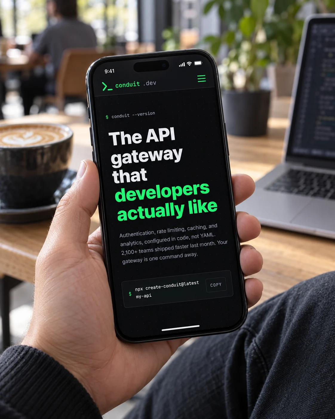
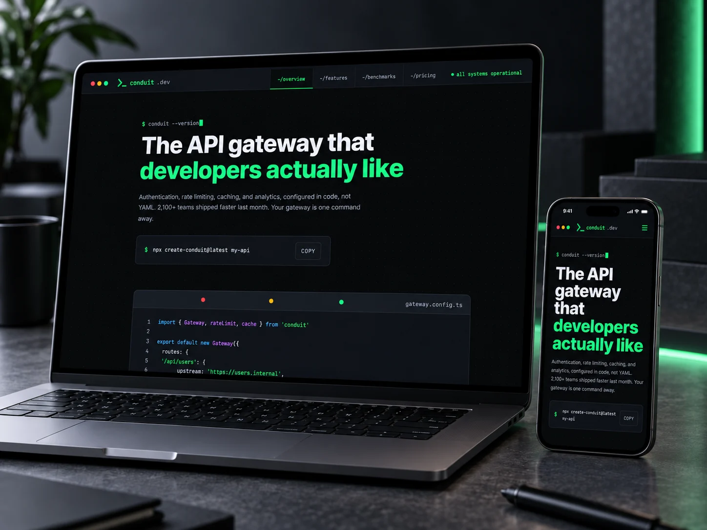
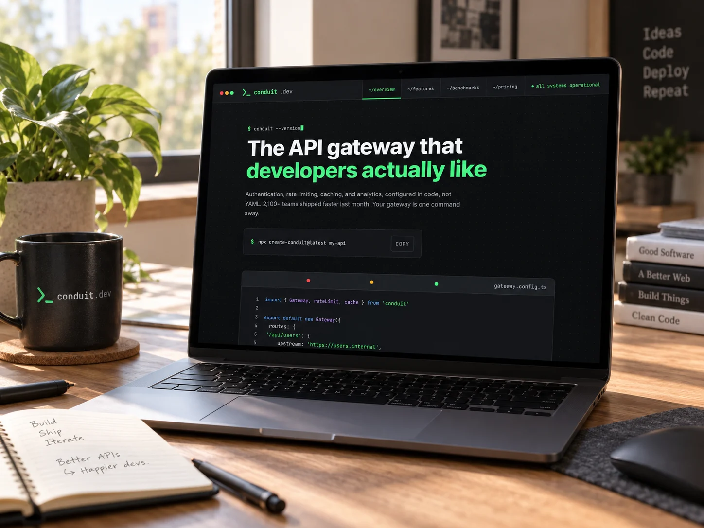
This is the product. The old site showed none of it.
Conduit's entire pitch is that gateway configuration lives in a file you can read and version. We counted the code on the old homepage and found zero characters of it. In its place sat a dashboard of business metrics, the one screen an engineer adopting a gateway never opens.
Characters of code
The config block plus both install commands
Actions behind a sales call
Request a Demo four times, Contact Sales four, Talk to an Expert once
Enterprise phrases
Estate four times, outcomes three, transformation twice, in 601 words
The opening: from an API estate to a version string
Before
A 29-word sentence containing enterprise-grade, operationalize and mission-critical, then two buttons that both lead to a form.
After
A shell prompt, a headline that names its reader, and one action: copy the install command.
Proof: from a commissioned study to milliseconds
The old page carried five figures across nine appearances: forty percent lower total cost of ownership, three point two times faster time to value, sixty percent less overhead. All sourced to a commissioned study, in a footnote set at 10px and 3.1 to 1.
Four figures replaced them, each with a unit and an explanation: 8ms median at the edge, five nines with the downtime budget spelled out as 26 seconds a month, 2.1 billion requests a day, 300 points of presence. Every one of them is falsifiable, which is what makes them persuasive.
The close: from Contact Sales to one command
Before
A pricing section with no prices. Contact Sales appears five times here alone, three of them standing where a figure should be.
After
A million requests a month, free, no card. Procurement still happens, just after the gateway is already running.
The identity
Read the old headline aloud and most engineers guessed consulting.
The indigo gradient, the analyst band and the estate vocabulary added up to a services firm. A services firm is not something you install.
Accelerate your API estate
Inter at five weights, one gradient running through the wordmark, the buttons and the stats. Fourteen-pixel radii on every surface, so nothing ranked above anything else.
The API gateway that developers actually like
One flat green at 11.17 to 1, rationed to the prompt, the status dot and the copy button. Monospace marks everything the machine said, so the page can tell its own claims apart from its evidence.
Nobody believed the site was aimed at the wrong reader until we counted the code and found none.
Two things to keep honest. The new page still claims 2,100 teams shipped faster last month, which nobody can check and which should come out. And its four footer links render 21.5 pixels tall, under the 44 they need.
The explorations
Three directions were designed. One shipped.
Each was built as a full working page, not a mood board, so the choice was made against real type, real spacing and real interaction. All three are shown here, with the reason the two that lost did not ship.
Terminal
terminal/dev aesthetic · green · code windows + live benchmarks
Leads with a readable request and a live benchmark, which is the first thing an engineer evaluating a gateway wants to see.
Open full page ↗Blueprint
navy + blue · blueprint grid · request-flow architecture diagram
Explained the architecture instead of showing the API. A request-flow diagram tells you the system exists; it still does not let you read a call.
Open full page ↗Daylight
clean light-mode docs style · green accent · dark code insets
Closest rival. Dropped because the dark code insets lost contrast on the light ground, and the benchmark figures stopped reading as live numbers.
Open full page ↗In context