Botanical ingredients named
Rosehip, lavender, jojoba, calendula, chamomile, squalane, vitamin E, hyaluronic acid
Studies with a stated sample size
200 participants, over eight weeks
Unsupported superlatives
Advanced, rare, precious, sublime, exceptional
The finding
The numbers were never the problem.
Both pages claim 94 per cent improved radiance. The old one attributed it to “a consumer perception study” in 9px type at 1.58:1 against its background — the least legible sentence on the page, set directly beneath the largest number on it. Forty-eight of its 76 text elements sat below 13px. Nothing named an ingredient, an origin, or a participant count, in a category where the buyer reads the label before she reads the headline.
A percentage is not evidence until something stands behind it.
The figures are unchanged. What changed is the line underneath: a named study, a participant count, and a duration, set at a size that can be read.
Before
“Based on a consumer perception study.” Nine pixels, 1.58:1, and no number of people anywhere on the page.
After
Independent clinical study, 200 participants, eight weeks — attached to the same three figures.
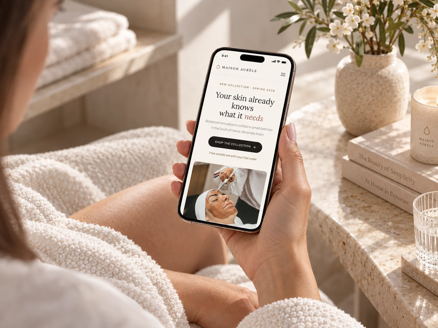
“A curated selection of botanical actives” names nothing.
The old page described its ingredients without listing one, and located the house in France without saying where anything was grown. The rebuilt page names eight actives and the garden they come from.
Before
Heritage, elegance, and a curated selection. No ingredient, no origin, and “Enquire” where three prices should be.
After
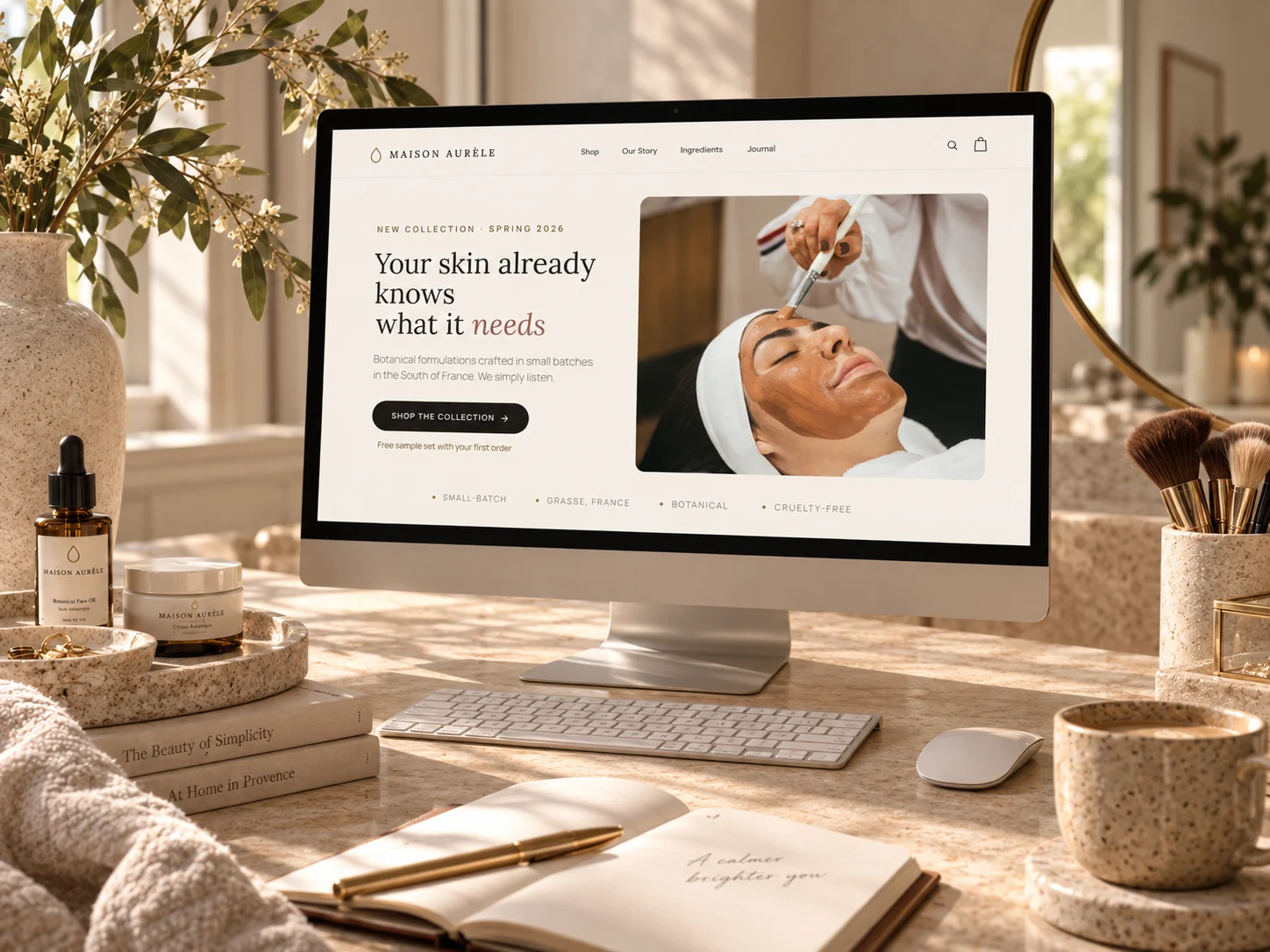
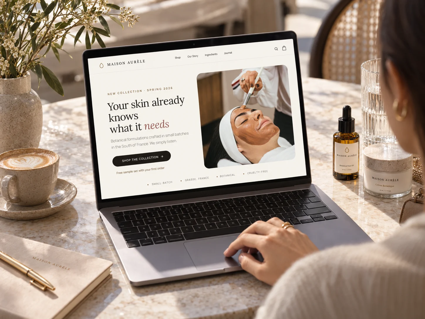
Eight named actives, cold-pressed in a botanical garden in Grasse, which the page states four times.
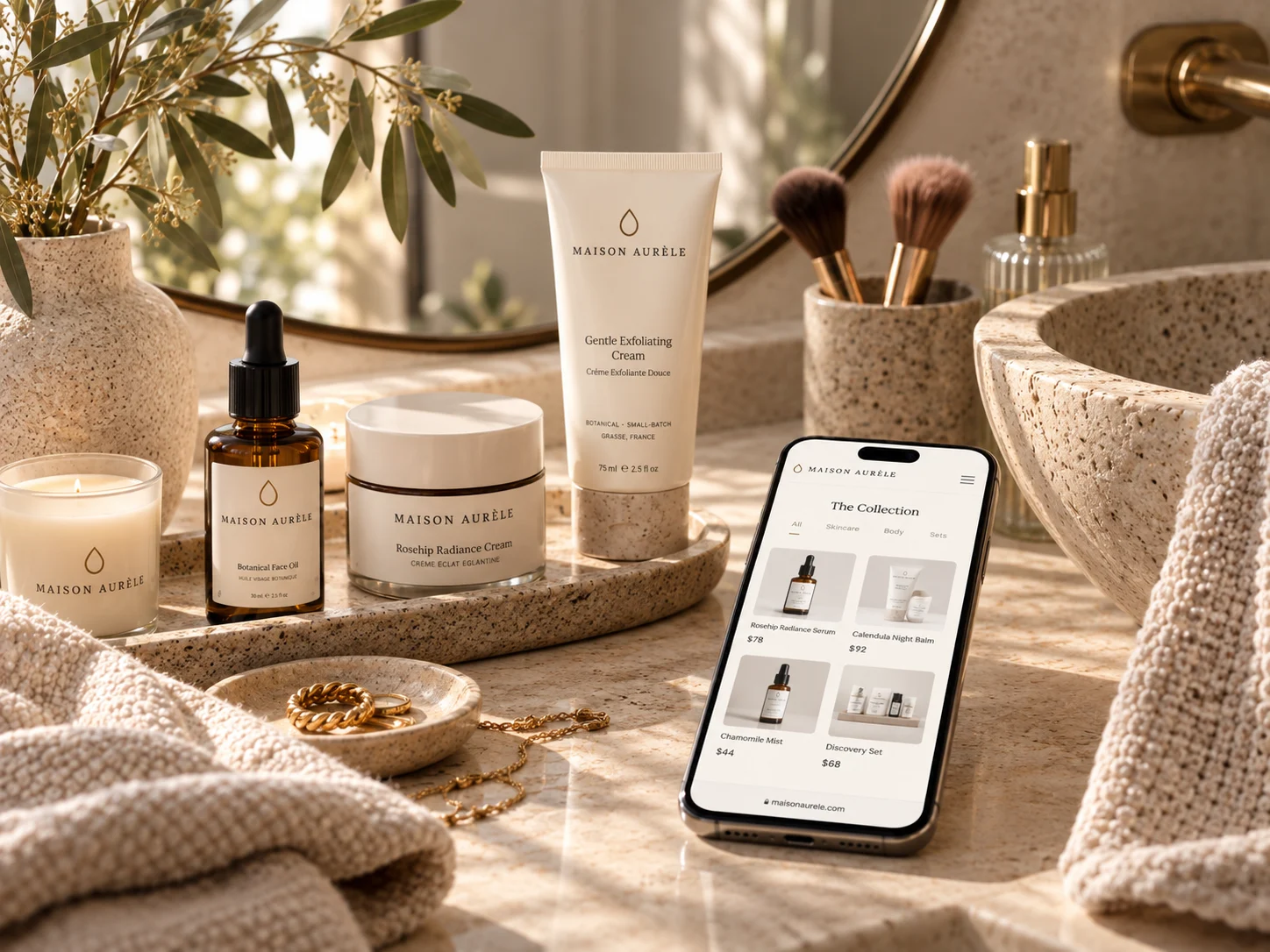
On a phone
The collection page on a phone.
Measured on both rendered pages, at 1440 wide
Botanical ingredients named
Studies with a stated sample size
Mentions of where ingredients are grown
Products priced as “Enquire”
Prices stated on the page
Unsupported superlatives
Text elements below 13px
Smallest type on the page
Contrast failures against WCAG AA
A category that asks for faith, sold to someone who reads the label.
Still open: 24 of the 27 actions on the rebuilt page are smaller than 44px in one dimension, mostly the inline product controls, and the three reviewer portraits remain stock photography. The clinical figures are presented as a study the brand commissioned; in a real engagement that study would need to exist before this page ships.
The explorations
Three directions were designed. One shipped.
Each was built as a full working page, not a mood board, so the choice was made against real type, real spacing and real interaction. All three are shown here, with the reason the two that lost did not ship.
Atelier
soft light editorial · Lora serif · floating botanical circles
Gives the clinical figures and the ingredient list room to be read, which is the whole argument.
Open full page ↗Noir Botanique
dark + moody luxe · Cormorant italics · gold accents
Beautiful, and it worked against the brief. The dark ground made the participant counts and ingredient names the hardest things on the page to scan.
Open full page ↗Apothecary
structured editorial grid · Marcellus · numbered catalogue
Ordered the range well, but a numbered catalogue made the collection feel like inventory rather than something formulated.
Open full page ↗In context